勾勒未來世界的輪廓!《SPACE AGE DESIGN》特展,解構 Verner Panton 與太空世代的美學狂想

© jamieyelo / HCS
2026 年,適逢丹麥未來主義設計巨擘 Verner Panton 的百年誕辰。明日家居 MOT CASA 於 NOKE 忠泰樂生活策劃了《SPACE AGE DESIGN—Verner Panton 與太空世代設計經典展》。展場中,流線且充滿有機曲面的前衛設計,像是如飛碟般圓潤的鮮豔座椅,打破水平邏輯的沙發,再到閃爍著金屬鏡面光澤、宛如漂浮星體的吊燈,彷彿將人瞬間抽離地球表面。但這場展覽並不只是一次單純的科幻懷舊,而是引領我們重返狂熱的年代,親歷一場跨越半世紀、顛覆傳統與階級的美學叛逆。
-
The year 2026 marks the centenary of the birth of the Danish futurist design giant Verner Panton. MOT CASA has curated the "SPACE AGE DESIGN: Verner Panton and Space Age Design Classics Exhibition" at NOKE. In the exhibition space, avant-garde designs with flowing, organic curves, from vividly colored chairs as round as flying saucers to sofas that break horizontal logic, and chandeliers shimmering with metallic mirror finishes like floating celestial bodies, instantly transport visitors off the surface of the Earth. However, this exhibition is not merely a simple sci-fi nostalgia trip. Instead, it leads us back to the fervent era of the Space Race, allowing us to witness an aesthetic rebellion that spans half a century and subverts tradition and class.
重返太空時代
要看懂這些太空時代設計的線條與輪廓,我們必須將時間軸拉回 1950 年代,一個對科技深信不疑、社會氛圍高度樂觀的世代。
當時剛經歷二戰的全球社會,正處於亟欲重建並迎向新秩序的心理狀態。人們渴望戰後新時代生活的到來,將對美好明天的寄託,轉而投射在快速發展的科技上。此時,美蘇兩國展開激烈的太空競賽。先是 1957 年蘇聯成功發射人類史上第一顆人造衛星,緊接著 1969 年美國阿波羅 11 號登陸月球。這場向外征服宇宙,將目光拋向大氣層外的較勁,不僅推動科學技術的發展,也轉化為全人類對未來世界的集體想像。
火箭、衛星與太空艙的符號開始走入大眾文化,同時也在設計界引發一場材質革命。過去流行於歐洲皇宮貴族,象徵階級與地位的高階木製傢俱,如紫檀、黑木,逐漸無法滿足大眾需求。而戰爭期間,曾經被當作戰略物資,取代金屬與木材結構的塑料與各類新興合成材料,則積極尋找民生與居家用途。這些可以開模量產,不怕磁力且能輕易塑形的材質,因此變成設計師們描繪明日生活的理想媒介。
-
Return to the Space Age
To truly understand the lines and contours of these Space Age designs, we must turn the timeline back to the 1950s, a generation that implicitly trusted technology and possessed a highly optimistic social atmosphere.
The global society, having just experienced World War II, was in a psychological state of eager reconstruction and embracing a new order. People longed for the arrival of a new post-war life, projecting their hopes for a better tomorrow onto the rapidly developing technology. At this time, the United States and the Soviet Union launched a fierce Space Race. First, the Soviet Union successfully launched the first artificial satellite in human history in 1957, followed closely by the United States landing Apollo 11 on the moon in 1969. This competition to conquer the universe and cast our gaze beyond the atmosphere not only propelled the development of science and technology but also transformed into the collective imagination of the future world for all humanity.
The symbols of rockets, satellites, and space capsules began to enter popular culture while simultaneously sparking a material revolution in the design world. The high-end wooden furniture, such as rosewood and ebony, which had been popular among European royalty and symbolized class and status, could gradually no longer meet the needs of the general public. Meanwhile, plastics and various new synthetic materials, once used as strategic materials during the war to replace metal and wood structures, actively sought domestic and household applications. These materials, which could be mass-produced in molds, were unaffected by magnetism, and could be easily shaped, thus became the ideal medium for designers to depict the life of tomorrow.

© jamieyelo / HCS
塑料的普及,在社會學的某種意義上,實現了「設計民主化」這件事。相較於高度仰賴原木與耗時手工的傳統傢俱,化學材質能透過工業化開模進行大規模量產。技術的進步大幅降低了製造成本,也突破過去傢俱外型的物理限制,使得那些具有流線曲面、色彩明亮的突破性設計,能以平易近人的方式進入一般大眾的日常生活。
-
The popularization of plastic, in a sociological sense, realized the concept of "design democratization." Compared to traditional furniture that heavily relied on logs and time-consuming manual labor, chemical materials could be mass-produced through industrial molding. The advancement in technology drastically reduced manufacturing costs and broke through the physical limitations of past furniture shapes, allowing those breakthrough designs with flowing curves and bright colors to enter the daily lives of the general public in an accessible way.

© jamieyelo / HCS

© jamieyelo / HCS

© jamieyelo / HCS

© jamieyelo / HCS
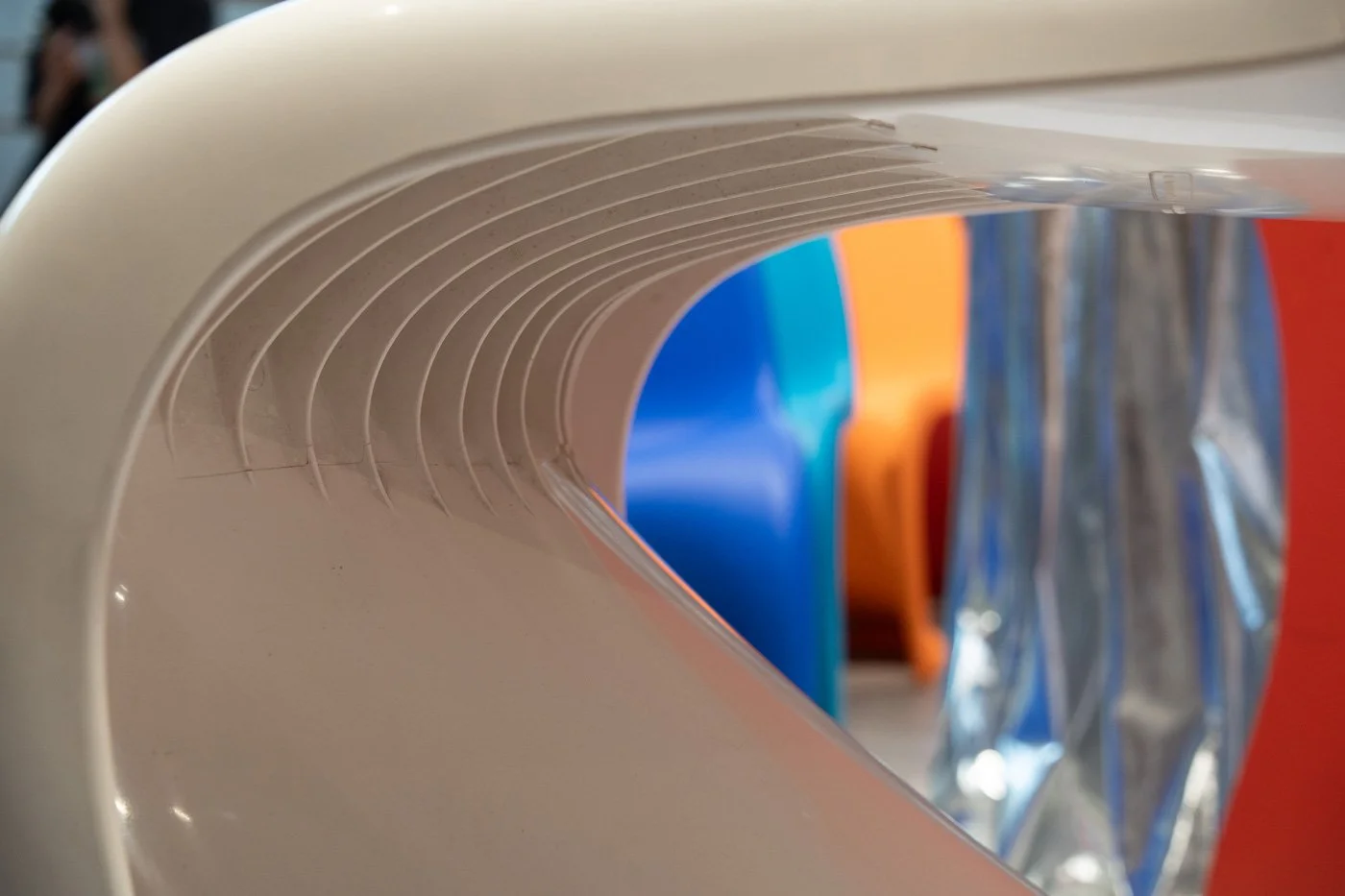
拒絕直角的流線設計與太空橘
太空時代的設計語彙中,最鮮明的特徵便是「拒絕直角」。設計師們以流線的有機曲面來取代生硬的幾何框架,除了展現塑料一體成型的可塑性,更是對外太空想像的具象投射。宛如飛碟(UFO)的扁平圓弧、猶如火箭空氣動力學的流體線條,以及象徵宇宙星體與發射場的「圓形」與「球體」,成為了最受追捧的設計元素。
伴隨著未來感外型的,是極致的色彩運用。太空世代的設計大幅拉高了色彩的純度,將無比強烈、鮮豔的色彩注入空間。在色彩的歷史中,「橘色」其實是一個相對晚期才被定義的顏色。15 世紀以前的歐洲並沒有橘子,直到葡萄牙人將這款水果從亞洲引進後,才逐漸演變出「Orange」一詞,同時指稱水果與顏色。
由於橘色難以從天然植物或礦物中輕易萃取,直到 18、19 世紀才發展出成熟的人工調色配方。於是在 1950 到 1960 年代,飽和、溫暖、高度「人工化」的色彩,被當時的人們視為最新穎、最能代表科技與希望的顏色,精準視覺化了人類欲想征服宇宙的野心。
-
Streamlined Designs Rejecting Right Angles and Space Orange
In the design vocabulary of the Space Age, the most distinct characteristic is the "rejection of right angles." Designers replaced rigid geometric frames with flowing organic curves, which not only demonstrated the plasticity of one-piece molded plastic but also served as a concrete projection of outer space imagination. Flat arcs resembling UFOs, fluid lines akin to rocket aerodynamics, and "circles" and "spheres" symbolizing cosmic celestial bodies and launch pads became the most highly sought-after design elements.
Accompanying the futuristic exteriors was the extreme application of color. Space Age design significantly heightened color purity, injecting intensely vibrant and vivid colors into spaces. In the history of color, "orange" is actually a visual symbol defined relatively late. Europe did not have oranges before the 15th century. It was not until the Portuguese introduced this fruit from Asia that the word "Orange" gradually evolved to refer to both the fruit and the color.
Because orange was difficult to easily extract from natural plants or minerals, mature artificial color mixing formulas were not developed until the 18th and 19th centuries. Consequently, in the 1950s and 1960s, this saturated, warm, and highly "artificial" color was viewed by the people of that time as the most novel color and the one that best represented technology and hope, accurately visualizing humanity's ambition to conquer the universe.

© jamieyelo / HCS

© jamieyelo / HCS

Verner Panton 的叛逆狂想
在這場推翻舊框架的浪潮中,丹麥設計巨擘 Verner Panton 無疑是最具代表性的革命者。對 Panton 而言,傢俱不應只是單純的生活用品,更該是強烈的情感與感官體驗。他大膽顛覆當時偏重天然材質與功能主義的理念,擁抱塑料、玻璃纖維與泡棉等新興化學材質,並為其注入大膽且高純度的鮮豔色彩。
而 Panton 最具代表性的巔峰之作,便是設計史上首張以單一材質製作一體成形並量產的懸臂椅——《Panton Chair》。
-
The Revolutionary Breaking the Mold: Verner Panton's Rebellious Fantasy
In this wave of overthrowing old frameworks, the Danish design giant Verner Panton is undoubtedly the most representative revolutionary. For Panton, furniture should not merely be a simple everyday item but rather a strong emotional and sensory experience. He boldly overturned the prevailing concept that emphasized natural materials and functionalism, embracing emerging chemical materials such as plastics, fiberglass, and foam, and infusing them with bold and highly pure vivid colors.
Panton's most representative pinnacle work is the Panton Chair, the first cantilever chair in design history to be mass-produced in a single piece from a single material.

過去的懸臂椅多半仰賴鋼骨或木材(如 Marcel Breuer 的鋼管椅,或是荷蘭設計師 Gerrit Rietveld 的 Zig-zag 椅)來支撐結構。Panton 想用新穎的塑料挑戰一體成型的懸臂結構,但這個構想在當時實在太過超前。他從 1950 年代末就畫出了草圖,卻苦尋不到願意製造的廠商;直到 1963 年才與 Vitra 達成合作。即便如此,Vitra 的研發團隊與 Panton 仍花了好幾年的時間反覆試驗,才在 1967 年由 Vitra 與美國的 Herman Miller 攜手推出第一批的試產系列。
為了能大規模量產,後續幾代陸續換上了不同的合成材料,但每一種都帶來新的力學難題。現場展出的白色 Panton 椅,即是當年在椅身與椅腳的轉折處增加「肋條」結構來分擔承重的版本。直到 1999 年,塑料與成型技術終於成熟,Vitra 才得以實現 Panton 最初的構想,成為我們如今所見的最終版本。從最初的紙上構想到 1999 年的終版,這場橫跨好幾十年的工藝拉鋸,見證了人類征服塑料材質極限的工藝里程碑。
-
Past cantilever chairs mostly relied on steel frames or wood (such as Marcel Breuer's tubular steel chair or Dutch designer Gerrit Rietveld's Zig-zag chair) to support the structure. Panton wanted to use novel plastics to challenge a one-piece cantilever structure, but this concept was truly too far ahead of its time. He had drawn sketches since the late 1950s but struggled to find a manufacturer willing to produce it until he partnered with Vitra in 1963. Even so, the Vitra research and development team and Panton spent several years repeatedly experimenting before Vitra and the American company Herman Miller jointly launched the first batch of trial production series in 1967.
To enable large-scale mass production, subsequent generations gradually switched to different synthetic materials, but each brought new mechanical challenges. The white Panton Chair exhibited on-site is the version that added a "rib" structure at the turning point between the seat and the legs to share the load. It was not until 1999, when plastic and molding technologies finally matured, that Vitra was able to realize Panton's original vision, becoming the final version we see today. From the first paper sketch to the final version in 1999, this craftsmanship tug-of-war spanning decades witnessed a milestone in humanity's conquest of the limits of plastic materials.
© jamieyelo / HCS
無重力狀態下的乘坐實驗
當化學材質解放傢俱的物理形體,Panton 緊接著要顛覆的,便是人類長期被傳統禮儀束縛的身體。以本次展場中、Vitra 為紀念大師百年誕辰特別推出的限量雙色版《Heart Cone Chair 愛心甜筒椅》為例,這張源自半世紀前的作品,初問世時許多人試圖以傳統座椅的方式坐在椅面正中間,反而導致身體不知如何擺放。事實上,Panton 的初衷希望使用者能以最慵懶的角度,隨性地斜靠在愛心輪廓的兩側翅膀上。捨棄拘謹的設計思維,傳遞著太空時代不受拘束的自由態度。
從單一座椅放大到整體空間,打破常規的狂想在《Living Tower 生之塔》上展現得淋漓盡致。於 1970 年發表的巨型雕塑傢俱,徹底瓦解傳統客廳沙發「並排水平而坐」的邏輯,創造出一個垂直堆疊的多層結構。想像的起源,來自於太空艙的作息環境。在太空中,人們的移動方式是用漂浮的,空間沒有地心引力帶來的限制,自然沒有爬到上方的問題。垂直取代了水平,傳統社交場合的座位階級與相對視角也被隨之打破。
-
Seating Experiments in a Zero Gravity State
As chemical materials liberated the physical forms of furniture, what Panton subsequently wanted to subvert was the human body, which had long been bound by traditional etiquette. Take the Heart Cone Chair as an example, a limited dual-color edition specially launched by Vitra to commemorate the master's centenary, which is exhibited on-site. When this piece originating from half a century ago was first introduced, many people tried to sit exactly in the middle of the seat in the manner of a traditional chair, which instead caused them not to know how to position their bodies. In fact, Panton's original intention was for users to casually lean against the two wings of the heart outline at the laziest angle. This design thinking that discards restraint conveys the unbound, free attitude of the Space Age.
Expanding from a single seat to the entire space, the fantasy of breaking conventions is vividly displayed in the Living Tower. This giant sculptural furniture, published in 1970, thoroughly dismantled the logic of "sitting side-by-side horizontally" on traditional living room sofas, creating a vertically stacked, multi-layered structure. The origin of this imagination came from the living environment of a space capsule. In space, people's mode of movement is floating; the space lacks the restrictions brought by gravity, so naturally, there is no problem of climbing upward. Verticality replaced horizontality, and the seating hierarchy and relative perspectives in traditional social settings were consequently broken.

Heart Cone Chair 愛心甜筒椅。© jamieyelo / HCS

Living Tower 生之塔。© jamieyelo / HCS


跨越半世紀的太空迴響
太空時代對形式與材質的顛覆,並沒有隨著阿波羅計畫的結束而停止,這股前衛精神早已深植入當代設計的基因。走入《SPACE AGE DESIGN》特展的後半段,展場的視角從太空世代經典老件,一路延伸至當代設計師 Marc Newson、Ron Arad 及 Tom Dixon 等人的作品。例如 Tom Dixon 標誌性的吊燈,便延續了對圓弧與金屬反光材質的狂熱。這些當代作品,在在證明了,Space Age Design 不僅是一種特定年代的風格。細細品味這些經典之作,我們會發現,無論科技的載體如何更迭,人類對未來生活那份純粹的嚮往與樂觀探索,其實從未真正離我們遠去。
-
Space Echoes Spanning Half a Century
The Space Age's subversion of forms and materials did not stop with the end of the Apollo program; this avant-garde spirit has long been deeply rooted in the DNA of contemporary design. Entering the latter half of the SPACE AGE DESIGN exhibition, the perspective of the venue extends from classic Space Age vintage pieces all the way to the works of contemporary designers such as Marc Newson, Ron Arad, and Tom Dixon. For instance, Tom Dixon's iconic chandeliers continue the fanaticism for arcs and metallic reflective materials. These contemporary works prove time and again that Space Age Design is not merely a style of a specific era. Looking closely at these classic works, we will find that no matter how the mediums of technology change, humanity's pure yearning and optimistic exploration for future life have actually never truly left us.

© jamieyelo / HCS


© jamieyelo / HCS
展覽地點:NOKE 忠泰樂生活 Uncanny