
讓幾何釉彩在空間盛開:專訪荷蘭磁磚品牌 Palet 創辦人 Gilles de Brock
The Orange House Sokcho © Palet
[ZH]
在多數人的印象中,磁磚是廚房與浴室裡講求防水、耐用與易於清潔的建材。走進建材行,從規格整齊的標準磚,到以數位噴墨呈現石材、水泥紋理的仿製磚,選擇雖然豐富,設計卻容易落入相似的形式。
荷蘭品牌 Palet ,試圖為磁磚開拓另一種可能。
[EN]
Letting Geometric Glazes Bloom Through Space: An Interview with Gilles de Brock, Founder of Dutch Tile Brand Palet
For most people, tile is a building material for kitchens and bathrooms, valued for being waterproof, durable and easy to clean. Walk into a building-supplies showroom and the choices are plentiful, from neatly sized standard tiles to imitation tiles that use digital inkjet printing to reproduce the textures of stone and concrete, yet the designs tend to fall into similar forms.
The Dutch brand Palet is trying to open up another possibility for tile.
TTRS Seoul © Palet
[ZH]
創辦人 Gilles de Brock 與 Jaap Giesen 原本從事平面設計,兩人透過網路影片自學程式編寫與機械工程,從零組裝 CNC 噴釉設備,摸索出獨特的磁磚製作方式。
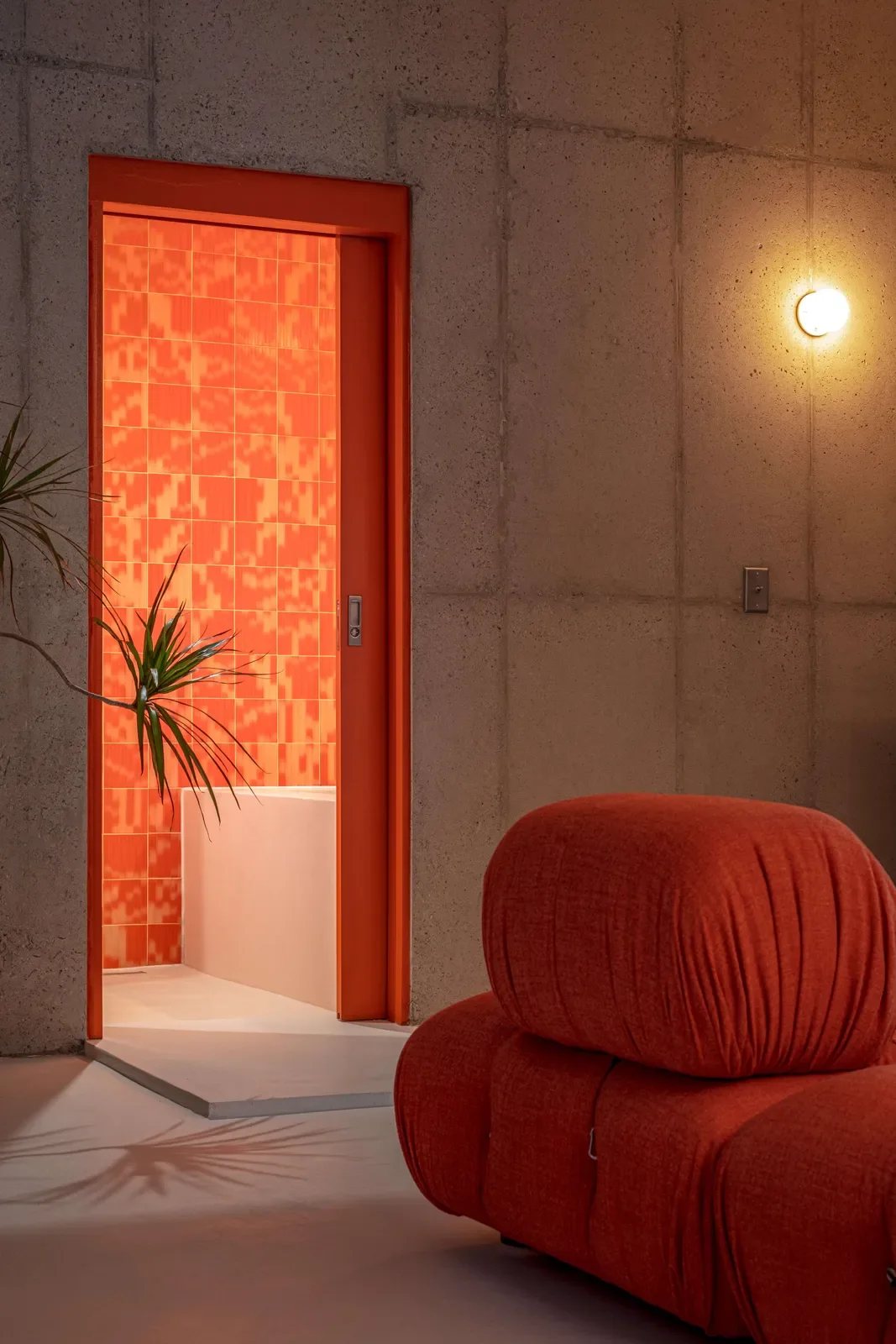
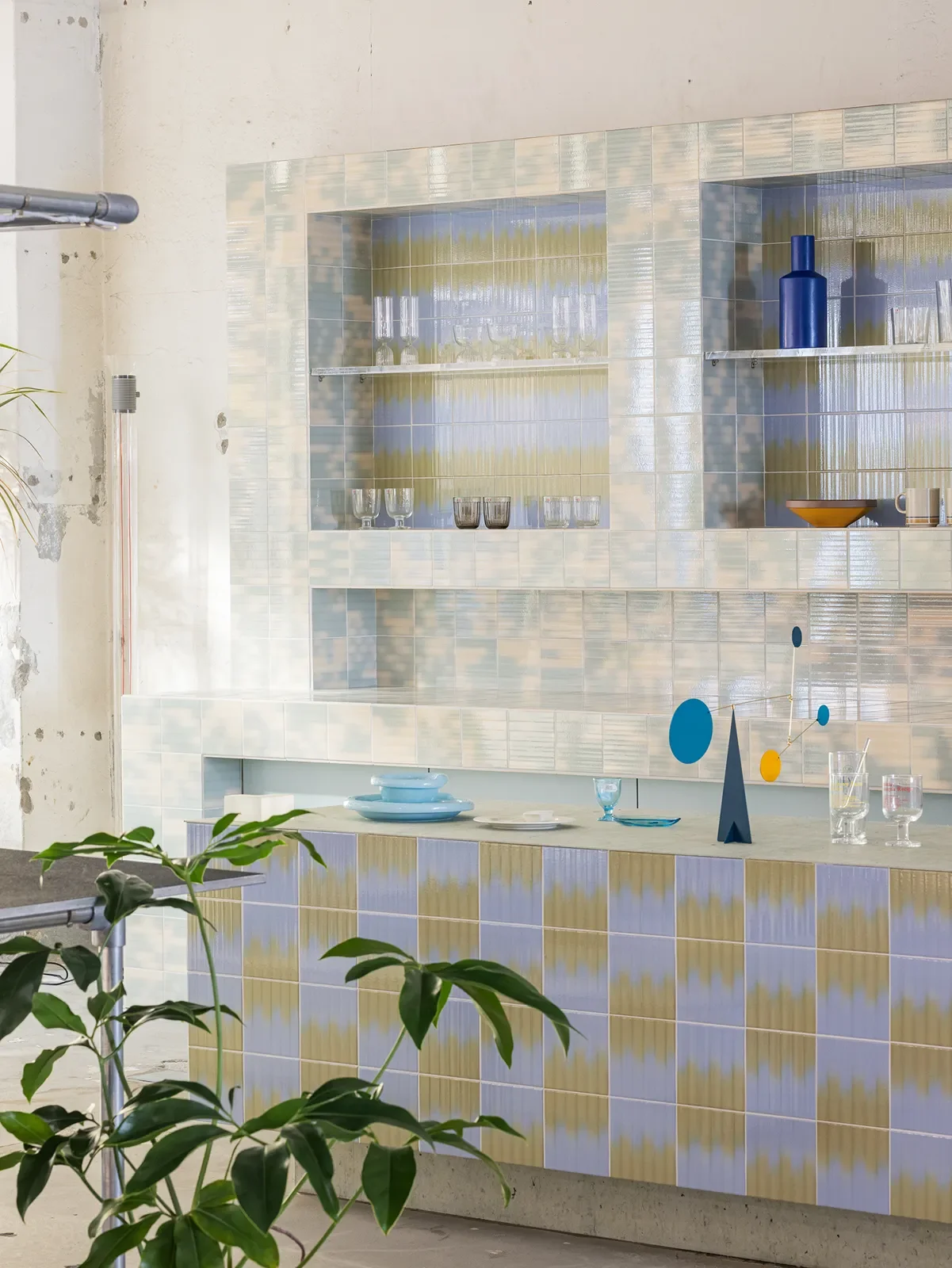
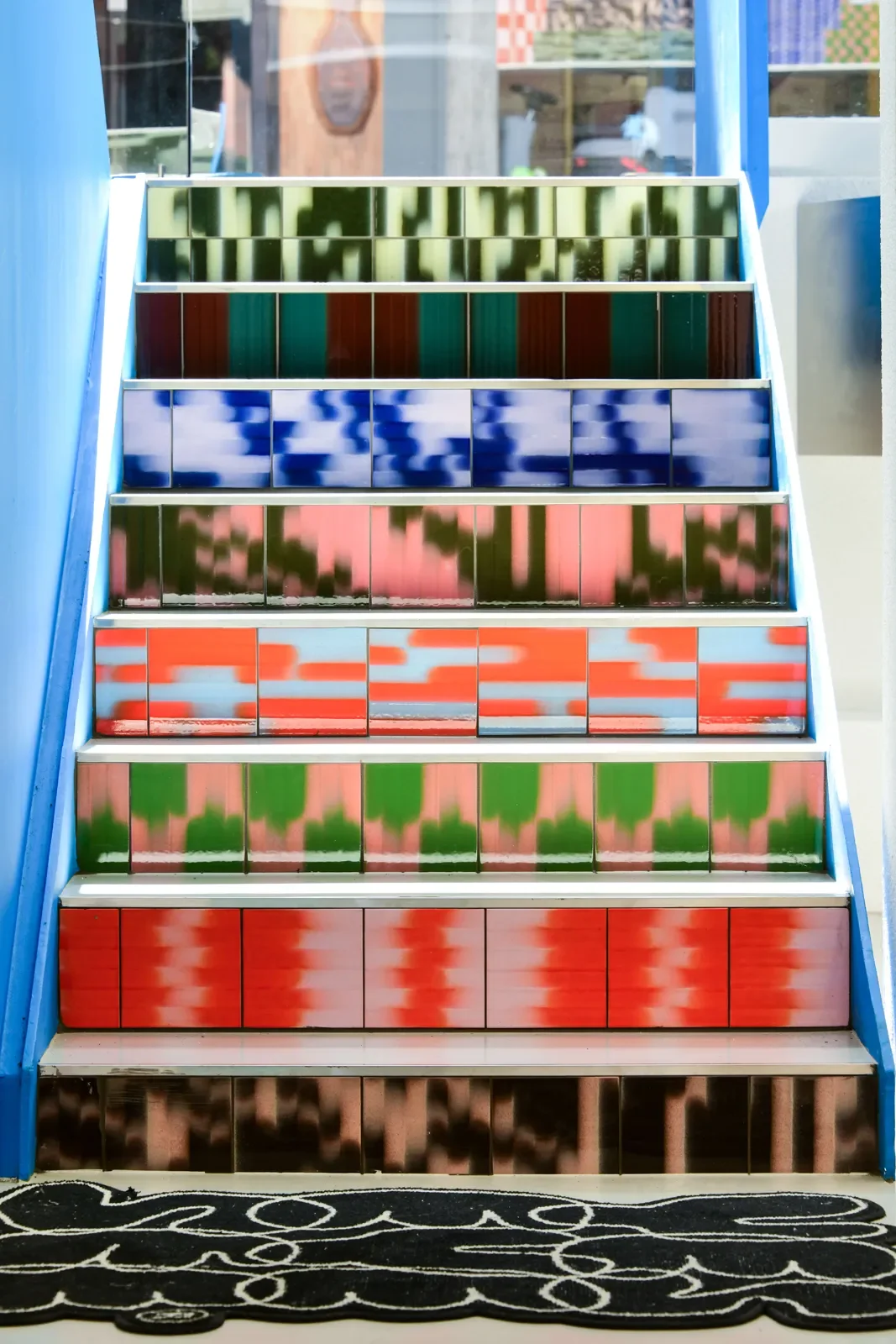
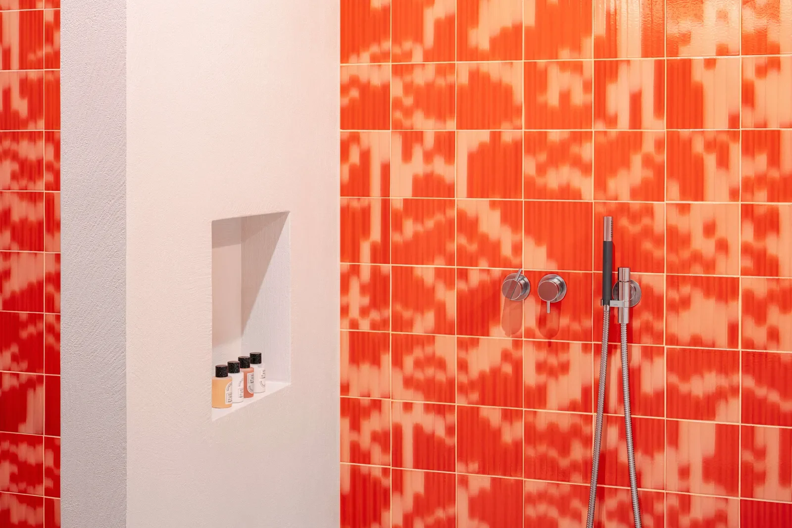
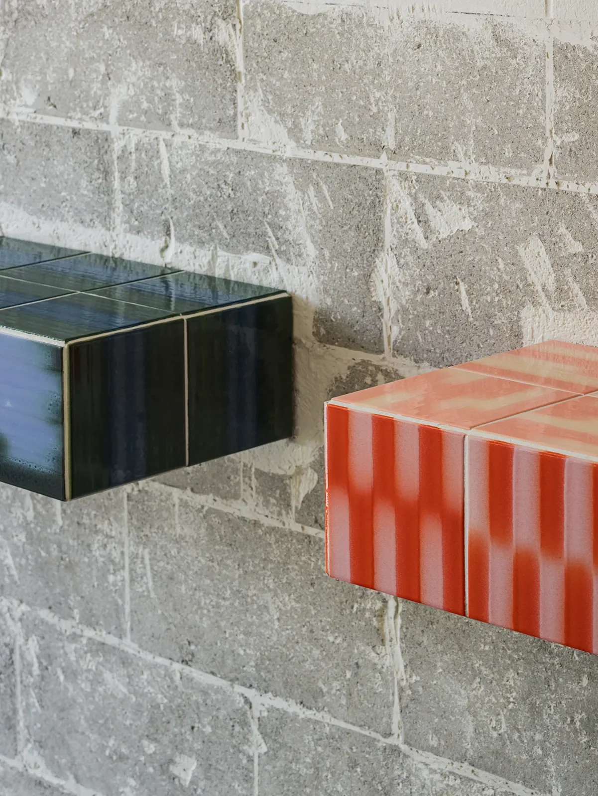
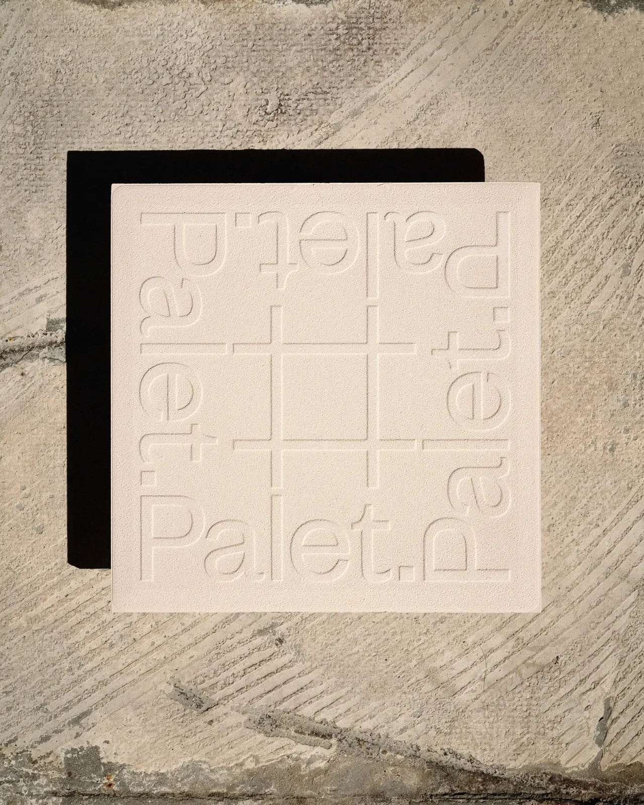
Palet 的作品以鮮明的幾何圖形與大膽的雙色漸層為特色。釉色帶有數位點陣般的顆粒感,邊緣則呈現噴繪般的柔和變化。當磁磚成片鋪展,原本局部的圖案轉化為大型構圖,讓牆面展現近似藝術作品的視覺張力。
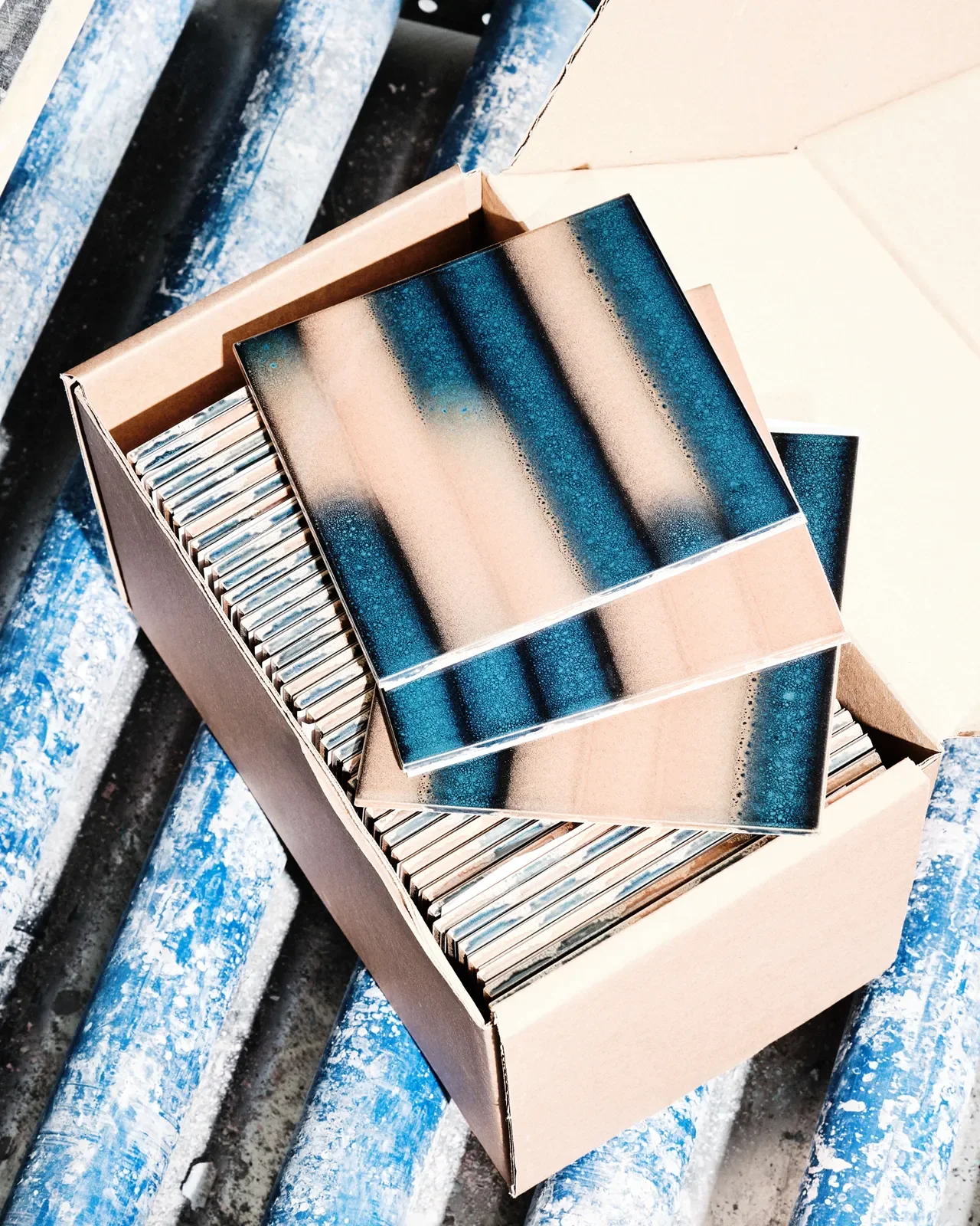
由於平面設計講究比例、構圖與色彩,當圖樣進入實體製作,釉藥特性與窯燒溫度便成為新的變數。Palet 將數位控制技術運用於施釉,讓圖形與色彩依照設定呈現,同時保留釉料經高溫燒製後的流動變化。設計由此延伸至材質本身,在磁磚表面留下厚度、光澤與細微起伏。
[EN]
Founders Gilles de Brock and Jaap Giesen originally worked in graphic design. Teaching themselves programming and mechanical engineering from online videos, the two assembled CNC glaze-spraying equipment from scratch and worked out a distinctive way of making tiles.
Palet's work is defined by bold geometric shapes and daring two-colour gradients. The glazes have a grain like a digital dot matrix, with edges that soften as if airbrushed. When the tiles are laid out in sweeps, what began as a local pattern turns into a large composition, giving the wall a visual tension close to that of an artwork.
Because graphic design values proportion, composition and colour, once an image moves into physical production, the properties of the glaze and the kiln temperature become new variables. Palet applies digital control to glazing, so that shapes and colours appear as programmed while the flowing changes of the glaze fired at high temperature are preserved. Design thus extends into the material itself, leaving thickness, lustre and subtle undulations on the tile surface.
YESEYESEE Seoul © Palet
[ZH]
從平面走向立體,一場始於色彩的創作實驗
「一開始只是因為我自己的創作逐漸脫離紙本海報,轉向更純粹的印花與圖像。」
Gilles 對色彩與不同媒材的探索,導引著 Palet 的誕生。受過平面設計訓練的他,習慣透過色票、螢幕上的 RGB 數值,以及印刷時的 CMYK 配比掌握色彩。直到開始嘗試立體織品,親手染製羊毛、製作地毯,他才進一步體會到材質如何改變色彩的表現。纖維紋理、表面起伏,以及染料與羊毛交織出的層次,都讓平面圖像有了不同的觸感。
繼地毯、絲巾之後,還有哪些材質值得探索?Gilles 開始留意陶瓷釉藥。釉彩經過窯燒,會因化學變化呈現不同的色澤與玻璃質感,過程中的細微變化也為成品留下難以預料的效果。
[EN]
From Flat to Dimensional
“It started simply because my own work was gradually moving away from paper posters toward more purely printed patterns and images.”
Gilles's exploration of colour and different media guided the birth of Palet. Trained in graphic design, he was used to handling colour through swatches, RGB values on a screen, and CMYK ratios in print. It was only when he began experimenting with three-dimensional textiles, dyeing wool by hand and making rugs, that he came to understand more fully how material changes the way colour appears. The texture of fibres, the undulations of a surface, and the layers that dye and wool create together all gave flat images a different feel to the touch.
After rugs and silk scarves, what other materials were worth exploring? Gilles began to pay attention to ceramic glazes. Fired in a kiln, a glaze takes on different hues and a glassy quality through chemical change, and the subtle shifts along the way leave the finished piece with effects that are hard to predict.
© Palet
[ZH]
2017 年,他前往日本陶瓷重鎮有田町(Arita)參與駐村計畫,研究傳統陶瓷釉藥。駐村接近尾聲時,好友 Jaap 飛往日本與他會合。兩人同樣出身平面設計,對圖像與色彩有著相近的想法。在東京的一次聚會中,他們聊起一個構想:如果將色澤濃郁的傳統釉彩轉化為磁磚圖案,再透過放大與排列,讓圖形延伸至整面牆,甚至整個空間,會產生什麼樣的效果?
這個想法隨著兩人返回荷蘭後逐漸成形。然而,當時市面上的工業設備多以數位印刷呈現圖案,難以達到他們期待的釉層厚度與表面質感。現成設備無法滿足需求,兩人於是決定從機器本身著手。
[EN]
In 2017, he went to Arita, a major centre of Japanese ceramics, for an artist residency to study traditional ceramic glazes. As the residency neared its end, his good friend Jaap flew to Japan to join him. Both came from graphic design and shared similar ideas about image and colour. At a gathering in Tokyo, they talked about an idea: what would happen if richly coloured traditional glazes were turned into tile patterns, then enlarged and arranged so that the graphics extended across a whole wall, or even an entire space?
The idea gradually took shape after the two returned to the Netherlands. At the time, however, industrial equipment on the market mostly rendered patterns through digital printing, and could not achieve the glaze thickness and surface quality they were hoping for. Since off-the-shelf equipment could not meet their needs, the two decided to start with the machine itself.
The Orange House Sokcho © Palet
[ZH]
地下室裡的三年摸索,從廢棄雷射切割機打造噴釉設備
現代磁磚工業多以數位噴墨製作圖案,精準、快速,也適合大規模生產,卻難以呈現傳統高溫釉藥的質感。而絹印難以達到理想的釉層厚度,手工繪製則耗時費力,難以兼顧產量與成本。
「我們非常清楚自己想要的是法國、義大利老房子裡那種古老、濃郁且帶有流動效果的特殊釉(effect glazes),」Gilles 說道。
接下來的三年多,成了一場漫長的摸索。對機械工程幾乎一無所知的兩人,程式設計也得從頭學起。他們將 Gilles 家的地下室當作實驗室,從拆解零件、研究控制系統,到反覆調整噴塗方式,每個環節都得自己研究。
[EN]
Three Years in a Basement
Modern tile manufacturing mostly makes patterns by digital inkjet, which is precise, fast and suited to mass production, but struggles to capture the texture of traditional high-fire glazes. Screen printing cannot reach the ideal glaze thickness, while hand painting is time-consuming and laborious, making it hard to balance output and cost.
“We knew very clearly what we wanted: those old, rich, flowing special glazes, effect glazes, that you find in old houses in France and Italy,” Gilles says.
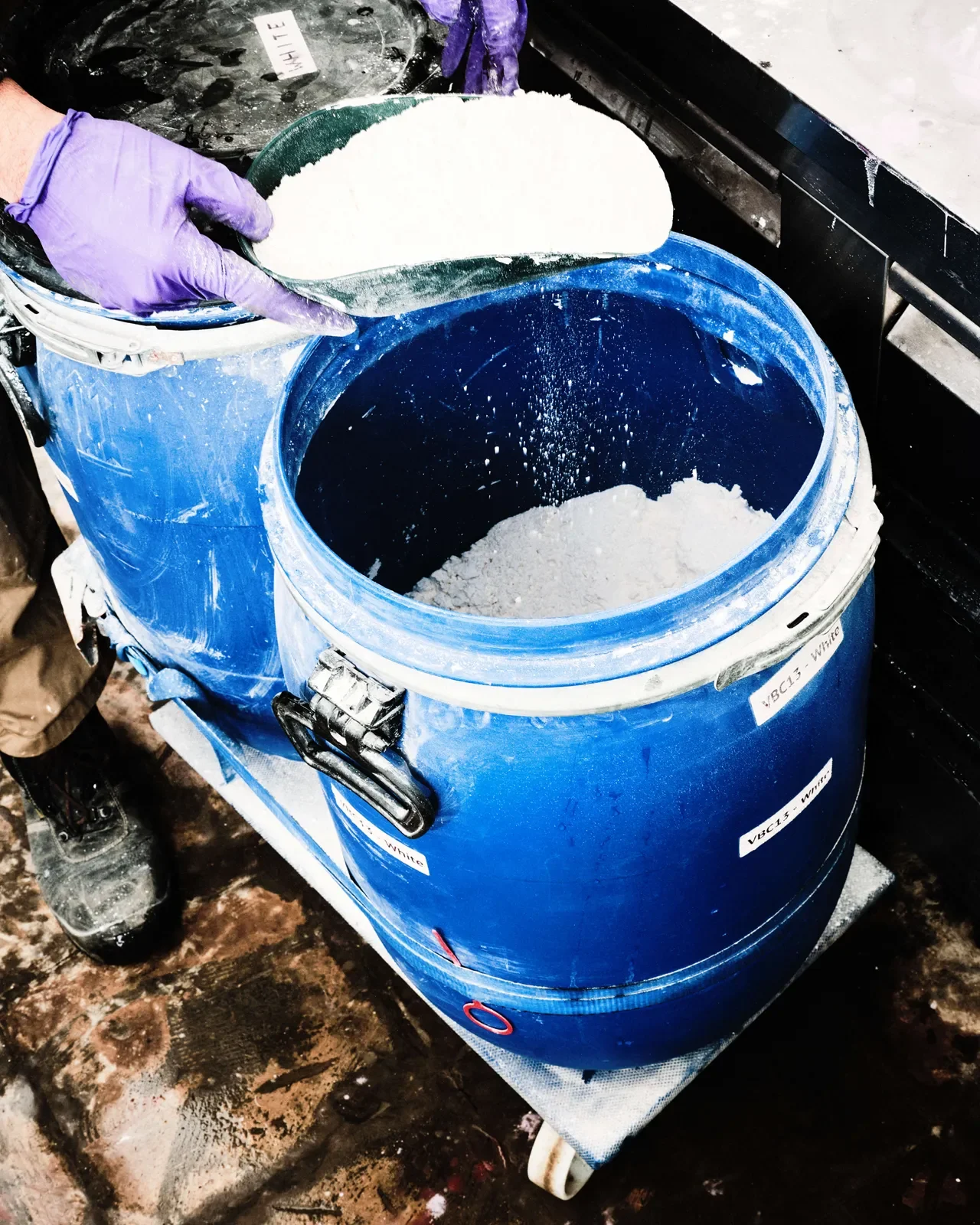
The next three-plus years became a long period of groping forward. Knowing almost nothing about mechanical engineering, the two also had to learn programming from the beginning. They used the basement of Gilles's home as a laboratory; from taking apart components and studying control systems to repeatedly adjusting the spraying method, every step they had to work out for themselves.
[ZH]
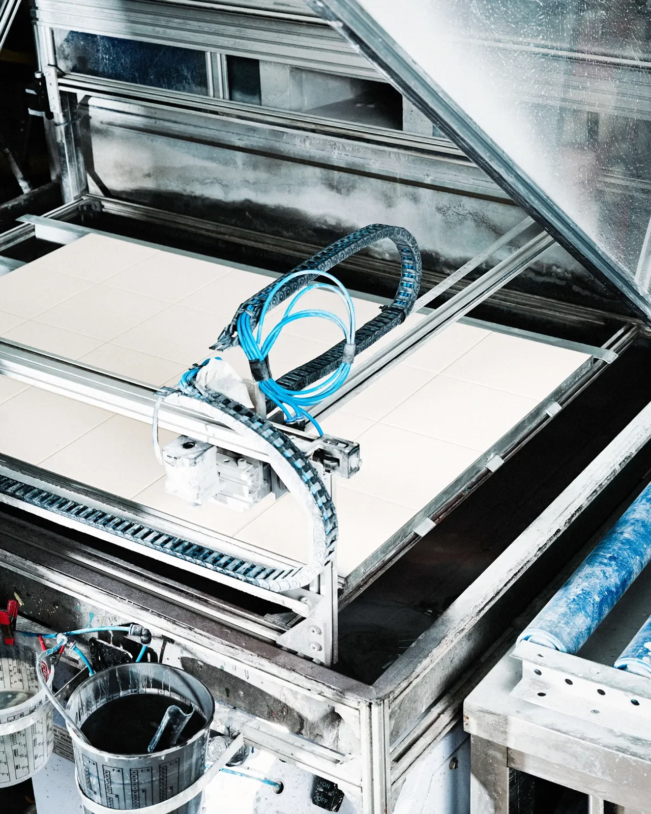
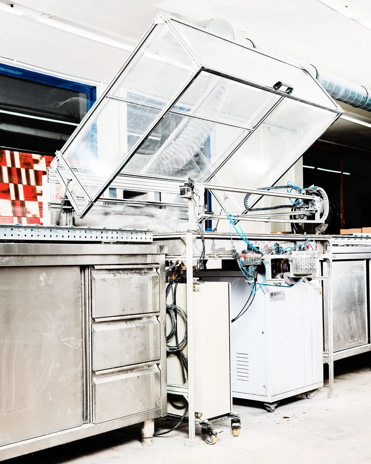
他們找來一台淘汰的雷射切割機,拆除原有的雷射模組,換上噴筆噴嘴,嘗試以氣動裝置,將液態生釉逐點噴灑在尚未燒結的陶坯上。由於沒有成熟的設備範本可供參考,常有機械故障、系統崩潰與程式錯誤接連發生,每次測試都可能帶來新的問題。
「一開始你甚至不知道要問什麼問題,更不知道該去哪裡找答案,只能沒日沒夜地在 YouTube 上看各種機械改裝與程式教學。」兩人一邊學習陌生的技術,一邊修改設備,逐步找出結合數位控制與傳統釉藥的方法。
[EN]
They found a discarded laser cutter, removed its laser module and fitted an airbrush nozzle, trying to use a pneumatic device to spray liquid raw glaze, dot by dot, onto ceramic bodies that had not yet been fired. With no mature equipment design to refer to, mechanical failures, system crashes and programming errors came one after another, and every test could bring a new problem.
“At the beginning you don't even know what questions to ask, let alone where to find the answers. You can only spend day and night watching all kinds of machine-modification and programming tutorials on YouTube.” Gilles says. Learning unfamiliar technologies while modifying their equipment, the two gradually found a way to combine digital control with traditional glazes.
© Palet
[ZH]
當低解析度遇上釉彩,發展出獨特的設計語言
經歷無數次失敗後,兩人終於讓拼裝而成的機器穩定運作。Gilles 將最初的原型比喻為蘇聯時代粗糙的 Lada 老爺車;經過二十多輪改良,如今的設備則逐漸發展成性能精密的 BMW。
有趣的是,這台機器的運作邏輯,與傳統工業追求高解析度的方向有所不同。
它的噴嘴一次噴出的線條寬達一公分,換算成數位影像解析度,一片磁磚上的圖案大約只有 6 × 6 個像素,部分情況甚至僅有十幾個像素。以現代印刷技術的標準來看,這幾乎是一台超低解析度的印表機。
「如果是受雇於傳統磁磚廠的工程師設計出這種機器,肯定隔天就被開除了。」Gilles 笑著說。
對 Gilles 與 Jaap 而言,機器的價值在於如何讓圖案、色彩與材質產生關係。釉料依照數位設定落在陶坯表面,再經高溫窯燒,形成不同於一般數位噴墨的色彩效果與質感。原本缺乏工程依據的實驗,也逐漸發展成 Palet 獨特的磁磚製作方法。
[EN]
Low Resolution Meets Glaze
After countless failures, the two finally got their improvised machine running steadily. Gilles likens the first prototype to a crude old Soviet-era Lada; after more than twenty rounds of improvement, the equipment has gradually developed into a finely tuned BMW.
Interestingly, the machine's operating logic differs from the high-resolution direction pursued by traditional industry.
Its nozzle sprays a line a full centimetre wide, which, converted into digital image resolution, means the pattern on one tile is only about 6 × 6 pixels, in some cases just a dozen or so. By the standards of modern printing, this is practically an ultra-low-resolution printer.
“If an engineer hired by a traditional tile factory had designed a machine like this, they'd have been fired the next day,” Gilles says with a laugh.
For Gilles and Jaap, the value of the machine lies in how it lets pattern, colour and material form a relationship. The glaze falls onto the surface of the ceramic body according to digital settings and is then fired at high temperature, producing colour effects and a texture that differ from ordinary digital inkjet. What began as an experiment with no engineering basis has gradually grown into Palet's distinctive method of making tile.
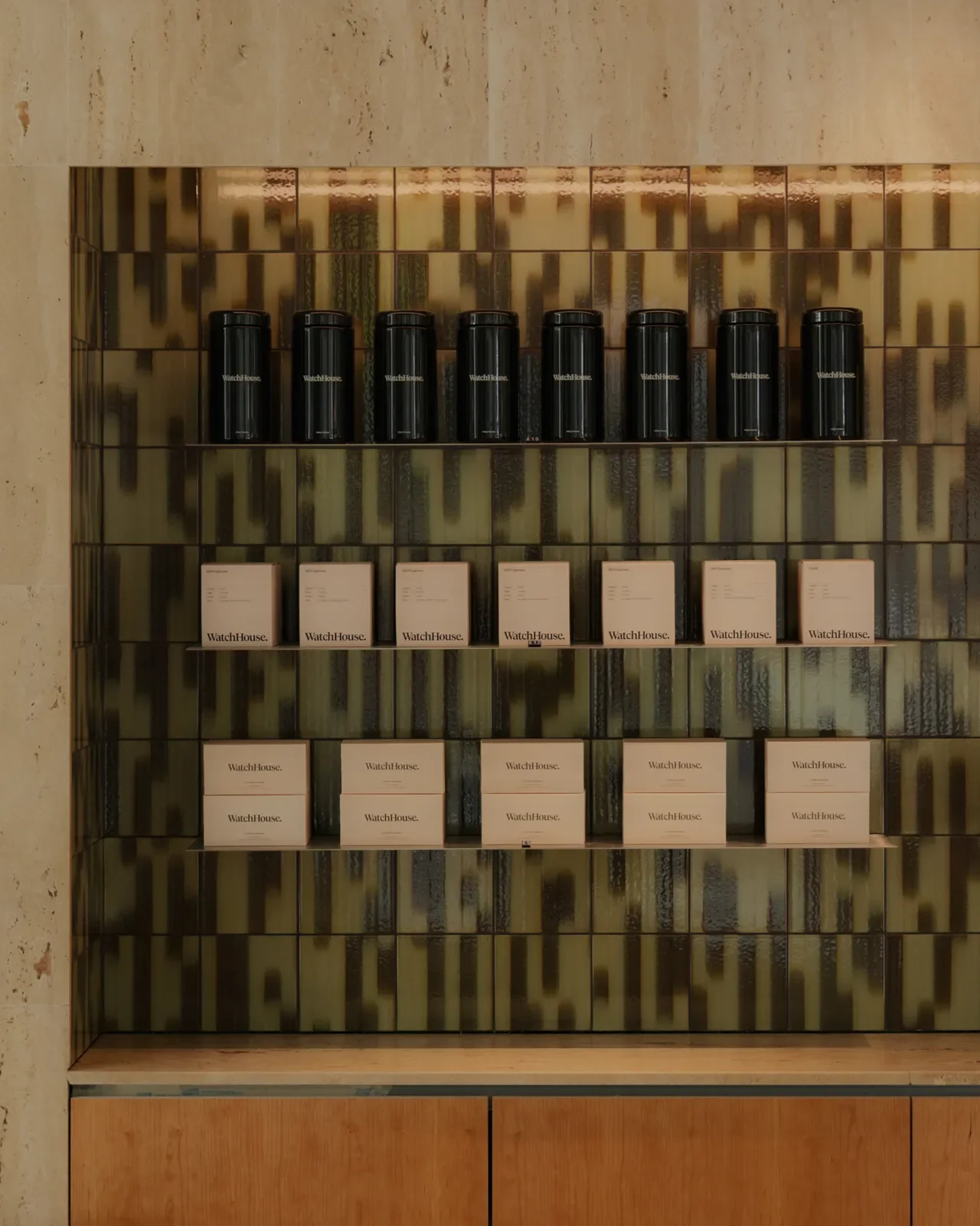
Watch House © Palet
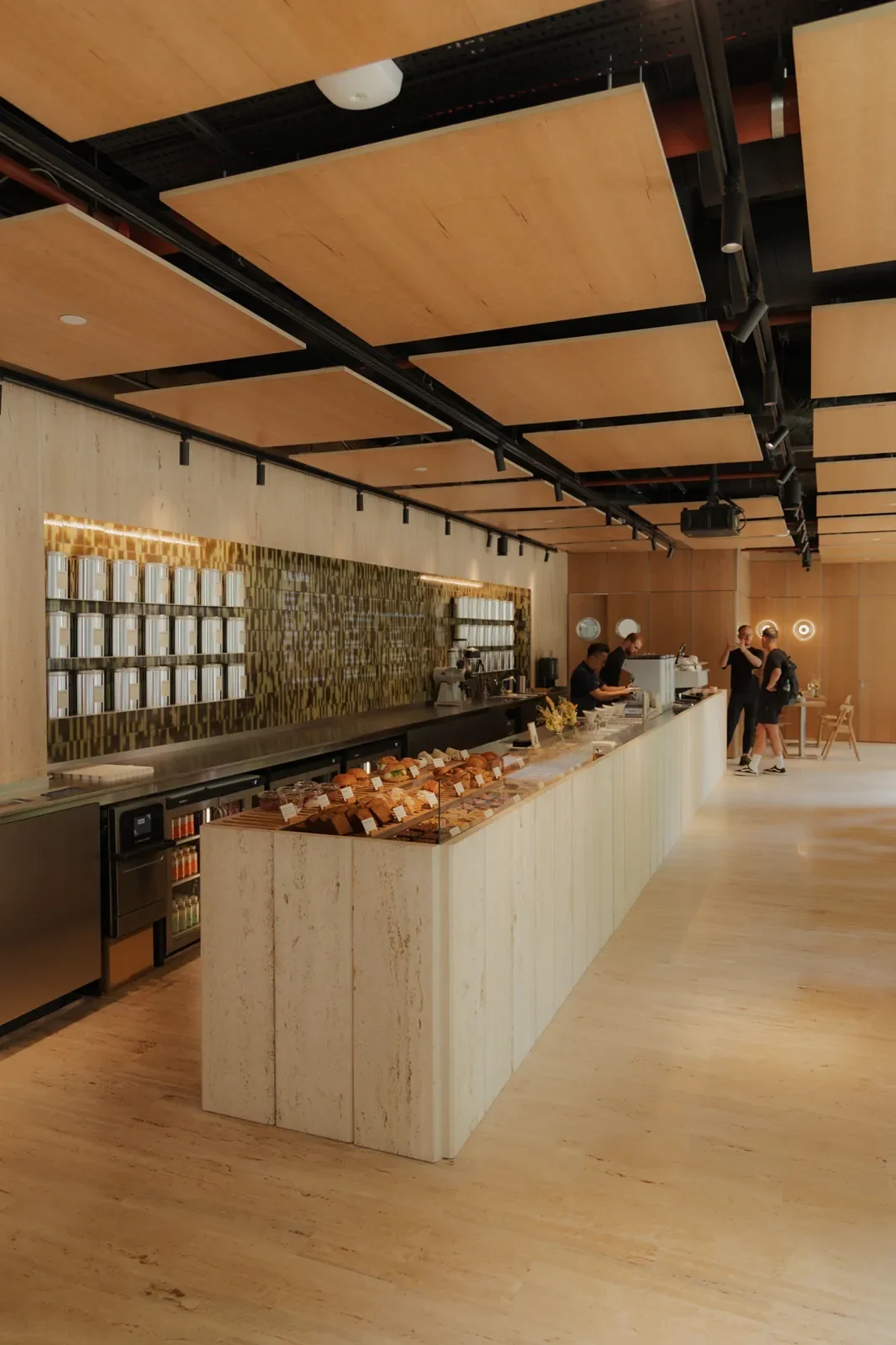
Watch House © Palet
[ZH]
從製程限制到迷幻漸層,意外發展出的品牌圖騰
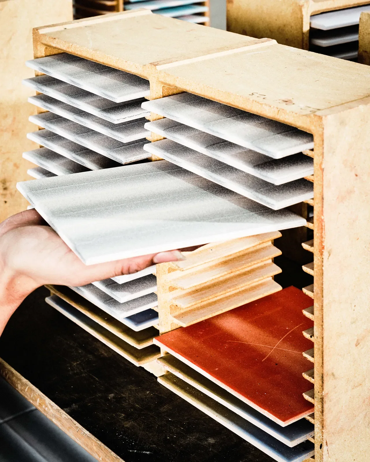
身兼機器製造者與視覺創作者,Gilles 與 Jaap 得以從製程本身尋找設計靈感。開發初期,團隊便遇上產能瓶頸:每完成一種顏色,噴頭就必須停止運作、移動至另一個區域,再重新啟動。頻繁的停頓與位移拖慢製作速度,即使耗費一整天,產量也僅有一至兩平方公尺。
為了改善效率,團隊嘗試讓噴頭在移動過程中持續運作,使兩種顏色沿著同一路徑連續噴灑,在噴塗時自然交融,形成漸層效果。
這項改變讓生產效率提升近九倍,也意外造就 Palet 最具辨識度的視覺語言:迷幻的雙色漸層。隨著噴頭移動,釉料在陶坯表面留下介於數位點陣與手工噴繪之間的紋理,色彩交界處則帶有細微的不規則變化。
對我們來說,視覺風格永遠是從媒材與工具的限制中衍生出來的。
Gilles 解釋道,「我不覺得『限制』是一種拘束,它反而幫你剔除了無謂的干擾。這台機器能做的事情非常有限,但正因為這些限制,強迫我們必須徹底改變思考圖案的方式。」
[EN]
Gradients Born of Limits
Being both machine builders and visual creators, Gilles and Jaap are able to look to the production process itself for design inspiration. In the early stage of development the team hit a bottleneck in output: every time one colour was finished, the nozzle had to stop, move to another area and start again. The frequent pauses and repositioning slowed production, and even a full day's work yielded only one to two square metres.
To improve efficiency, the team tried keeping the nozzle running while it moved, so that two colours were sprayed continuously along the same path and blended naturally as they landed, forming a gradient.
The change raised production efficiency nearly ninefold, and it also unexpectedly produced Palet's most recognisable visual language: the psychedelic two-colour gradient. As the nozzle moves, the glaze leaves a texture on the ceramic surface somewhere between a digital dot matrix and hand airbrushing, with subtle irregular variations at the colour boundaries.
For us, visual style always derives from the limits of the medium and the tools.
Gilles explains, “I don’t think ‘limits’ are a constraint; they actually help you strip out needless distraction. What this machine can do is very limited, but precisely because of those limits, we were forced to completely change how we think about pattern.”
© Palet
[ZH]
幾何圖形層層鋪展,延伸成整面牆的視覺律動
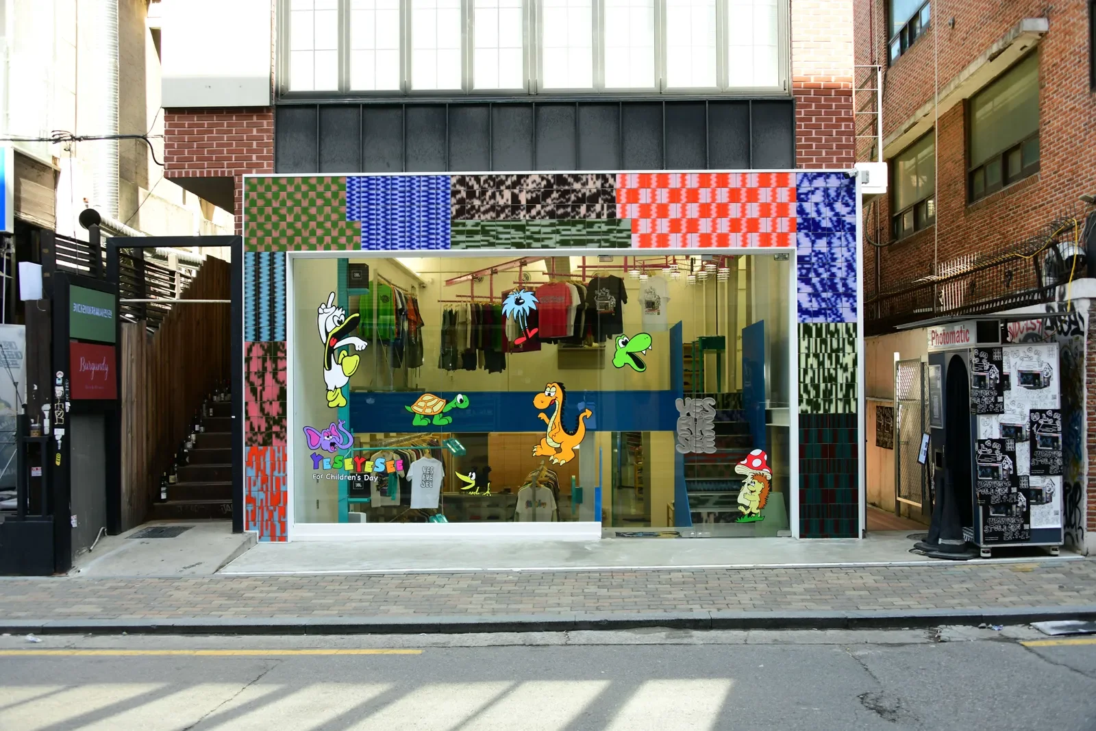
Palet 的圖案以大色塊、粗線條、條紋與格紋為主,帶有近似 Lo-fi 數位影像的顆粒質感。單片磁磚上的幾何圖形,經由重複鋪排與組合,逐漸發展成更大尺度的構圖。線條在牆面上延伸,色塊彼此交錯,讓局部圖案形成完整的視覺表現。
這種排列方式令人聯想到歐普藝術(Op Art)對視覺錯覺的探索,也呼應抽象繪畫對色彩與形狀的運用。隨著磁磚的排列方式與觀看距離改變,圖案時而呈現清晰的幾何結構,時而形成連續流動的視覺效果,讓磁磚進一步參與空間的整體構圖。
*歐普藝術(Op Art),又稱光學藝術或視幻藝術(Optical Art),透過幾何圖形、線條與色彩的規律排列及對比,創造視覺上的錯視效果,使靜止的平面呈現出流動、震動或空間變化的動態感。
[EN]
Geometry Across the Wall
Palet's patterns centre on large blocks of colour, bold lines, stripes and checks, with a grain like lo-fi digital imagery. Geometric shapes on a single tile, through repeated laying and combination, gradually develop into compositions at a larger scale. Lines extend across the wall and blocks of colour interlock, letting local patterns form a complete visual statement.
This way of arranging recalls Op Art's exploration of optical illusion, and also echoes abstract painting's use of colour and shape. As the tile layout and viewing distance change, the pattern at times shows a clear geometric structure and at times forms a continuously flowing visual effect, letting tile take further part in the overall composition of the space.
*Op Art, also known as optical art, creates optical illusions through the regular arrangement and contrast of geometric shapes, lines and colours, making a still surface appear to flow, vibrate or shift in space.
YESEYESEE Seoul © Palet
[ZH]
從磁磚設計到創作,Palet 將配色主導權交給使用者
當自製設備終於能在工作室穩定運作,Palet 開始思考如何讓更多人參與磁磚設計。
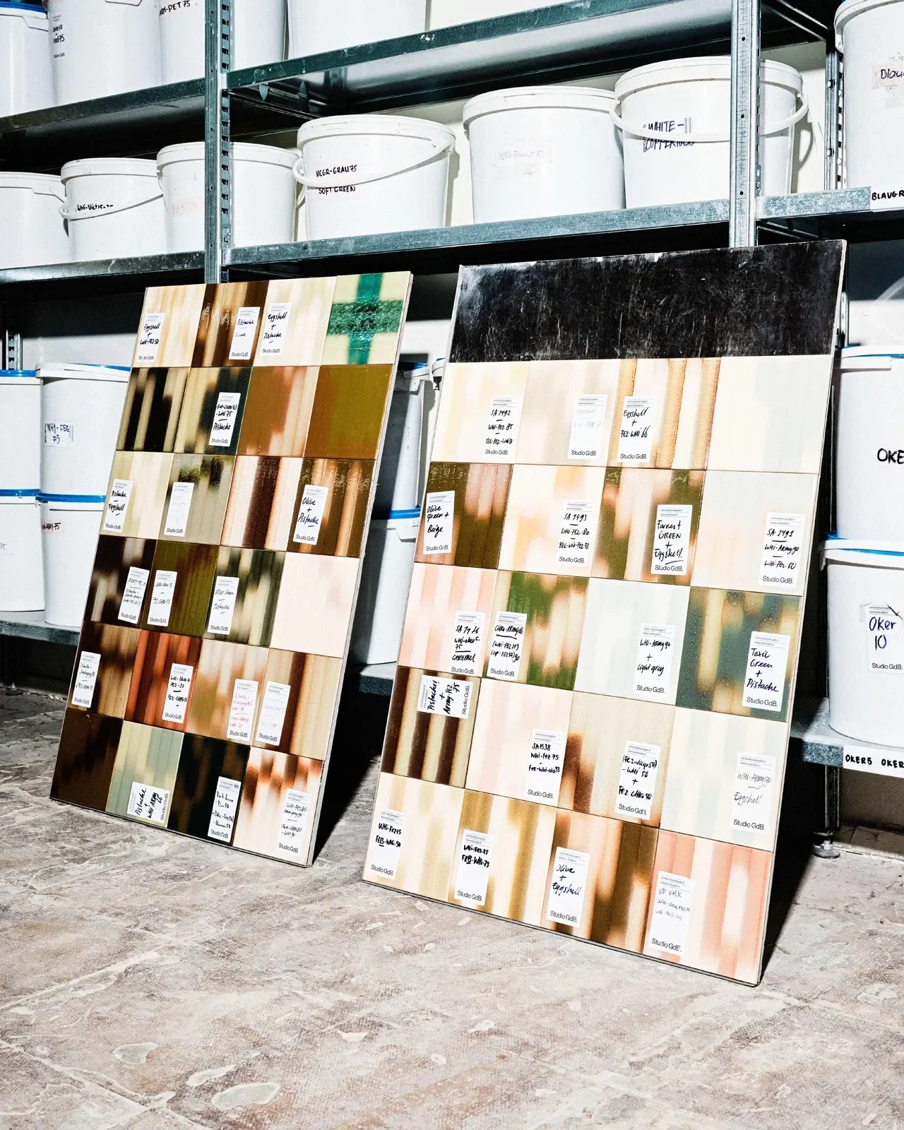
在品牌官方網站上,使用者可以透過線上配色工具,從數十種釉色中挑選兩種,再搭配格紋、條紋或大理石紋樣,即時預覽不同組合在磁磚表面的效果。色彩與圖案的選擇因此有了更多彈性,每個人都能依照自己的想法探索不同的設計組合。
這份彈性也延伸至生產端。Palet 將客製化磁磚的最低訂購量降至一平方公尺。傳統建材若涉及特殊色彩或紋理,往往需要數百平方公尺的訂單才能投入生產;Palet 自行開發的設備具備靈活換色與換料的能力,讓小批量製作也能實際執行。
「我們在不知不覺中,從磁磚設計師,變成了為設計師打造設計工具的人,」Gilles 說。
[EN]
Colour in the User's Hands
Once the homemade equipment could finally run steadily in the studio, Palet began thinking about how to let more people take part in tile design.
On the brand's website, users can use an online colour tool to choose two colours from dozens of glaze shades, then combine them with a check, stripe or marble pattern and preview in real time how each combination looks on the tile surface. This gives more flexibility to the choice of colour and pattern, letting everyone explore different design combinations in their own way.
This flexibility extends to production. Palet has lowered the minimum order for custom tiles to one square metre. With traditional building materials, special colours or textures often require orders of hundreds of square metres before production begins; Palet's self-developed equipment can switch colours and materials flexibly, making small-batch production practical.
“Without realising it, we went from being tile designers to people who build design tools for designers,” Gilles says.
TTRS Seoul © Palet
[ZH]
當設計師拿起調色盤,意想不到的組合就此發生
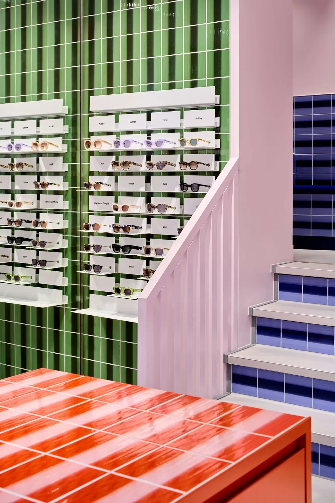
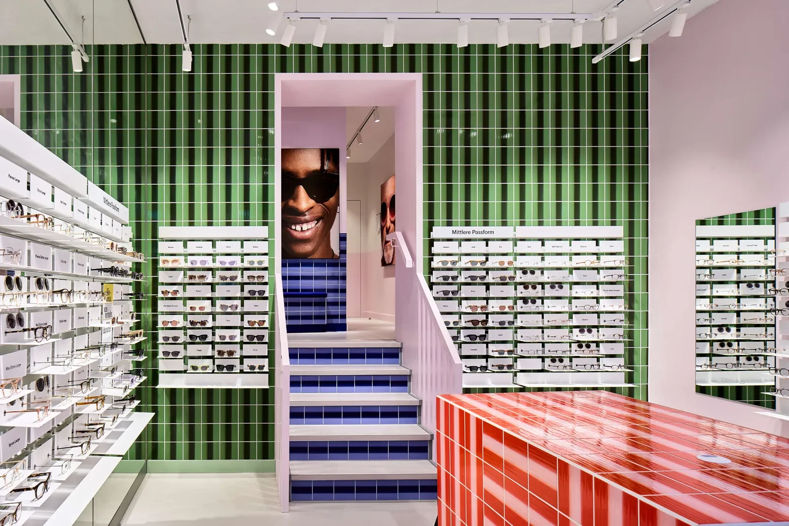
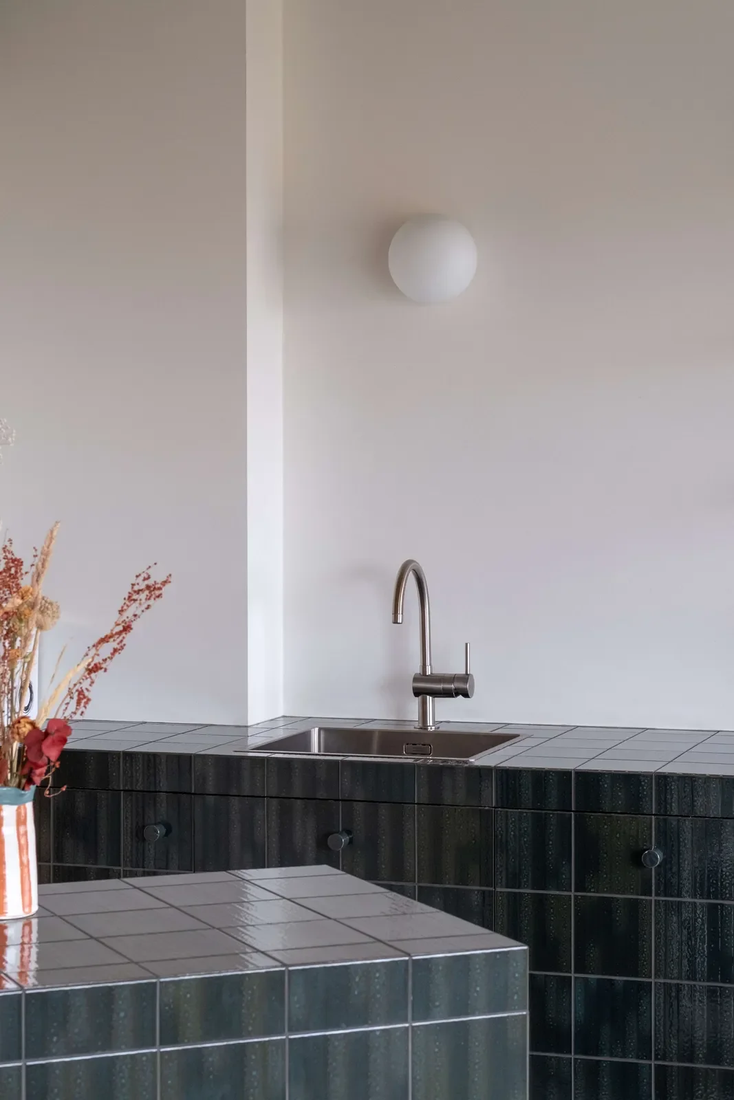
這套開放的設計方式,逐漸吸引不同領域的品牌與設計團隊參與。從眼鏡品牌 Ace & Tate 位於布魯塞爾與柏林的旗艦店、首爾潮牌 Yeseyesee 的概念店,到英國獨立廚飾品牌 HØLTE 的聯名廚房,Palet 的作品隨著不同品牌的設計語言,呈現出各自的面貌。
對 Gilles 而言,合作過程中最令人期待的時刻,出現在窯燒前後。
[EN]
When Designers Take the Palette
This open approach to design has gradually drawn in brands and design teams from different fields. From the Brussels and Berlin flagship stores of eyewear brand Ace & Tate and the concept store of Seoul streetwear label Yeseyesee, to a kitchen created in collaboration with UK independent kitchen brand HØLTE, Palet's work takes on a different look with the design language of each brand.
For Gilles, the most anticipated moment in collaboration comes around the kiln firing.
Ace & Tate Berlin © Palet
Ace & Tate Berlin © Palet
[ZH]
「很多時候,設計師挑選的色彩搭配完全超出我們的預期,」他分享道。「有時候,磁磚進窯之前,我們看著產線上的作品,心裡會想:這樣搭起來真的會好看嗎?但當窯門打開,磁磚冷卻之後,那些出乎意料的色彩碰撞,往往讓所有人驚豔,連我們自己都不得不佩服對方的眼光。」
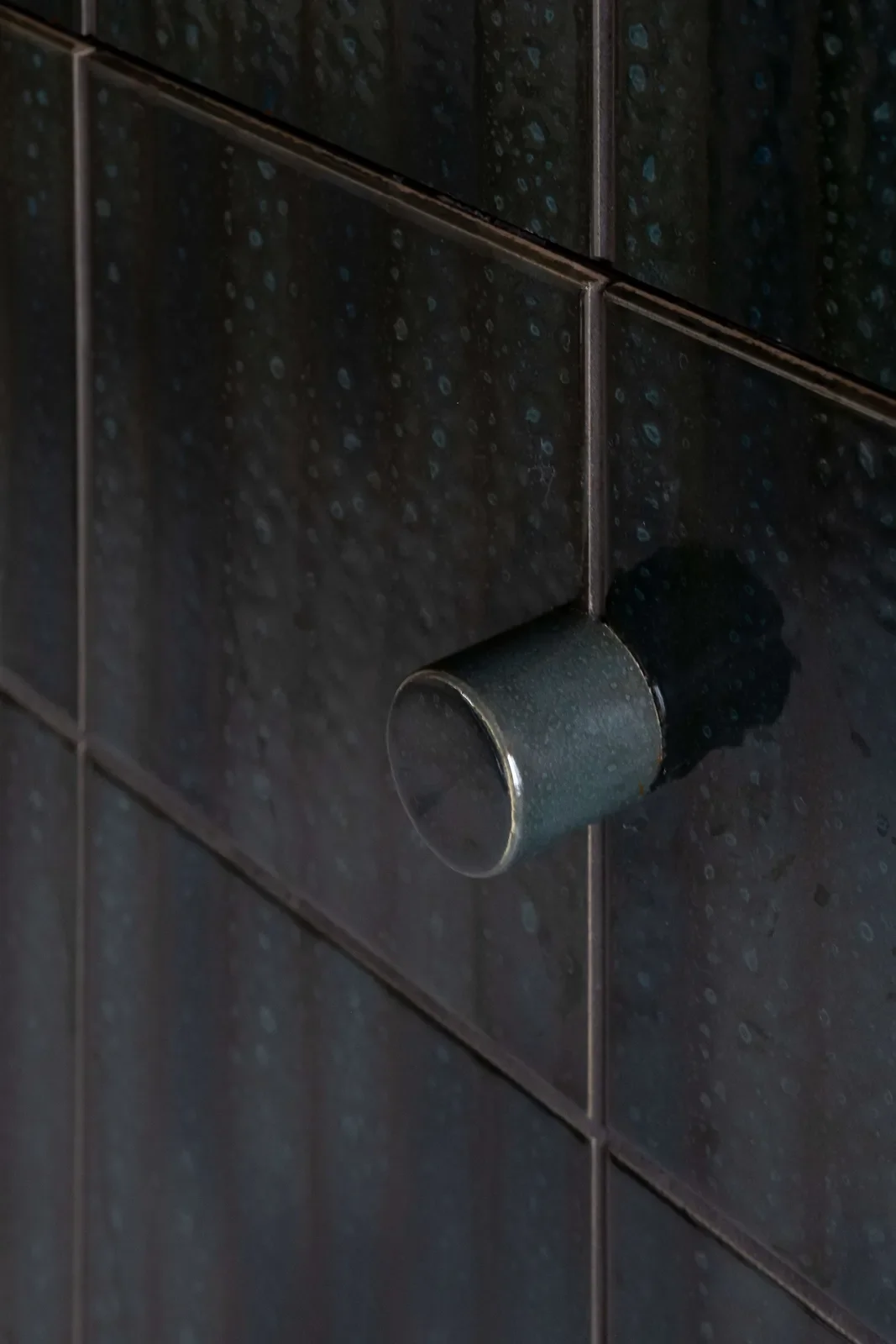
釉色經過燒製,冷卻後才呈現最終的色澤與質感。設計師提出配色構想,Palet 將其轉化為實體,過程中的變化有時也會帶來超出預期的結果。同一套材料經過不同的選擇與排列,便能在店鋪、廚房及其他場域中發展出不同的個性。
[EN]
“Many times, the colour combinations designers choose are completely beyond our expectations,” he says. “Sometimes, before the tiles go into the kiln, we look at the pieces on the production line and think: will this combination really look good? But when the kiln door opens and the tiles have cooled, those unexpected collisions of colour often amaze everyone. Even we can't help admiring their eye.”
After firing, the glaze colour shows its final hue and texture only once cooled. A designer proposes a colour idea, Palet turns it into a physical object, and the changes along the way sometimes bring results beyond expectation. The same set of materials, through different choices and arrangements, can develop different personalities in stores, kitchens and other settings.
[ZH]
在工業量產與手工工藝之間,尋找可持續的生產方式
談起品牌未來,Gilles 的想法相當明確。
建材市場的生產模式基本上分處兩端:一端是以規模與成本為優先的大型工廠,另一端則是產量有限、價格相對高昂的工藝作坊。Palet 希望透過小規模自動化產線,在生產效率與手工陶藝的質感之間找到自己的位置。
我們不想變成那種每天生產幾萬平方公尺、只追求產能數字的工廠;但我們也不想做一件動輒數千歐元、只有極少數人買得起的藝廊作品。
Gilles 說,「我們希望 Palet 介於這兩者之間,透過小規模的自動化產線,保留手工陶藝的隨機性與溫度,同時以合理、可負擔的價格,實現小批量的彈性生產。」
[EN]
Between Factory and Workshop
When it comes to the brand's future, Gilles's thinking is quite clear.
Production in the building-materials market basically sits at two ends: at one end, large factories that put scale and cost first; at the other, craft workshops with limited output and relatively high prices. Through a small-scale automated production line, Palet hopes to find its own place between production efficiency and the texture of handmade ceramics.
We don't want to become the kind of factory that produces tens of thousands of square metres a day and only chases output figures; but we don't want to make something that costs several thousand euros and that only a very few can afford, like a gallery piece, either.
Gilles says, “We want Palet to sit between the two, using a small-scale automated line to keep the randomness and warmth of handmade ceramics, while making small batches flexibly at reasonable, affordable prices.”
© Palet
[ZH]
他們的生產思維,也延伸至品牌對永續的思維。Palet 在永續聲明的開頭寫道:「世上沒有任何一個品牌是完全環保的。每一塊我們燒製的磚、每一個寄出的包裹,都在消耗地球的自然資源。(Unfortunately there is no such thing as a sustainable brand. Every tile we produce and every package we ship is connected to natural resources.)」
品牌採取全流程訂製生產(Made-to-Order),依據訂單安排製作,以減少預先生產造成的庫存與報廢;生產線則保留約 10% 的耗損緩衝,以因應製程中難以避免的材料損失。
至於磁磚表面的細微弧度,以及不同批次釉藥之間難以完全一致的色差,Palet 會依照可接受的範圍判定品質,保留陶瓷製作過程中自然形成的差異。對品牌而言,永續落實於每一次生產決策,從訂單數量、材料耗損到成品規格,逐步調整製作方式,讓資源使用更貼近實際需求。
[EN]
Their approach to production extends to the brand's thinking on sustainability. Palet opens its sustainability statement with: “Unfortunately there is no such thing as a sustainable brand. Every tile we produce and every package we ship is connected to natural resources.”
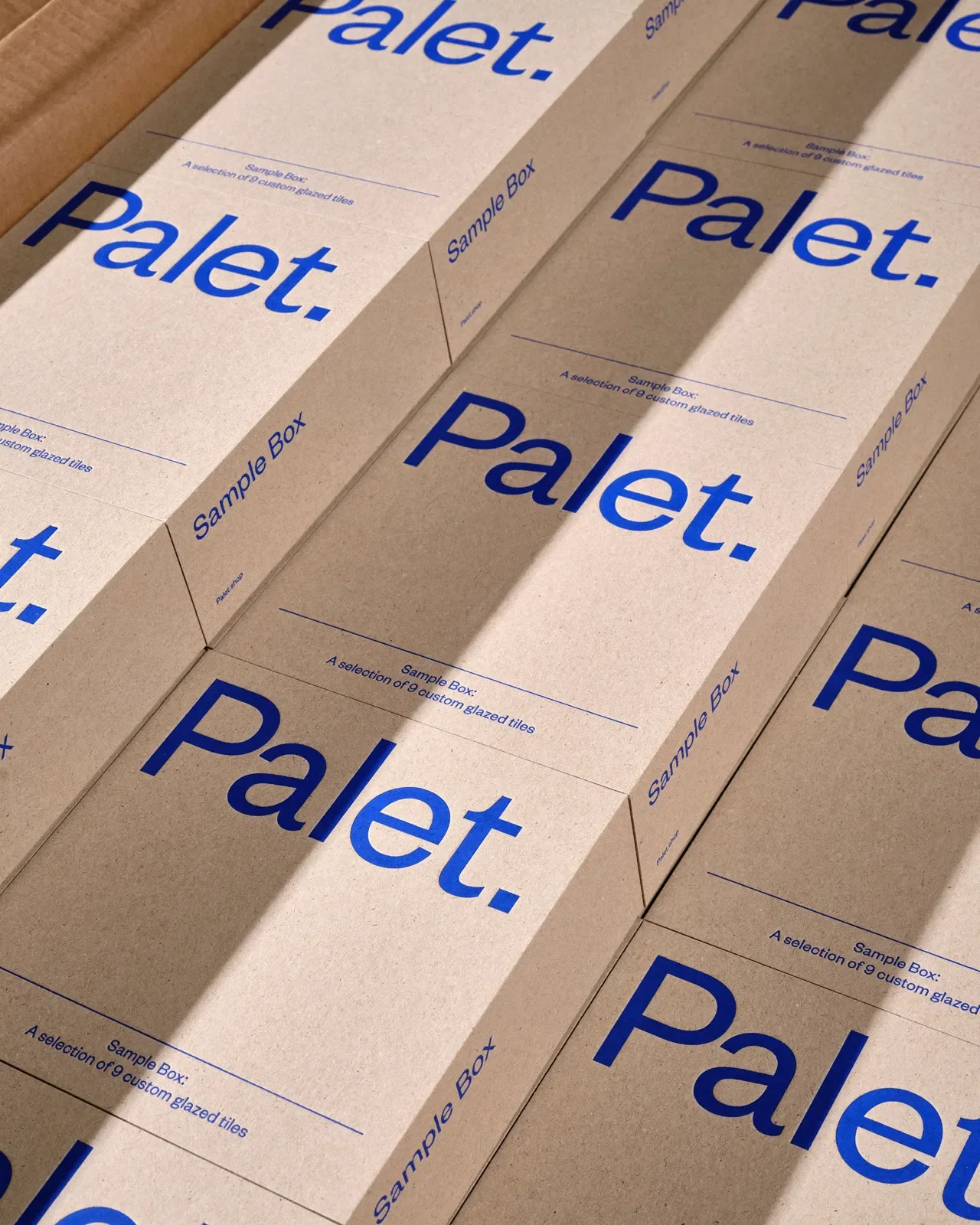
The brand produces entirely made to order, scheduling manufacture according to orders to reduce the inventory and waste that come with producing in advance; the production line keeps a buffer of about 10% for loss, to allow for the material losses that are unavoidable in the process.
As for the slight curvature of the tile surface, and the colour differences that can never be fully consistent between glaze batches, Palet judges quality by an acceptable range, preserving the differences that arise naturally in ceramic making. For the brand, sustainability is carried out in every production decision, from order quantity and material loss to the finished specification, adjusting the way things are made step by step so that resource use sits closer to actual need.
© Palet
[ZH]
從前衛設計走向新的傳統:讓時間證明風格
回望 Palet 的發展,起點是 2017 年在地下室裡反覆摸索的一顆氣動噴嘴。如今,自行研發的設備已成為品牌持續創作的基礎,作品也走進歐美與亞洲的商業空間及住宅。
談起幾何鮮明、色彩強烈的風格是否會隨著社群潮流退燒,Gilles 以 ALPI 幾何木皮為例,「ALPI 的幾何木皮剛推出時,也是一種非常前衛、強烈的設計,但三十年來,依然不斷被頂尖設計師採用,」Gilles 說道。「這類鮮明的視覺風格向來評價兩極,喜歡的人極度熱愛,不喜歡的人則避之唯恐不及。」
[EN]
From Avant-Garde to New Tradition
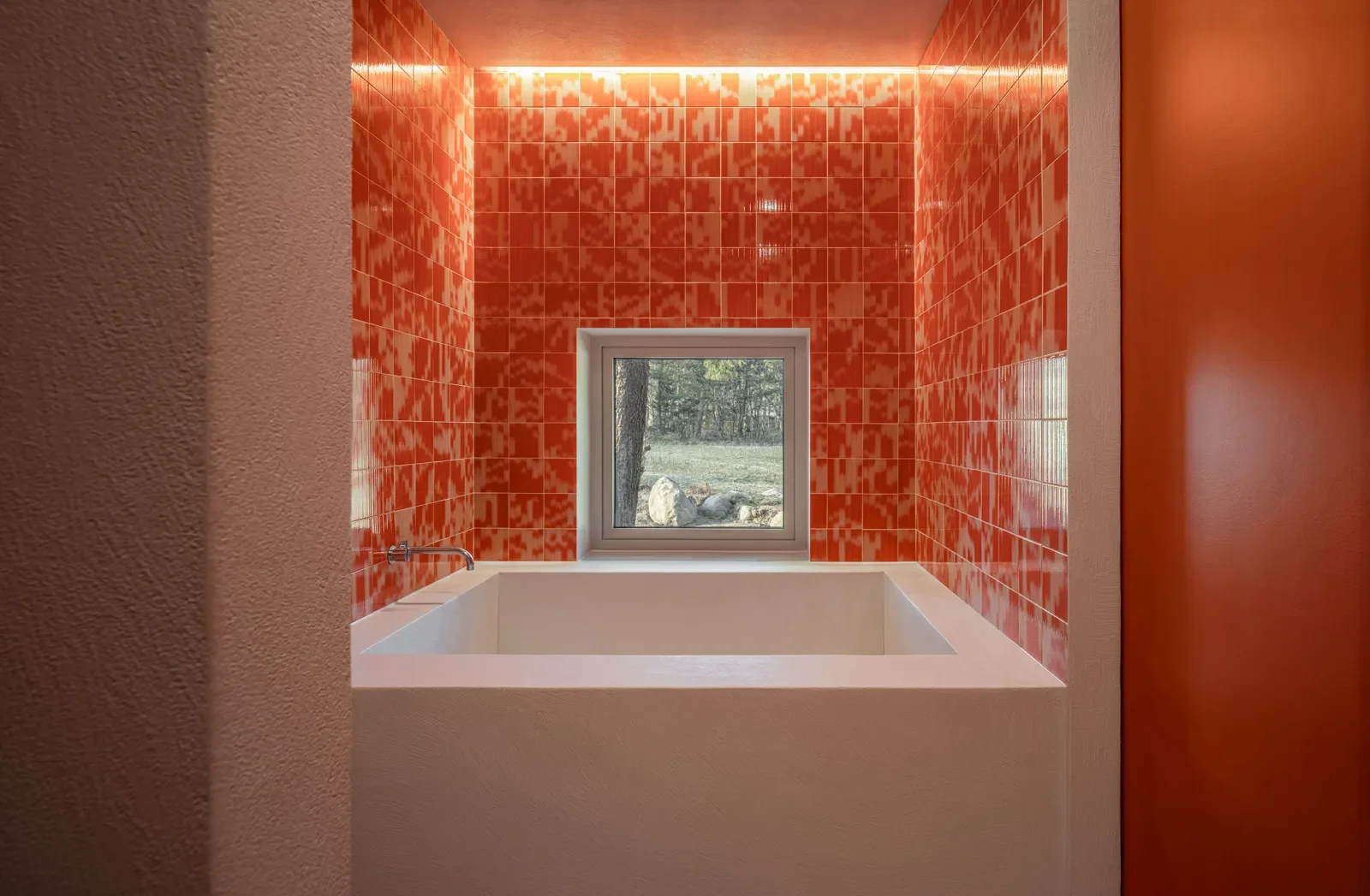
Looking back at Palet's development, the starting point was a pneumatic nozzle tested over and over in a basement in 2017. Today, the self-developed equipment has become the foundation of the brand's continuing creation, and its work has found its way into commercial spaces and homes across the West and Asia.
On whether a style with such sharp geometry and strong colour might fade along with social-media trends, Gilles points to ALPI's geometric wood veneers. “When ALPI's geometric veneers first launched, it was also a very avant-garde, bold design, but for thirty years top designers have kept using it,” Gilles says. “Visual styles this distinctive have always divided opinion: people who like them love them intensely, and people who don't avoid them like the plague.”
The Orange House Sokcho © Palet
[ZH]
在他心裡,設計的價值需要時間驗證。當一種風格歷經不同世代的設計師之手,持續出現在各種空間裡,便有機會逐漸超越當下的流行,成為經得起時間考驗的經典。
Gilles 也期待,這套設備與製作方法能夠長久運作。數十年之後,今日仍帶有實驗色彩的機械與工藝,或許已成為一種成熟的製作方式,甚至發展成新的傳統。
[EN]
In his mind, the value of design needs time to prove itself. When a style passes through the hands of designers of different generations and keeps appearing in all kinds of spaces, it has a chance to gradually go beyond the fashion of the moment and become a classic that stands the test of time.
Gilles also hopes this equipment and method of making will keep running for a long time. Decades from now, the machinery and craft that still feel experimental today may have become an established way of making, even a new tradition.
© Palet