「鬆開邊界,餘裕旋即浮現」WONDER+ STUDIO 重導光線與氣流,打造具呼吸感的明亮排屋
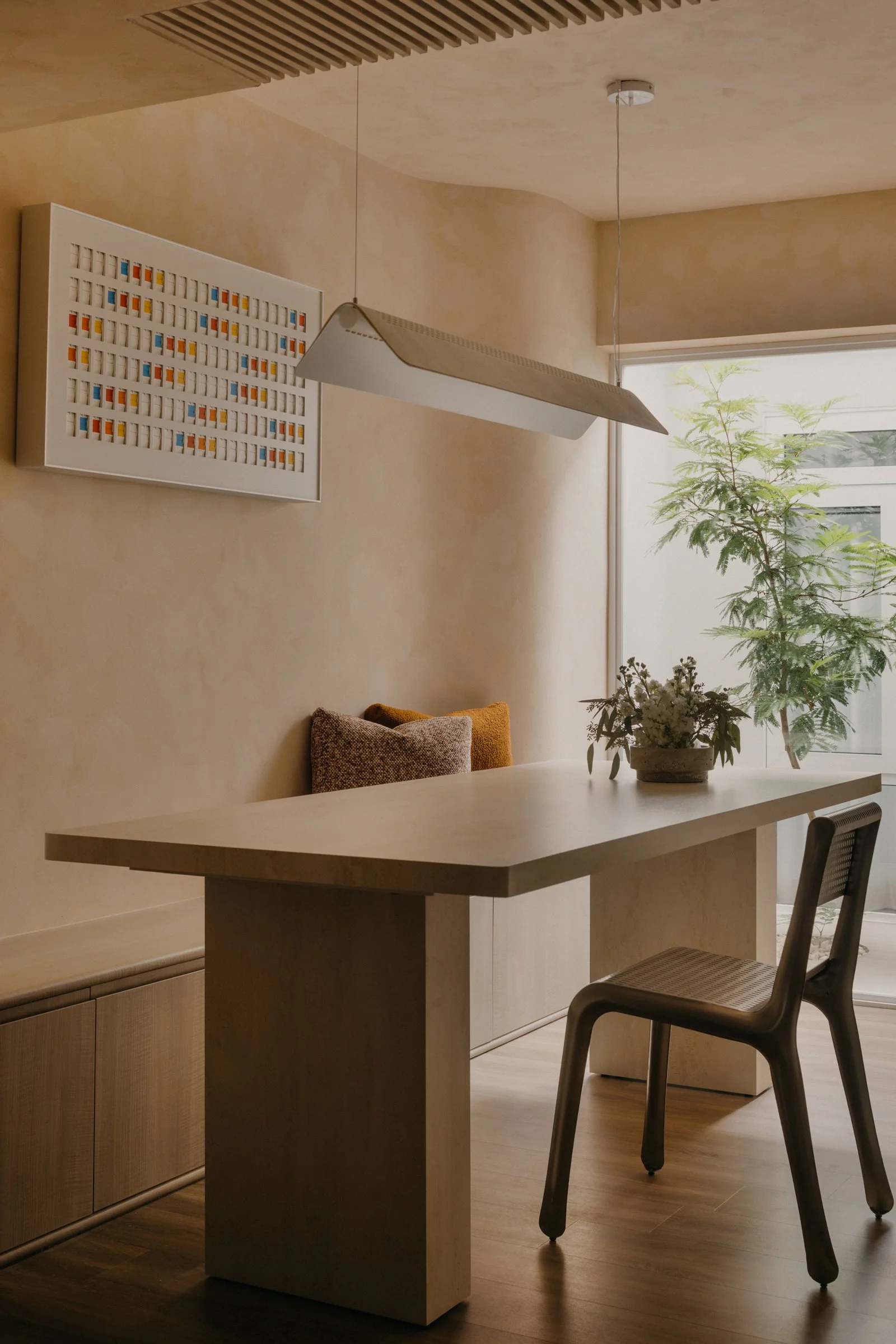
Photo by Studio Periphery
-
A design that moves the heart is never determined by scale, but by how thoughtfully designers respond to spatial constraints, addressing needs and aspirations through forms that embrace everyday life. In Singapore's Jalan Gembira, a neighbourhood between the central and eastern districts, interior design practice WONDER+ STUDIO was commissioned to reimagine a 1600 sqft two storey terraced house, seeking to realise precisely this philosophy within modest proportions.
Jalan Gembira sits within the Macpherson precinct, a discreet and liveable enclave where old and new coexist in quiet contentment. There's an immediate sense of familiar warmth when you step into the area. WONDER+ STUDIO founder Ean Chu wanted to bring this quality indoors, letting the home's character sync naturally with the neighbourhood's rhythm. "The context here inspired us to capture that understated, local sensibility while revealing something quiet and refined through the spatial details," he says.
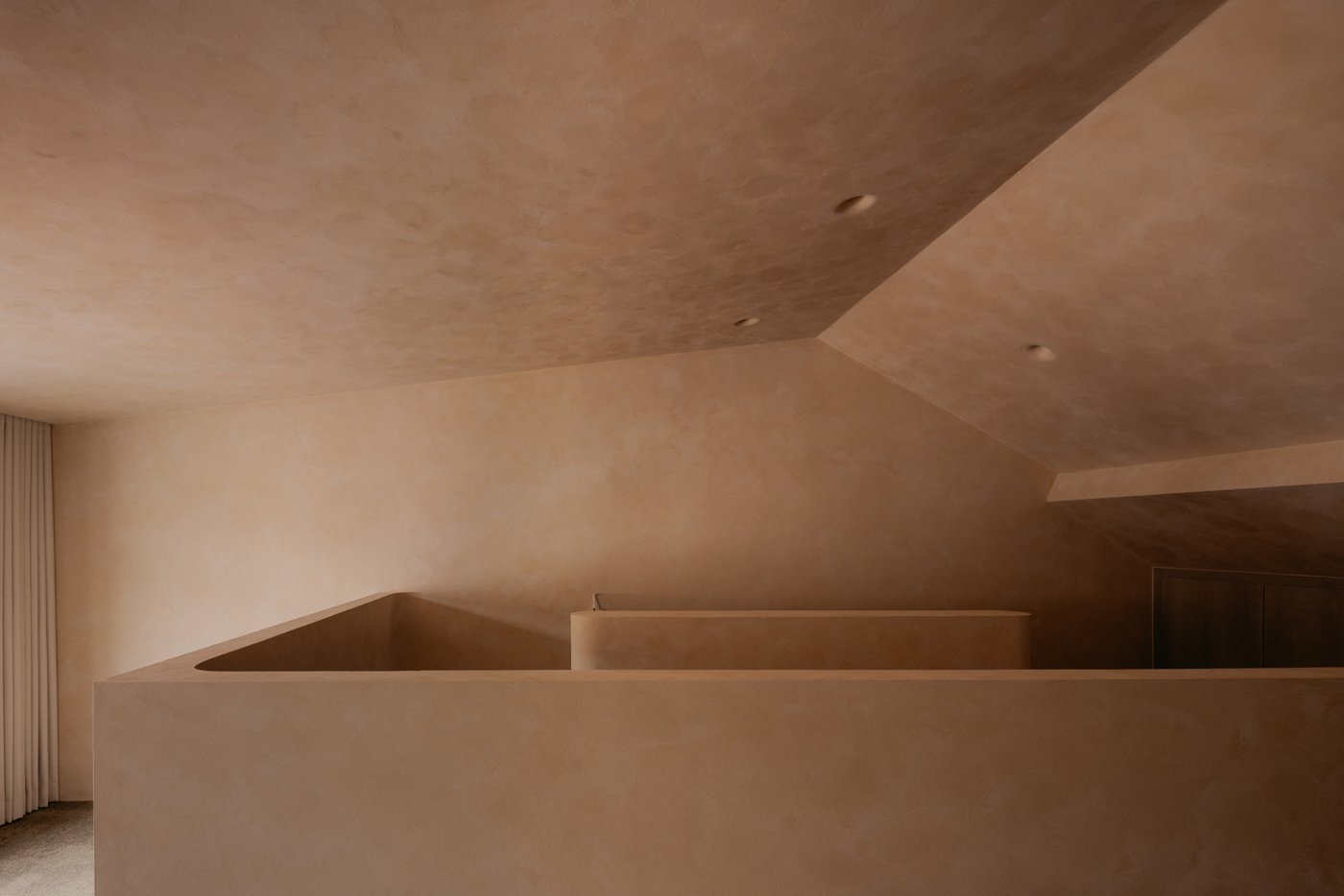
Photo by Studio Periphery
-
The intention behind the home was never to create a striking statement. It began with something far simpler and more genuine: the owners’ wish for a calm and comfortable place filled with sunlight and openness. When a space quietly supports its residents and offers a sense of ease and stability, it builds a quiet confidence. There is nothing ostentatious, yet anyone who enters immediately senses that everything is thoughtfully in place.
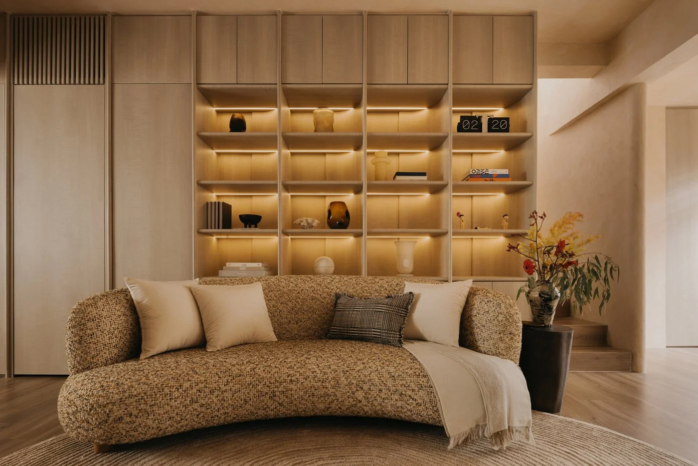
Photo by Studio Periphery
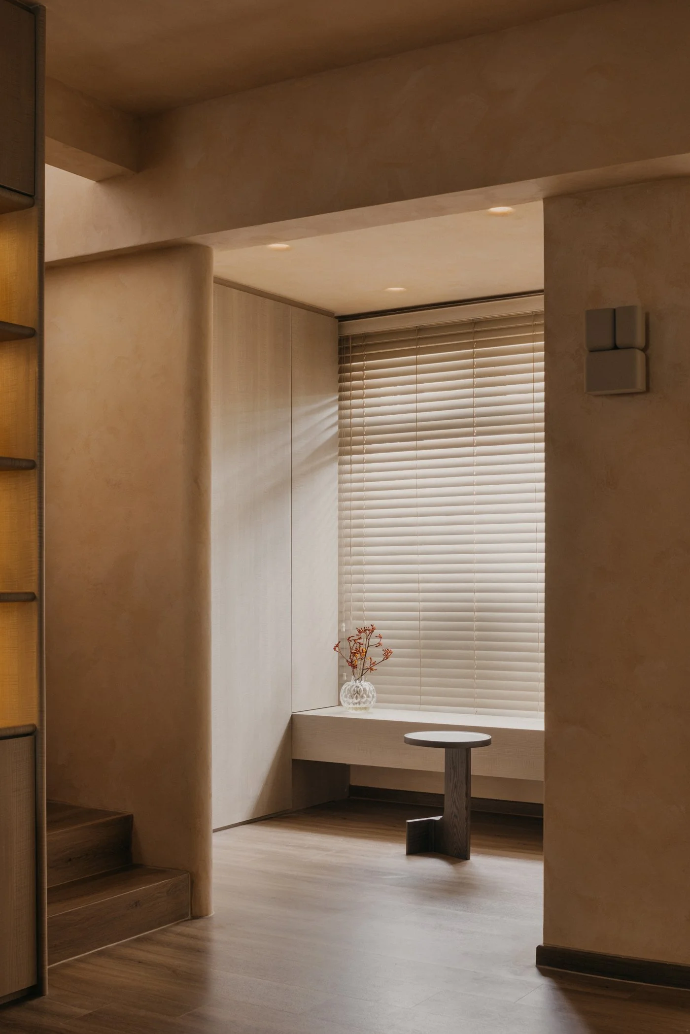
Photo by Studio Periphery
-
With this intention in mind, WONDER+ STUDIO began by “untying” the space. The original layout felt tight and compressed, so they introduced more fluid forms, softened edges, and interior arrangements that would not obstruct natural light. These strategies gradually reduced visual barriers and eased the sense of constraint.
Ean explains that clarity and flow were the core priorities during planning. In this long and narrow terrace house, the team focused on bringing in as much light and openness as the site would allow. Each zone had to serve multiple uses while respecting the limitations of front and rear daylight. The layout was reorganized into a continuous, permeable sequence, allowing both movement and sight lines to extend further. As a result, residents experience a sense of openness, along with the warmth and character that make the home feel lived in and welcoming.
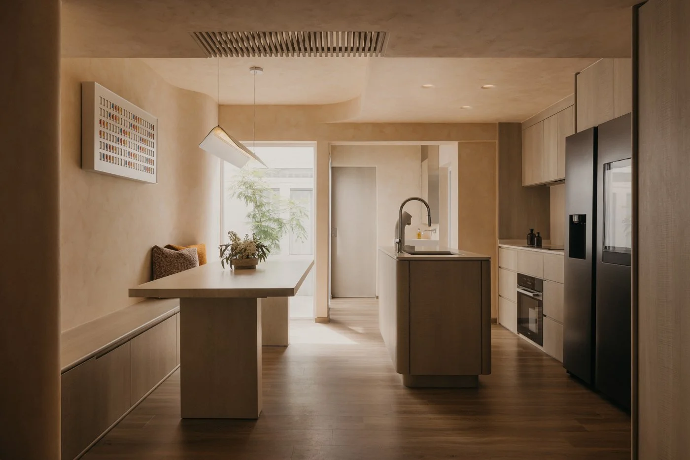
Photo by Studio Periphery
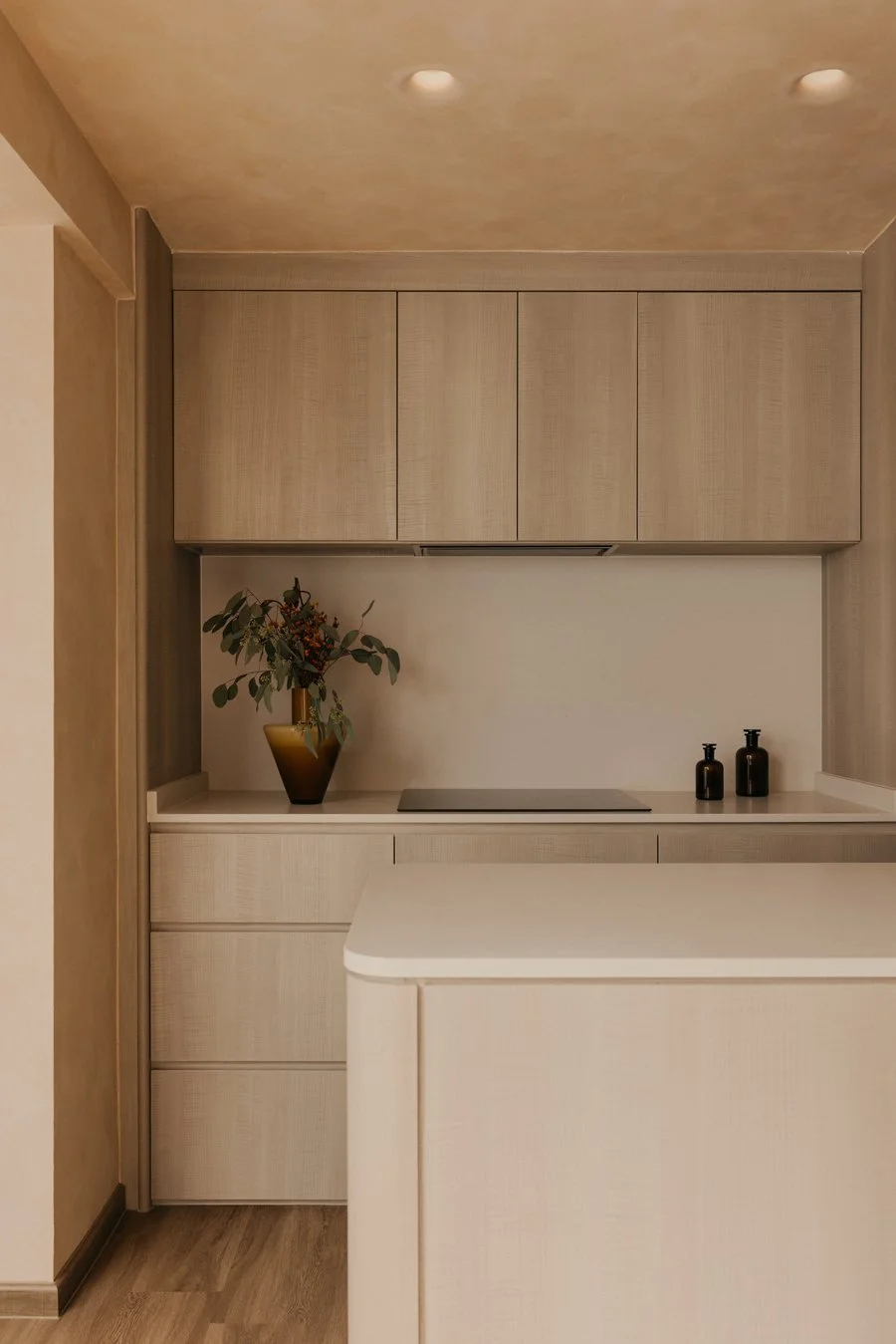
Photo by Studio Periphery
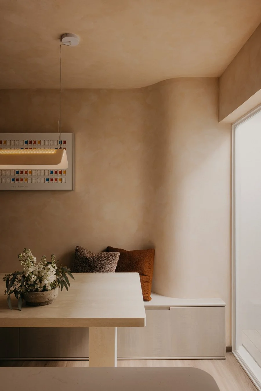
Photo by Studio Periphery
-
Continuing the grounded atmosphere of the exterior, the team selected materials that are simple, understated, and pleasant to the touch. Limewash was applied across the walls and ceiling, giving the surfaces a natural texture with subtle variations in tone. Throughout the day, light moves gently across its matte finish, revealing shifts in depth and shadow that trace the passing of time. These quiet transitions add a handmade warmth and a sense of depth to the interior. The longer one stays in the space, the more its understated character becomes apparent.
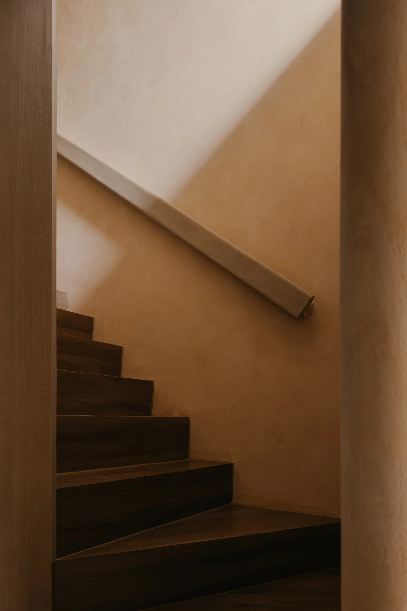
Photo by Studio Periphery
-
For Ean, a well-considered space does not need to announce itself or rely on attention-grabbing features. What matters is whether light, form, and emotion can settle into a coherent whole. This belief is carried through the details.
Most interior walls and volumes are shaped with gentle curves. Sharp intersections are softened, turning edges into continuous lines that reduce the sense of separation. As the body follows these rounded transitions and the eye moves between what is above and below, subtle moments appear: the corner beneath the stairs, the meeting point of wall and ceiling, the edge of a built-in cabinet. These quiet gestures encourage the shoulders to drop and the mind to ease, inviting people to feel how the home opens itself with a calm, welcoming warmth.
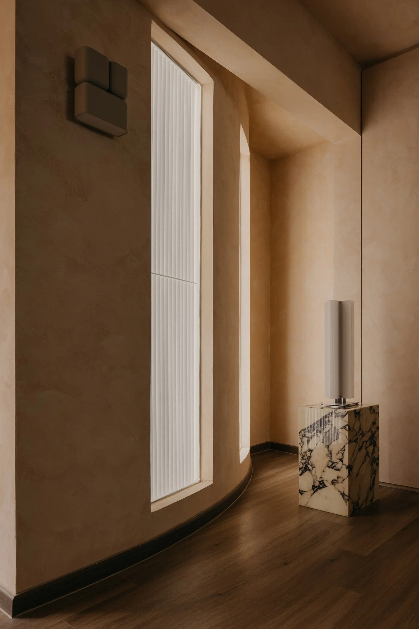
Photo by Studio Periphery
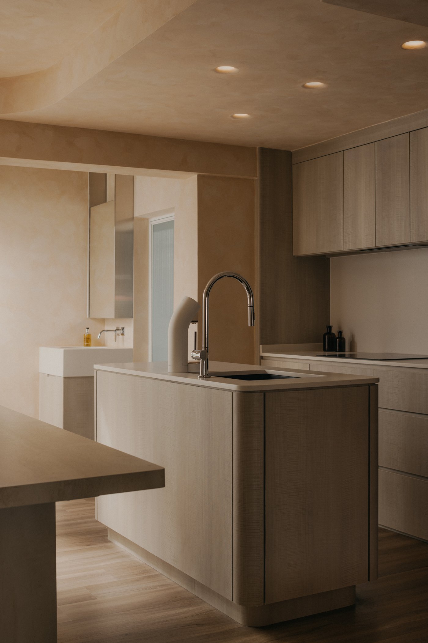
Photo by Studio Periphery
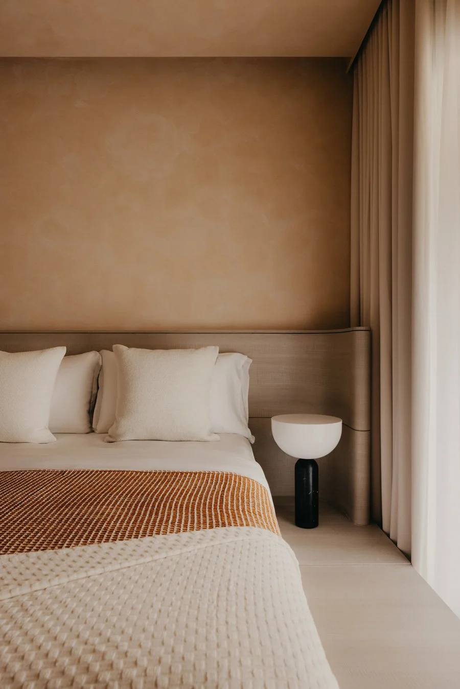
Photo by Studio Periphery
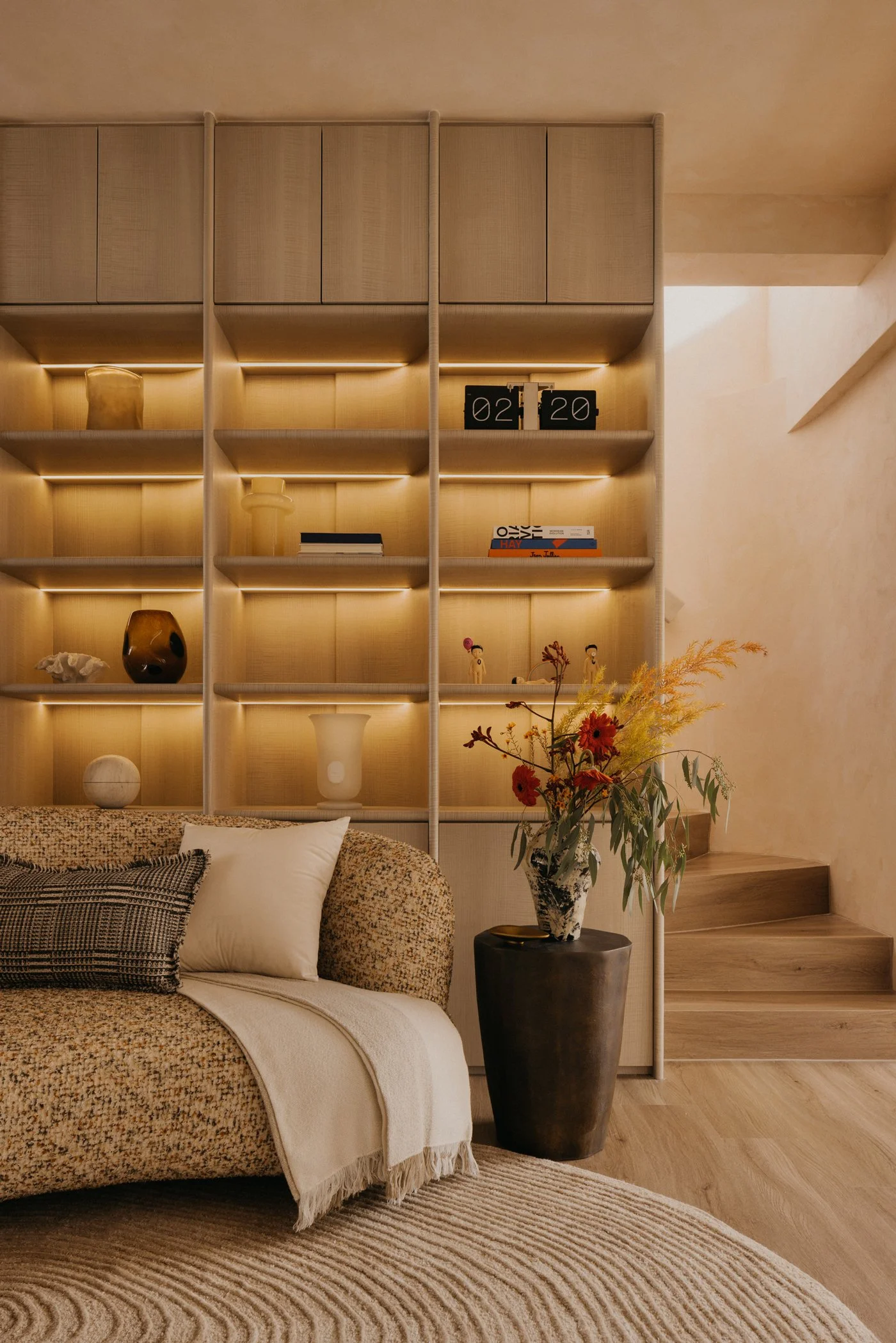
Photo by Studio Periphery
-
“We wanted the beauty of this home to live in the quiet, deliberate details. Rather than chasing formal perfection, what matters more is whether people can truly relax here and feel the grounding comfort of being home,” Ean says. The result is a place that feels effortless, light, and intimate. The interior seems tuned to the right volume, neither loud nor cold. People move, sit, rest, daydream, and breathe with ease, guided simply by instinct.
This brings up a question: How much space do we really need to live well? The answer may not lie in size or grand gestures, but in how closely a home aligns with the way its residents live. In this forty-five ping terrace house, WONDER+ STUDIO focused on creating that alignment by practicing subtraction, making room for clarity, and finding balance through thoughtful choices. The home returns to a state that feels just right.
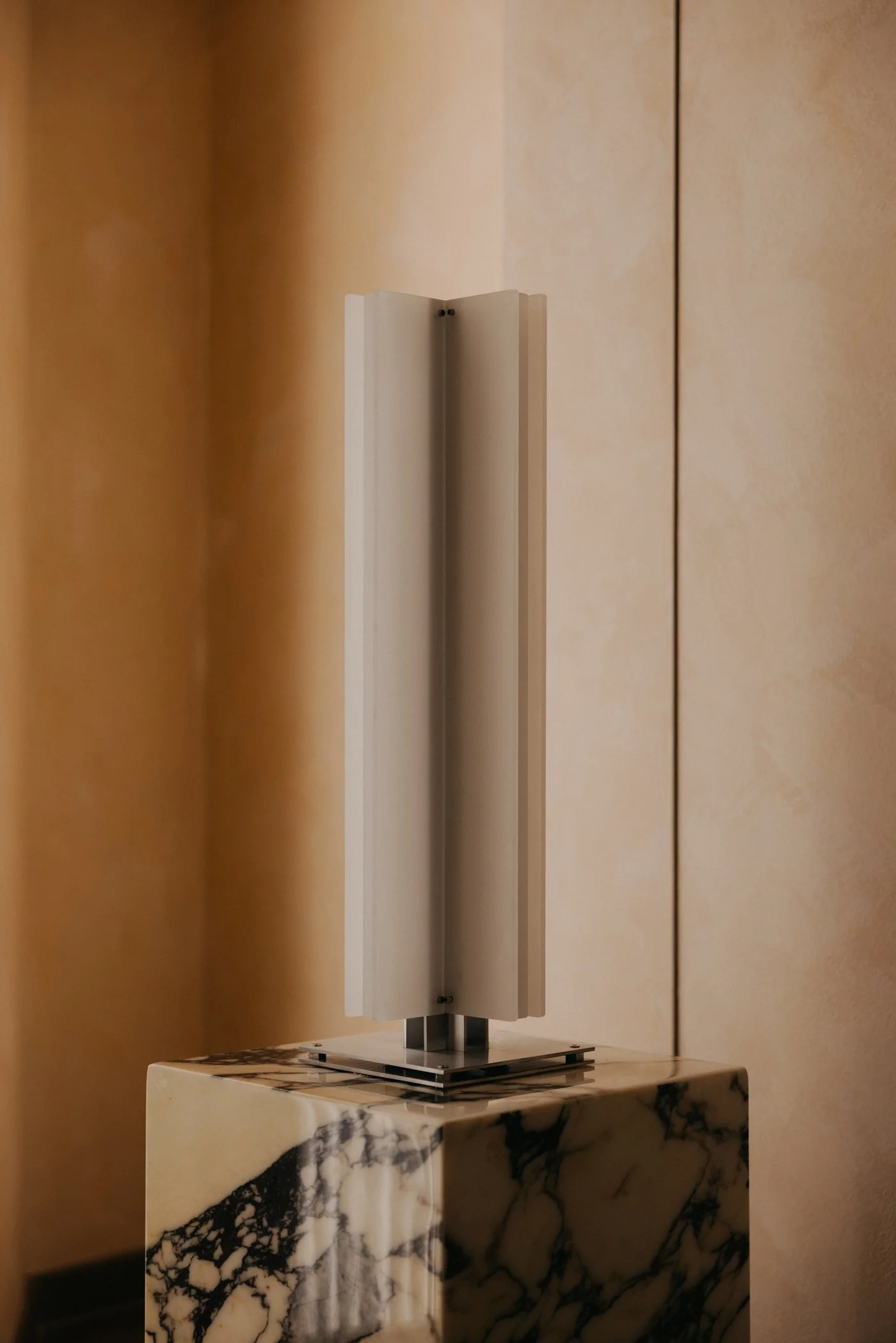
Photo by Studio Periphery
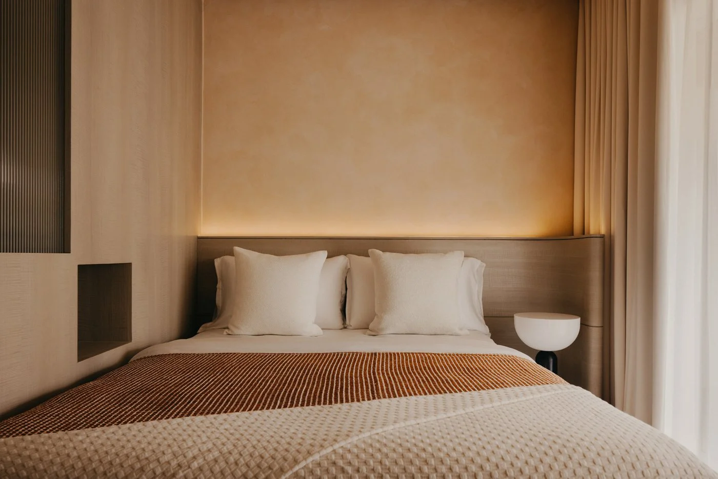
Photo by Studio Periphery
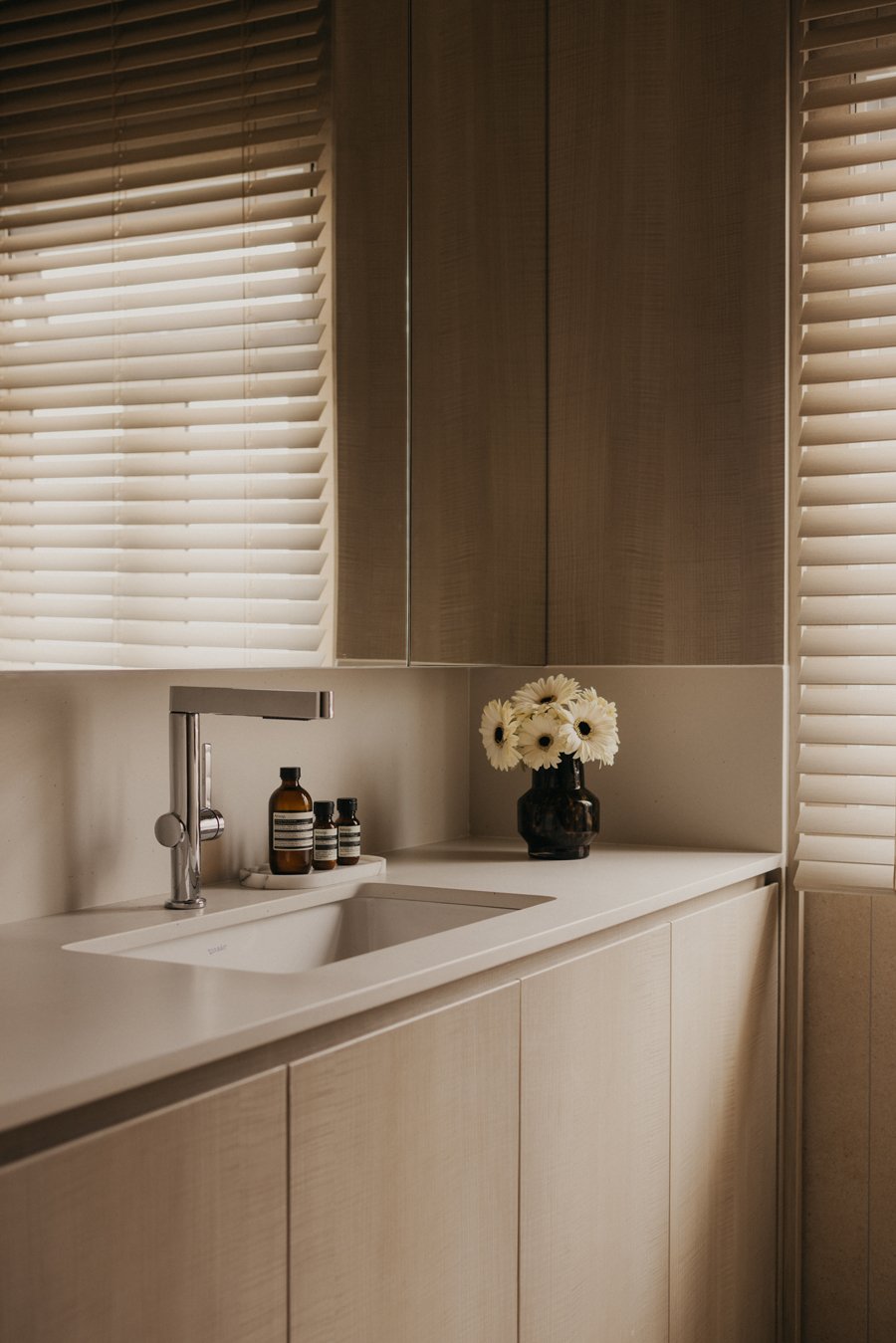
Photo by Studio Periphery
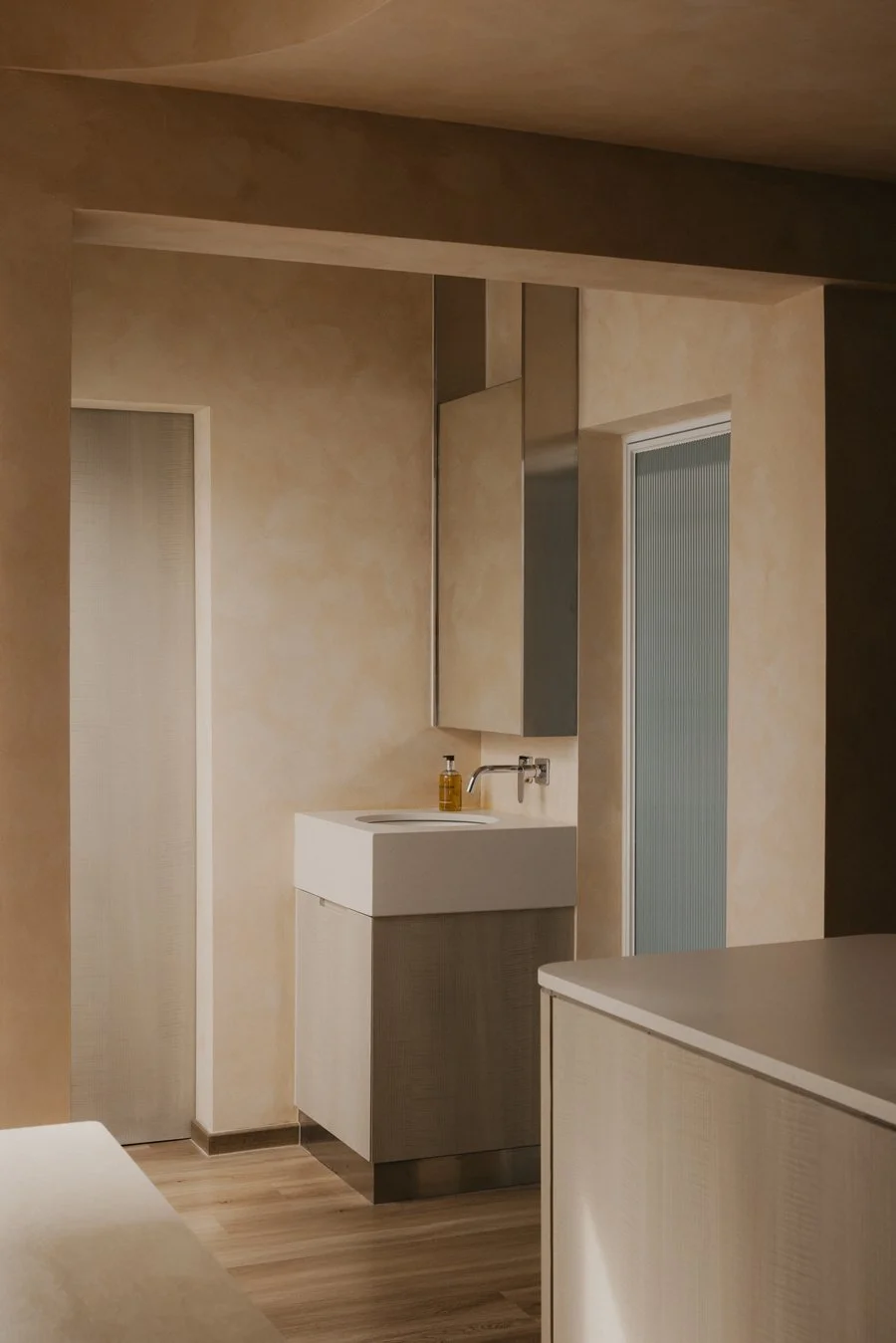
Photo by Studio Periphery