「不隨波逐流的反骨精神」青田中室內制作如何從當代設計的思路,開闢東方混血的折衷美學
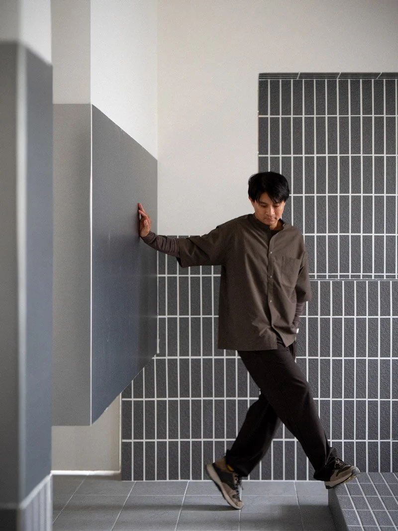
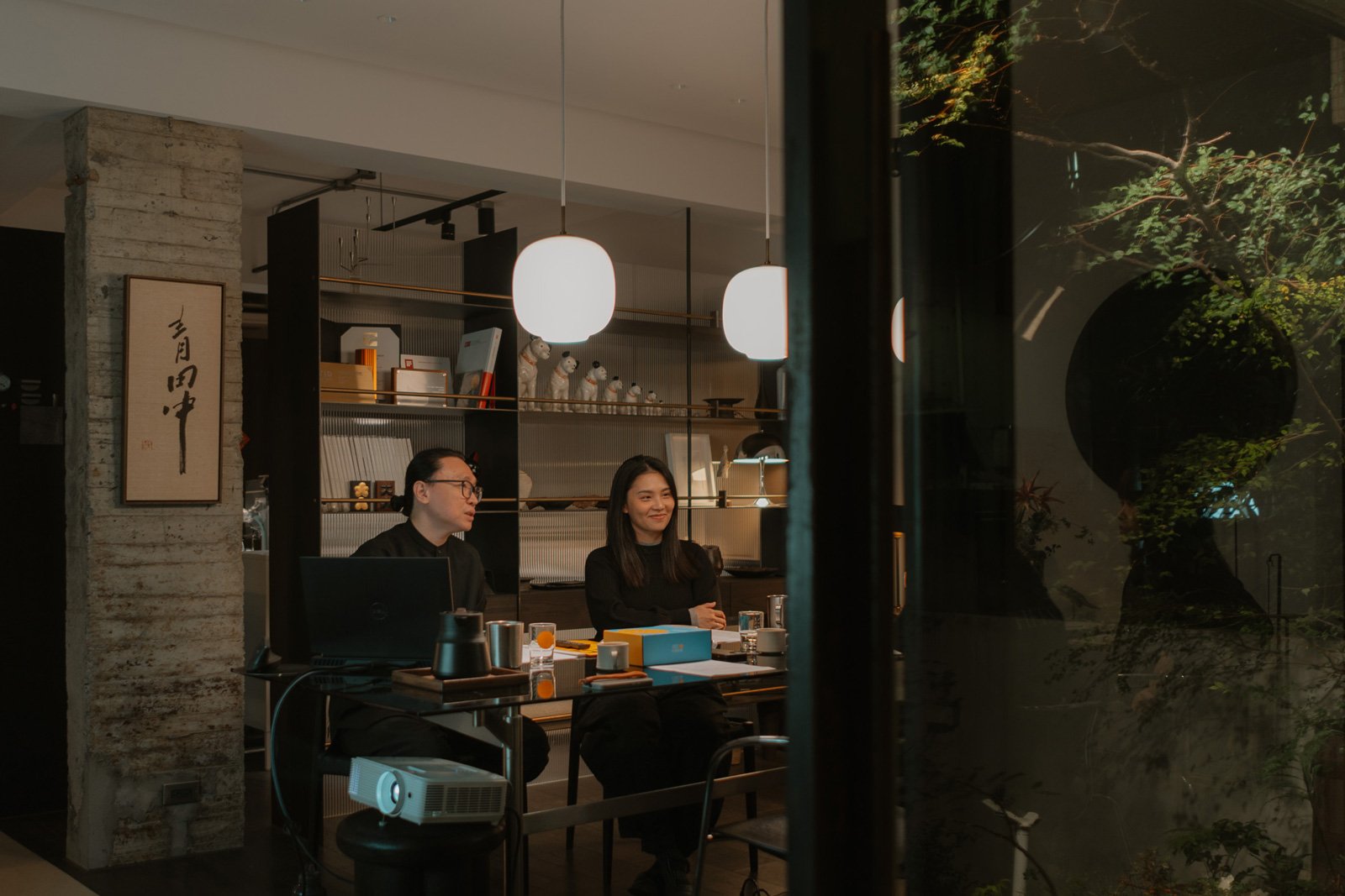
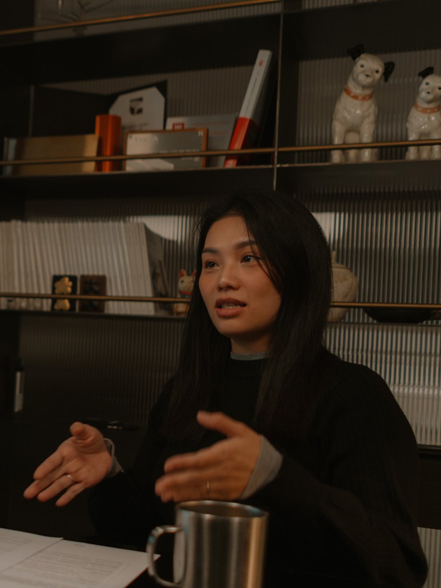
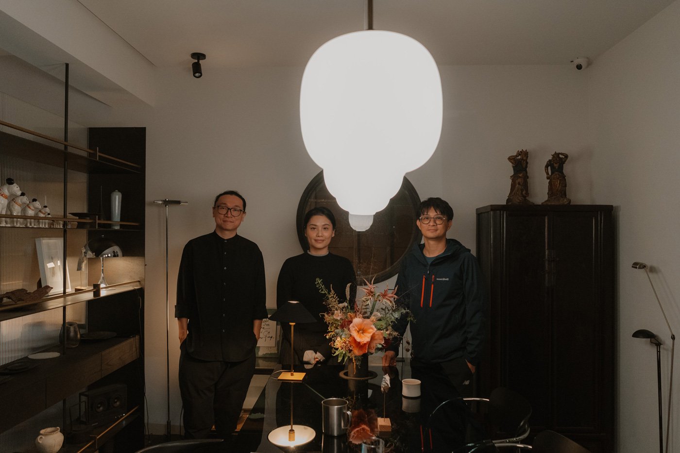
青田中室內制作創辦人, 左:Hugo / 右:Anny(Founders of AODA Interior Design, Hugo & Anny)
-
Contemporary design is predominantly shaped by Western aesthetics. When attempts are made to articulate an "Eastern" narrative, the result often lapses into a superficial layering of symbols or a nostalgia that loses sight of the clarity essential to modern living. Yet, AODA Interior Design moves against this grain with elegant defiance.
Founders Hugo and Anny adopt a broader, hybrid perspective they term "Pan-Asian." Much like the fluid strokes of calligraphy, they masterfully navigate the breath of a space—using the "void" to accentuate the "solid" reality of materials.
In this conversation, we explore how they reconcile the warmth of the East with the clean lines of modern design. In the density of the city, they render function invisible, returning luxury to light and air. Ultimately, AODA leads us to question: beyond the physical assembly of materials, what constitutes the spiritual wholeness of a home?
一直以來,我們在視覺與精神層面上都在追求一種對比的平衡
— 青田中設計/ Hugo & Anny
-
"We have always pursued a balance of contrasts, both visually and spiritually."
Q. Your portfolio exudes a distinct Eastern atmosphere. Where does this deep-seated appreciation stem from?Anny:
It’s in my DNA. I grew up watching my mother paint ink wash and my father practice calligraphy—he’s been at it for forty years. When I later studied design, I saw how Western masters like Hans Wegner drew from Ming Dynasty furniture for his Y Chair. It struck a chord: if they can interpret our culture so beautifully, why can’t we define it in our own language?Hugo:
When we launched AODA a decade ago, the Taiwanese scene was dominated by standard trends. We had a rebellious streak. We refused to follow the herd, aiming instead to forge a path that was authentically Asian, yet specifically Taiwanese.It wasn't easy. Back then, "Eastern" implied traditional or dated to most clients. We decided to trust our intuition, bypassing strict definitions in favor of a "Pan-Asian" hybrid perspective—expressing cultural roots within a strictly modern framework.
我們喜歡融合東西方元素,讓細節在空間相互襯托,使兩者都能突顯而出
-
Q: You emphasize "contrast" over the accumulation of symbols. How do you use this to create the "void" found in calligraphy?
Anny:
In calligraphy, the ink is form, but the white paper is breath. We deliberately carve out "voids" to manifest that quiet Eastern sentiment.To heighten this, we rely on material juxtaposition. We might keep a raw concrete wall but slice across it with incredibly fine black iron. Placing the precise against the primitive creates a tension that imbues the space with a sense of time and warmth.
-
Hugo:
Our project, A Path Amongst Cats, illustrates this. The owner is a local, so we recontextualized elements from the district’s temples. We applied "temple red" to the stair treads and abstracted traditional window grilles for the kitchen. International media were intrigued because they saw Eastern culture woven into modern life elegantly, without resorting to clichés."We enjoy fusing Eastern and Western elements, allowing details to support one another so that both narratives stand out."
《A Path Amongst Cats》photo by YHLAA
《A Path Amongst Cats》photo by YHLAA
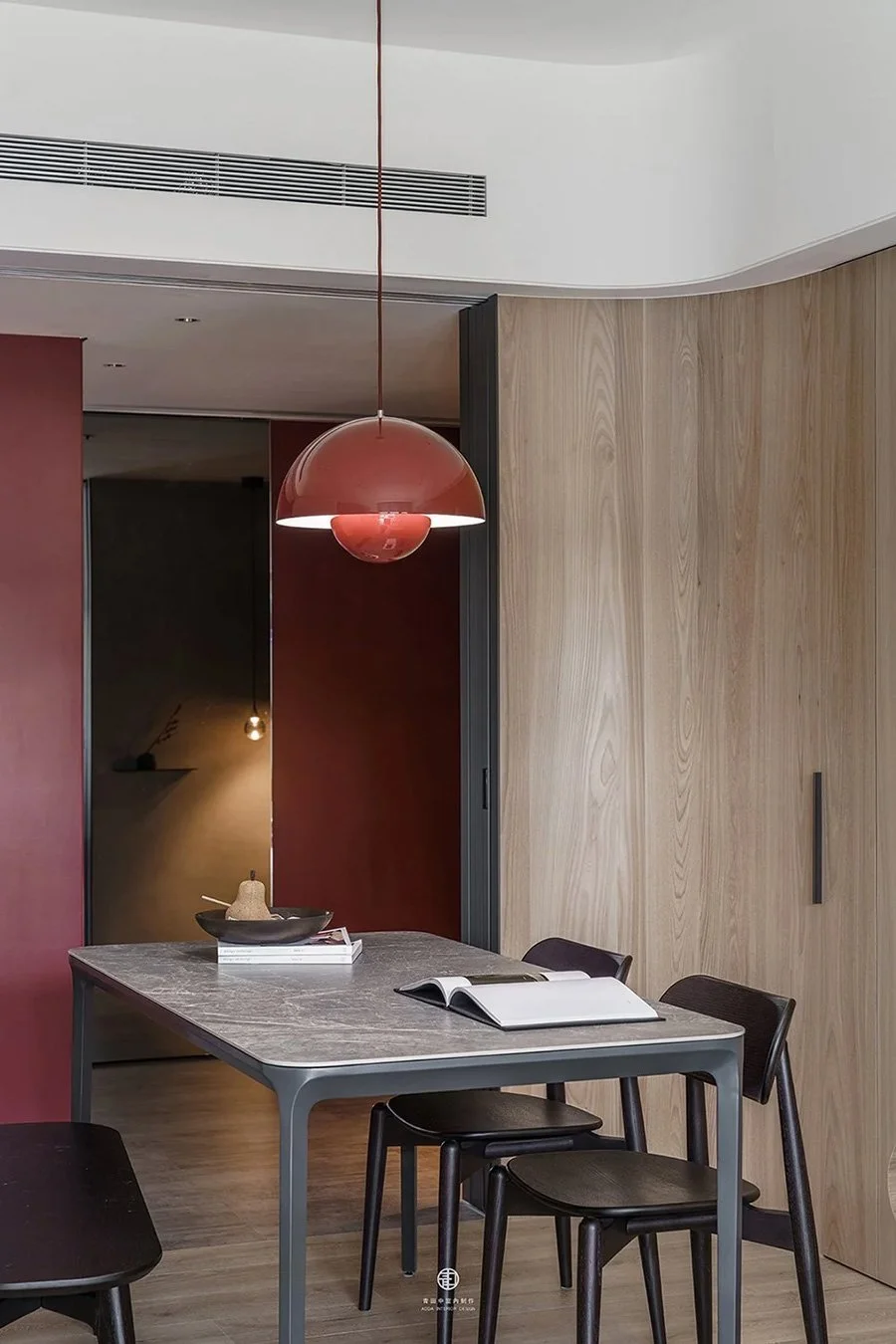
《A Path Amongst Cats》photo by YHLAA
-
Q. Cultural elements can easily feel kitsch if mishandled. How do you capture the spirit without it feeling like a costume?
Anny:
If the Eastern note is too heavy, the space loses its modern edge. We anchor it with contemporary materials—stainless steel, glass, mirrors—to pull the tension back to the present.Hugo:
Take this long table. We wanted to retain the Eastern symbolism of the "circle," but to avoid heaviness, we combined a glass top with a stainless steel structure, exposing the mechanics underneath. We even cut an aperture in the glass for floral arrangements. It marries aesthetics with function, preventing the piece from drifting into nostalgia.
-
Q: What is the primary concern during your design process?
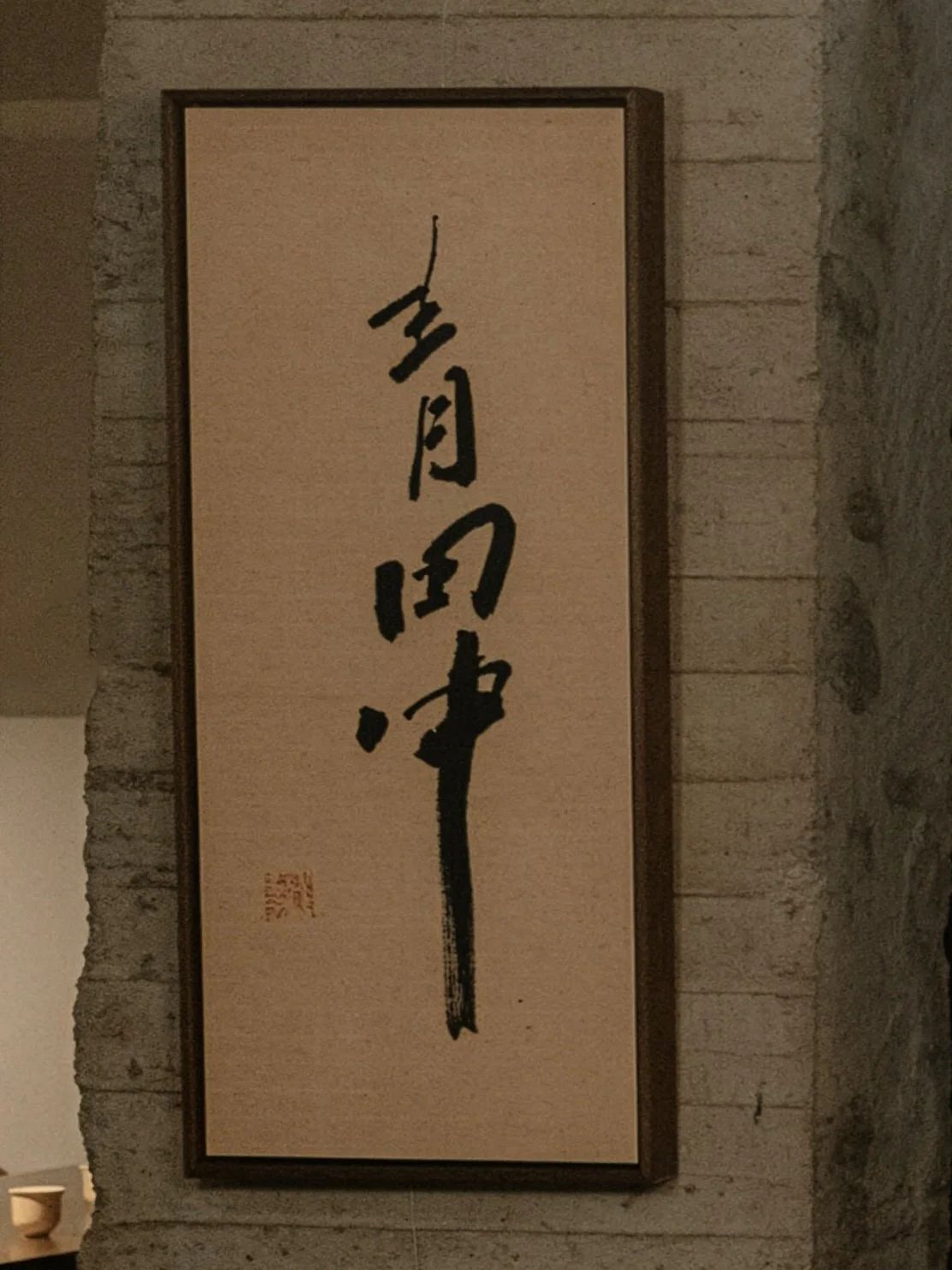
Anny:
We aim for equilibrium, but one that allows for wit. When our office was completed, calligrapher Wang Yi-chun wrote brand name, "AODA" (青田中). She noted that while the characters are symmetrical, she brushed them with deliberate asymmetry. It perfectly mirrored our philosophy.Hugo:
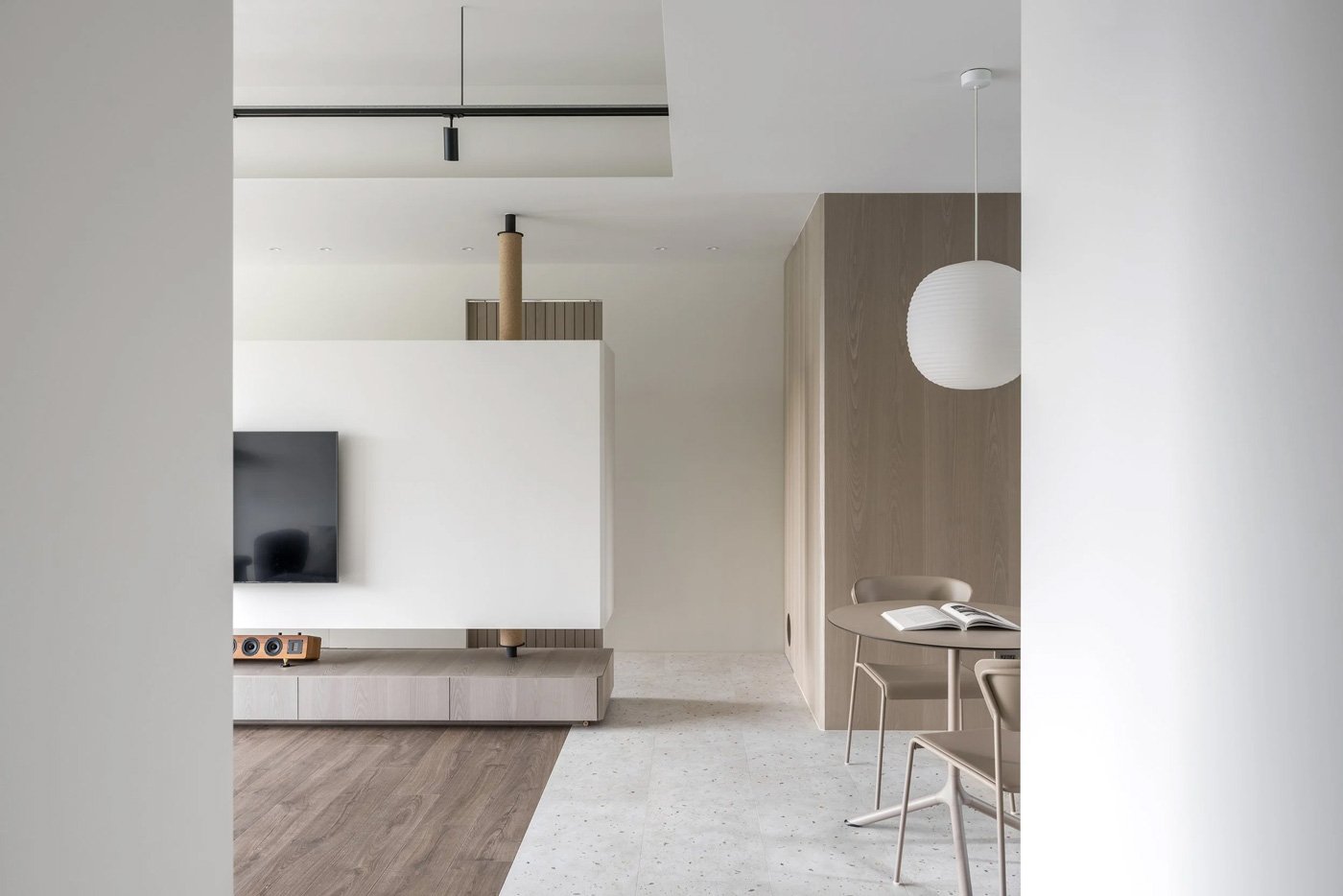
That balance is what I call a "dual-scenery"—the symbiosis of atmosphere and function. If a project is functionally demanding, I soften it with atmospheric textures. If it’s poetic, I ground it with utility. Aesthetics cannot be hollow; every detail must serve daily life.With residential footprints shrinking in Taiwan, the danger is letting function dictate form. We practice "editing"—constantly refining and discarding to let the true protagonist emerge. This isn't minimalism for the sake of style, which can be sterile, but a pursuit of spiritual clarity.
Anny:
A designer provides a balanced vessel. We step back to let the owners fill the void with their life traces, creating a home that is truly theirs.
一個空間如果什麼都想要表現,最後反而什麼都看不見;用「收」的方式,主角才會呈現出來
-
Q: In practical terms, how do you dissolve spatial boundaries while integrating function?
Anny:
We avoid fleeting trends. I often design through a "camera lens," utilizing framed views to extend visual depth.We also treat function like a user interface: powerful capability hidden behind a clean form. By consolidating scattered storage, we allow the remaining space to breathe.
Jamie:
Could you share a specific case study?Anny:
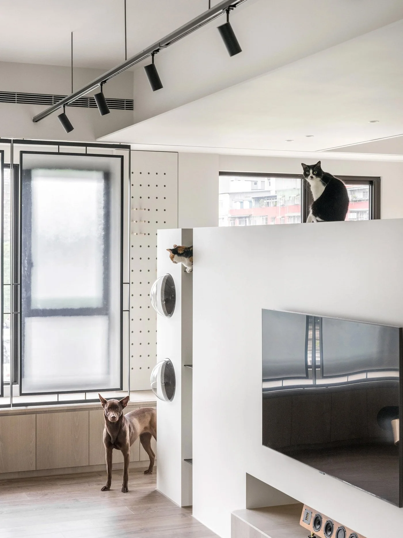
In Soft Spots, a 33sqm apartment for a female engineer, her hobbies became the muse. She loves giraffes, so we abstracted that imagery into square perforations on air vents and doors. It turned cold engineering necessities into playful highlights.
《Soft Spots》photo by Suiyu Studio 隨寓
-
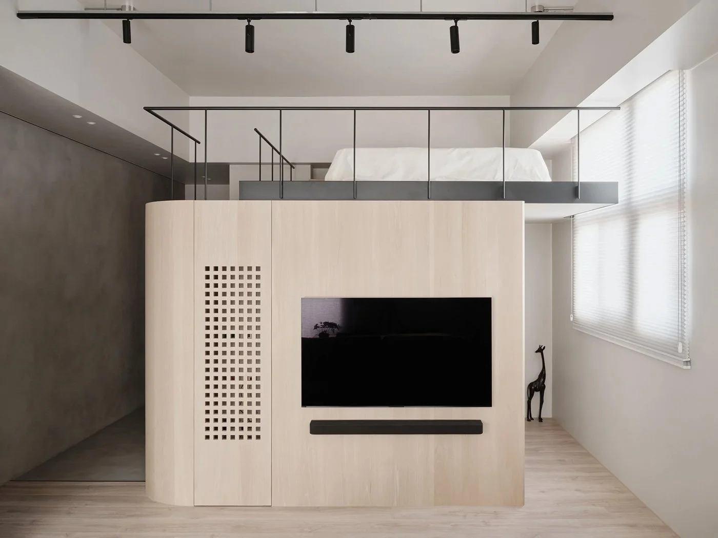
Hugo:
Traditionally, cabinets would suffocate a space this size. Instead, we consolidated all functions—storage, closet, kitchen—into a central "volume." We placed the bed atop this volume, utilizing verticality. By manipulating wood tones, we balanced the visual weight. When light and air flow freely, the brain perceives the space as expansive. We wanted the owner to feel the "softness of home," not the confines of a storage unit.
《Soft Spots》photo by Suiyu Studio 隨寓
《Soft Spots》photo by Suiyu Studio 隨寓
-
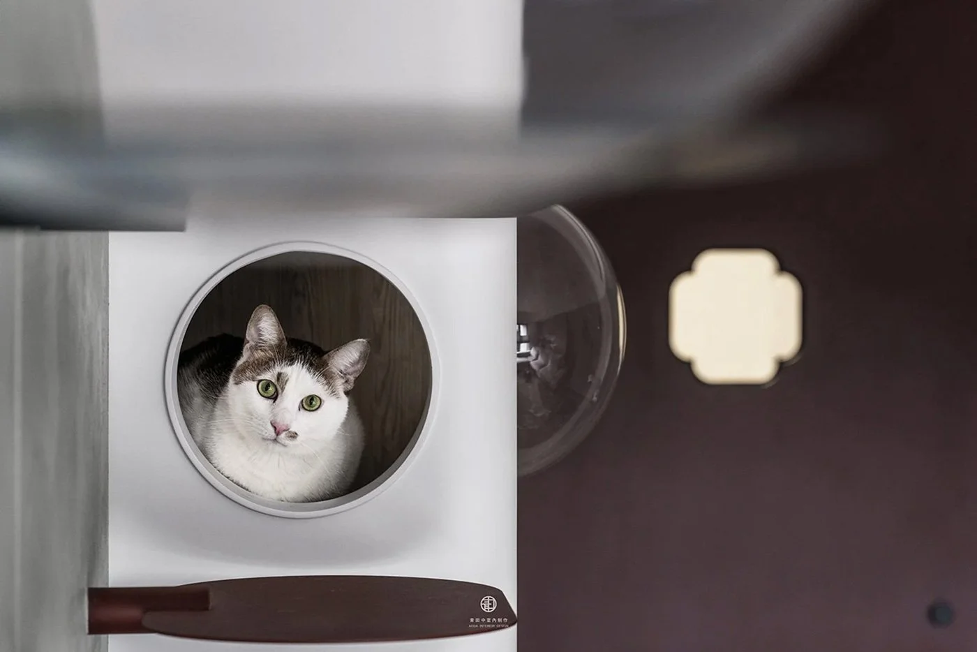
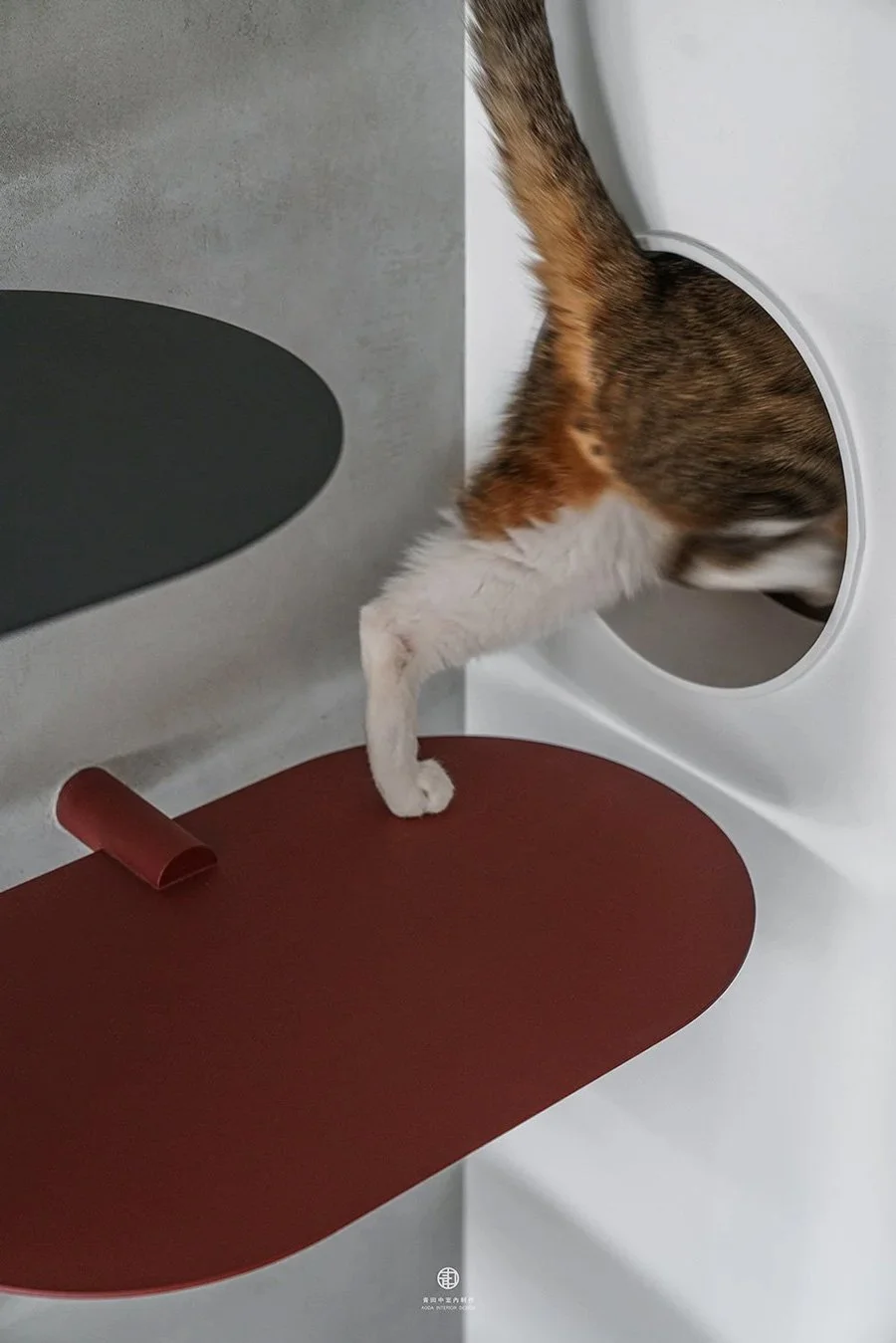
Anny:
Once upon a treetop is another exercise in this balance. The owners needed a "cat room" for a pet with behavioral issues, but required natural light and ventilation.Instead of a wall, we designed three large sliding screens. They act as privacy partitions—replacing curtains—but can slide to enclose a secure cat room when the owners leave. These screens, echoing Eastern partitions, solve a pragmatic problem. This is the "dual-scenery" in action.
《Once upon a treetop》photo by YHLAA
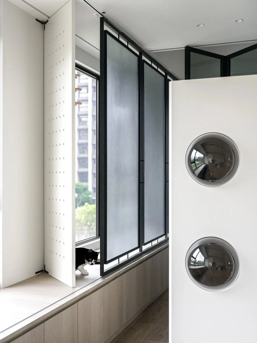
《Once upon a treetop》photo by YHLAA
我們會刻意在空間製造一些空白,這不是為了留白而留白,而是要把「生活的責任」交還給業主
《Once upon a treetop》photo by YHLAA
-
Q: Light is crucial for atmosphere. How do you approach it?
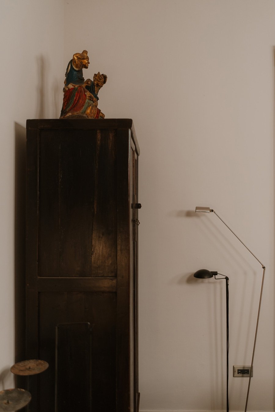
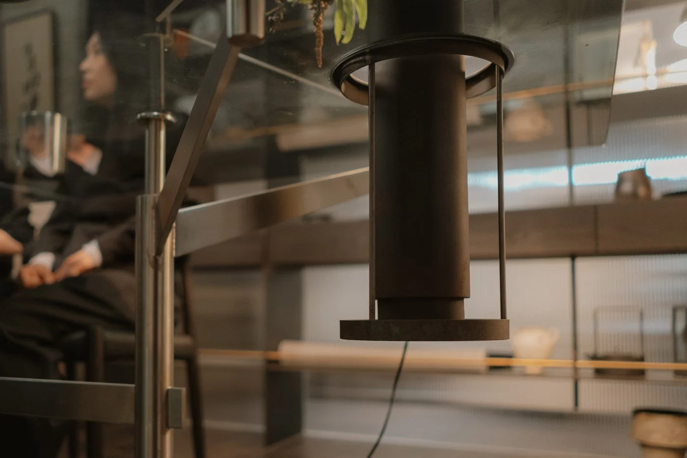
Hugo: We are incredibly sensitive to light. Even in fixed layouts, we guide light to flow between zones. We use the permeability of glass and steel to ensure the space never feels heavy.
We even choreograph the lighting for "after hours." Light offers stability; it sets the temperature of a home. We enjoy translating intangible light into tangible experiences.
-
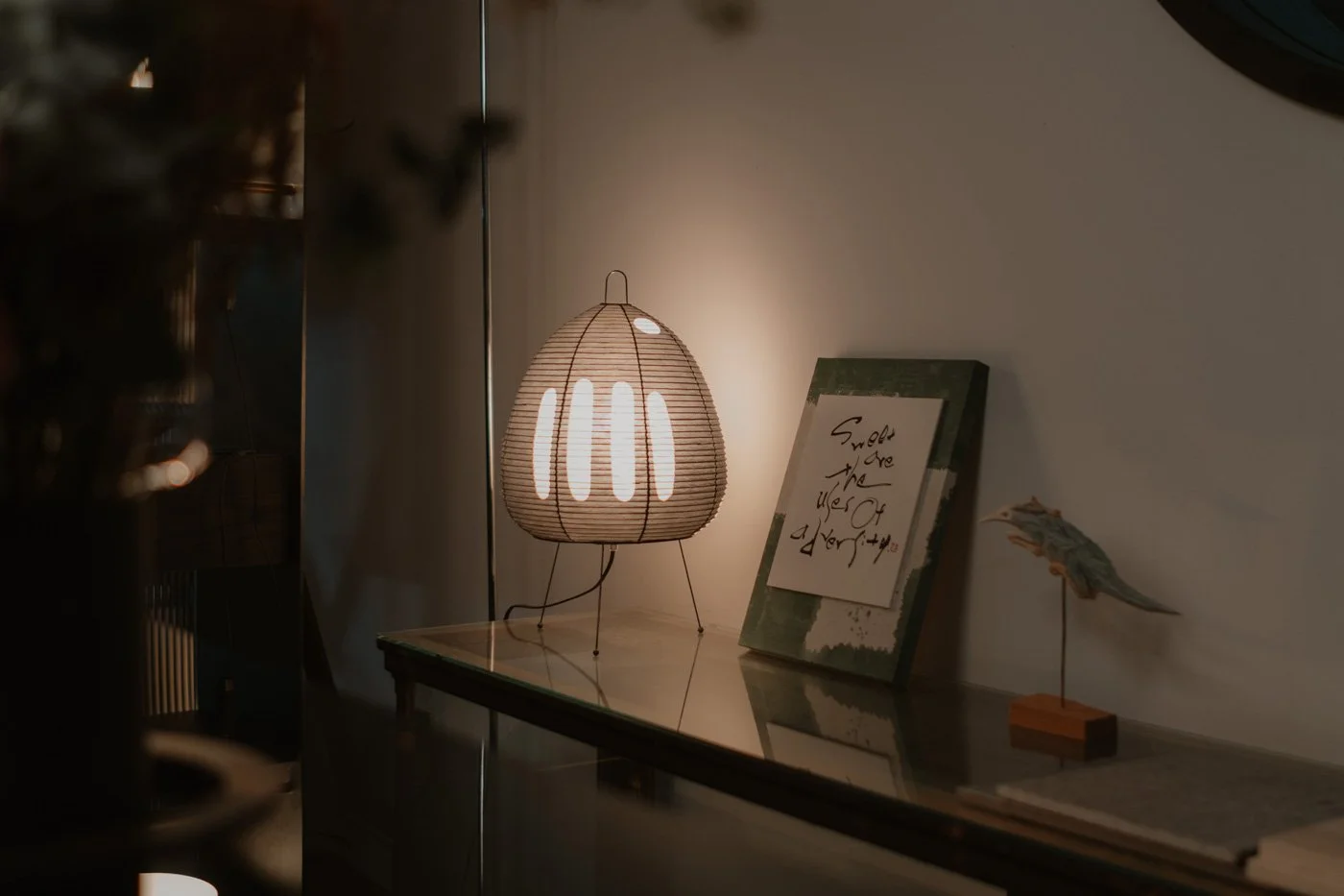
Q: Beyond spatial design, you invest heavily in curation. What role do objects play?
Anny:
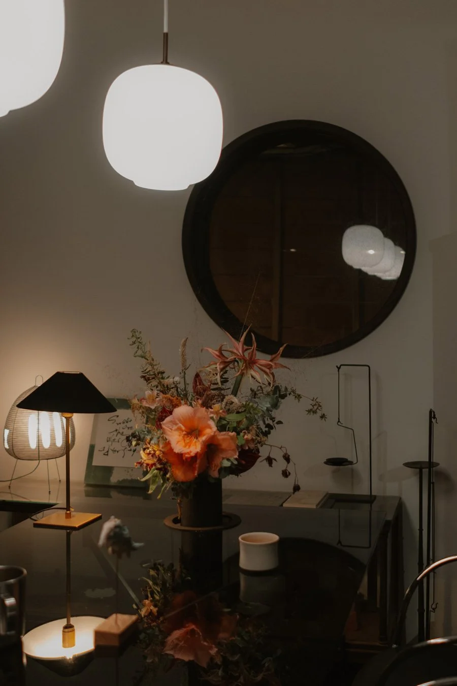
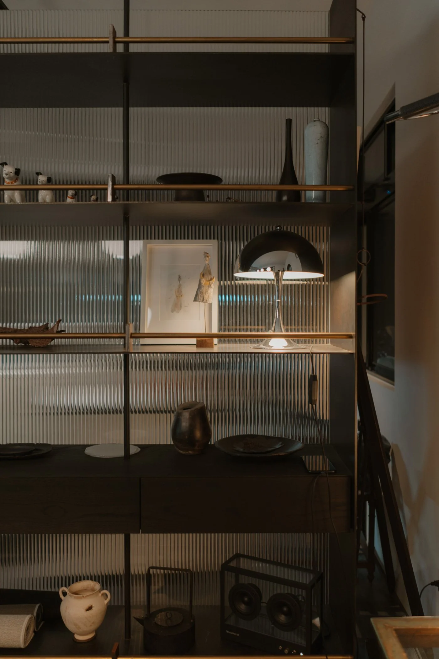
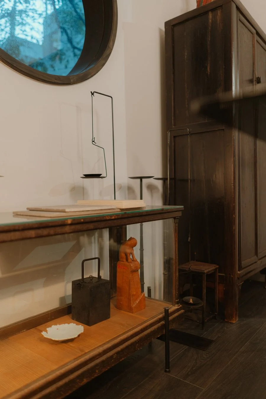
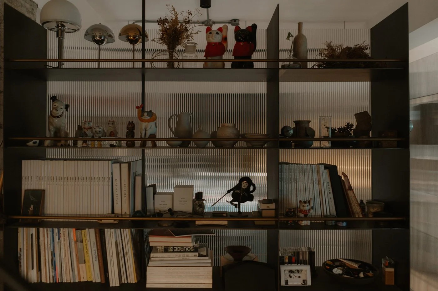
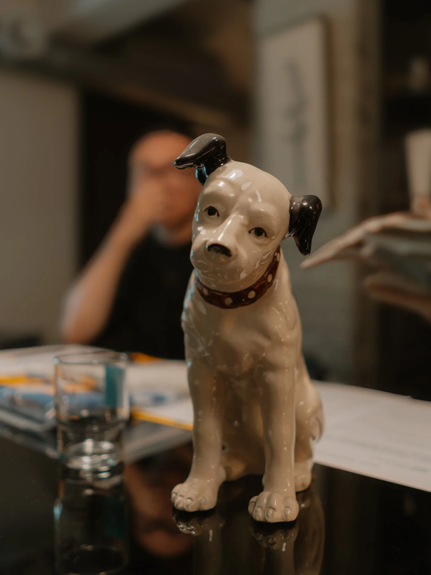
We have an obsession with objects. Furniture and art are crucial—they are often the final touch that brings the atmosphere to life. We source pieces from Japan, Europe, and Thailand through our own channels.We hosted a second-hand sale once because we don't want things to feel static. Objects need to flow in and out for a space to feel alive. For us, these selections aren't just styling props; they are essential to completing the vision we imagined. Sometimes we even customize hardware or find specific soft furnishings just to soften the hard lines of the cabinetry.
-
Q: Finally, regarding your recent collaboration with Japanese designers: How did this cross-cultural dialogue recalibrate your approach to materiality and the essence of a space?
Anny:
It fundamentally shifted our definition of "detail." For them, technical precision is merely the baseline; the true rigor lies in the spirit behind the form.In Taiwan, renovation is often understood as the additive layering of textures. This collaboration challenged us to balance the physical material with the spiritual. We learned that by stripping away the unnecessary physical layers, we could actually create a sense of spiritual abundance.
Hugo:
Japanese designers are constantly interrogating the intangible. This influenced us to look back at our own practice with fresh eyes.Although the market demands are different, we now try to guide homeowners to look beyond immediate needs. We ask them to consider the future form of their home—to identify what truly belongs to them, not just in terms of the tangible assembly of materials, but in the emotional resonance of the space.
攝影|Jamie Lo、Szuting Liu