為書留一盞燈,為時間留一個出口:金鳳書苑在綠蔭日光間構築一座閱讀秘境
— Marcus Tullius Cicero
-
Back when words were still etched onto scrolls of papyrus, hand-copied ink captured the relentless focus of scribes and authors over countless days and nights. Today, with a simple tap on a keyboard, we can slip thousands of volumes into our pockets and store them in the cloud. Reading has become exceptionally convenient and readily available, yet it has also quietly become too weightless—so light that we rarely sit down just to read, letting the afternoon sun drift from our shoulders to our feet as time slowly slips away.
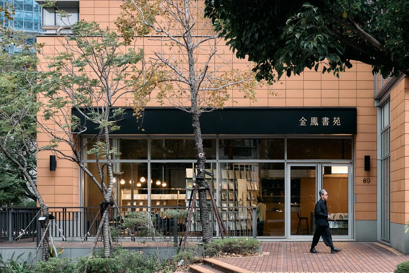
Nestled along Section 7 of Zhongshan North Road in Taipei's Tianmu district, Jin Feng Bookstore sits where street trees cast dappled shadows in the sunlight, and a warm glow permeates through its floor-to-ceiling glass. It extends a quiet invitation: temporarily set aside your phone, pick a seat, and let a book—perhaps one long covered in dust—find the person it was meant to meet this afternoon.
-
Starting from a Mother's Smile: Constructing a Spiritual Sanctuary
Jin Feng Bookstore doesn't strive to be the trendiest independent bookshop, nor does it attempt to replicate any proven formula for commercial success. It simply seeks to be a place where people can sit in quiet comfort, akin to the warmth of returning to a mother's home. Helmed by Yingtai Space Design, the design team aimed their inquiries deeper right from the start: In a city accustomed to moving so fast, where can an individual's focus truly linger?
The brand name, "Jin Feng," is tenderly borrowed from the founder’s mother. It symbolizes a uniquely maternal inclusivity and that reassuring smile one sees when pushing open the door, regardless of how chaotic the outside world may be. The design team distilled the essence of this emotional origin into the architectural framework, attempting to use the warmth and depth of a physical space to re-establish a long-lost connection between readers and books in our digitally saturated era.
-
Reflecting on Digital Superficiality: Reclaiming the Tactile Reality of the Fingertips
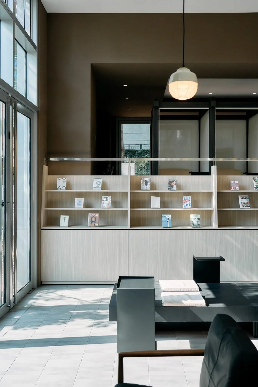
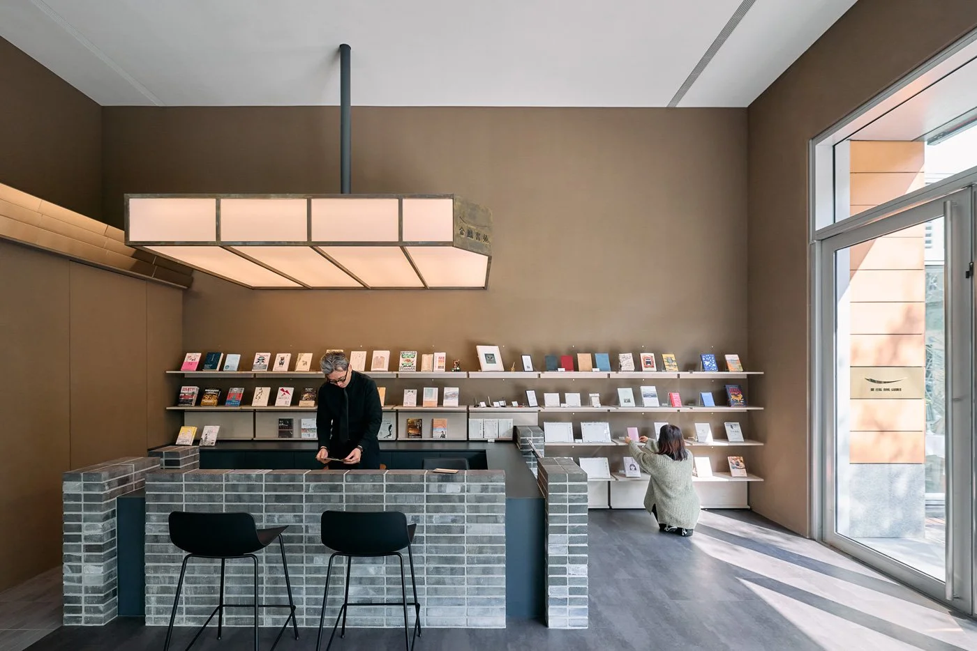
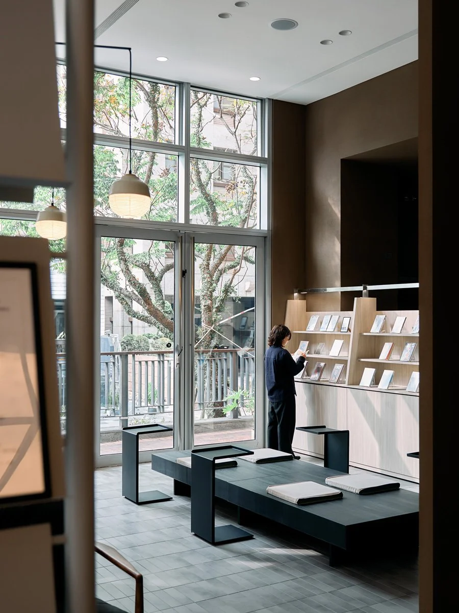
At its core, Jin Feng operates on a "curatorial book selection" model, rotating its overarching theme every three months. During the initial planning phase, Yingtai Space Design realized that the interior needed to break away from traditional retail display logic to reawaken the physical book's fading presence amidst the digital tide. To rediscover the tactile passion of physically turning pages, the design team chose to slow the space down, adapting to each thematic shift to create a reading environment that transcends eras and defies the constraints of time.
-
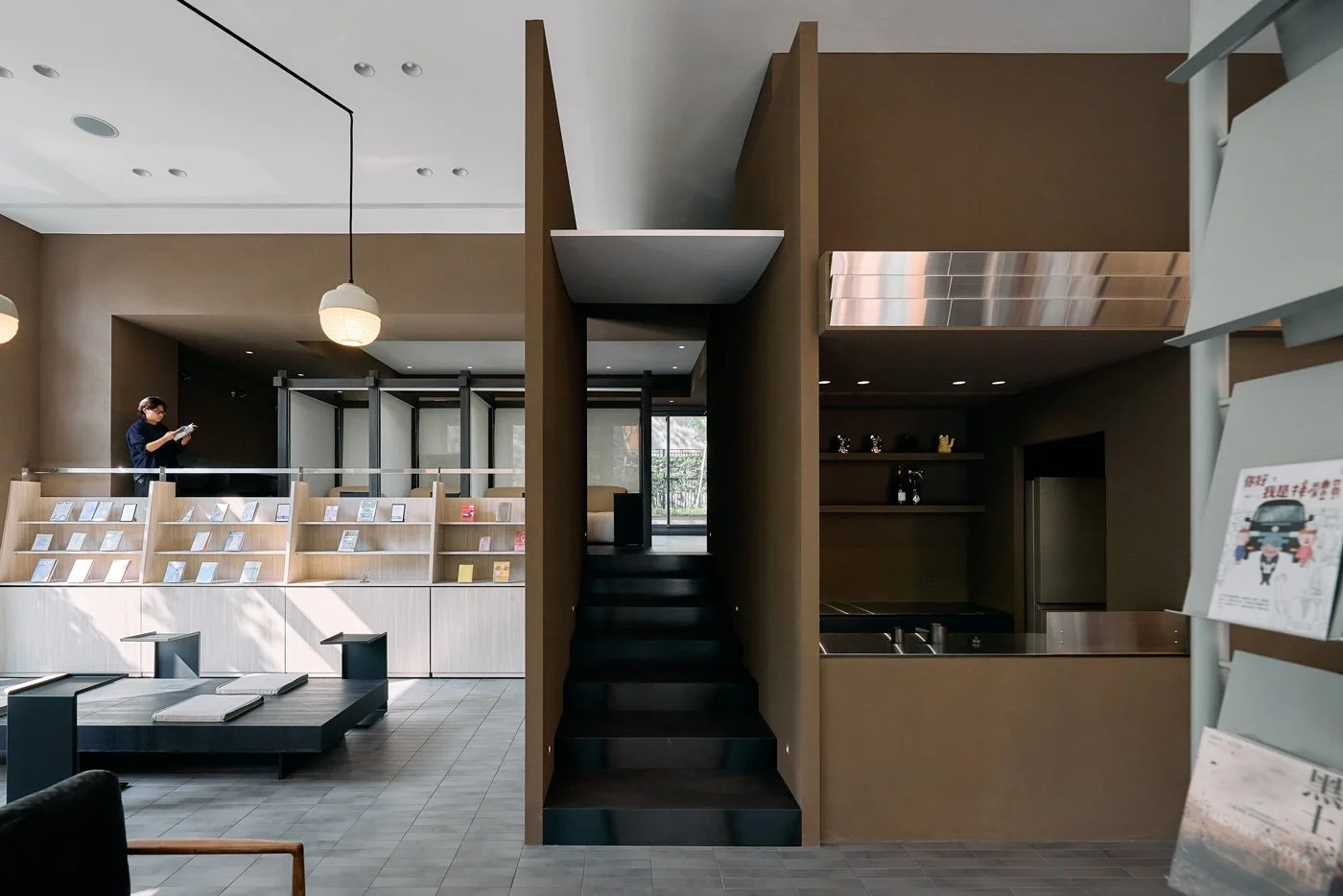
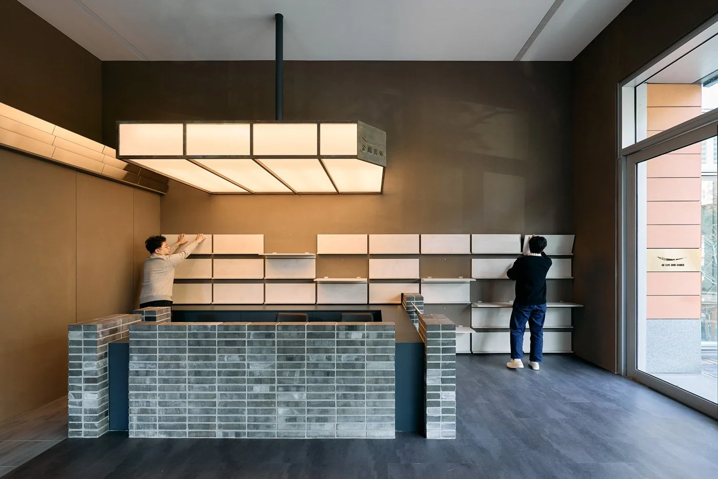
The team selected traditional Taiwanese roof tiles, imbued with historical depth, as the foundational tone of the space. This serves as both a tribute to local craftsmanship and a tangible manifestation of "time." Each piece of grey-blue kiln mutation represents the intellectual sparks of different authors—forged through fire and time to present a texture and color that is entirely unique.
This dedication to the passage of time extends to the details of the brand's visual identity. The indoor logo deliberately features a rusted, time-worn texture, standing in stark contrast with the bright gold signage at the entrance. Together, they symbolize the rich, mellow depth of knowledge that has been allowed to patiently brew.
-
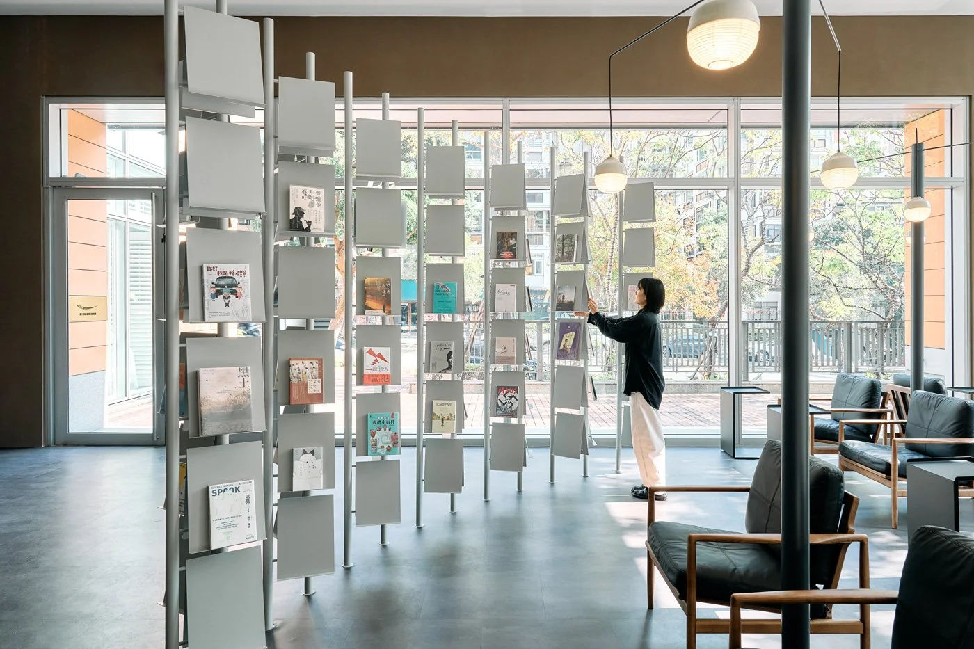
Breaking Rigid Display Syntax: Transforming Reading into an Ideological Dialectic
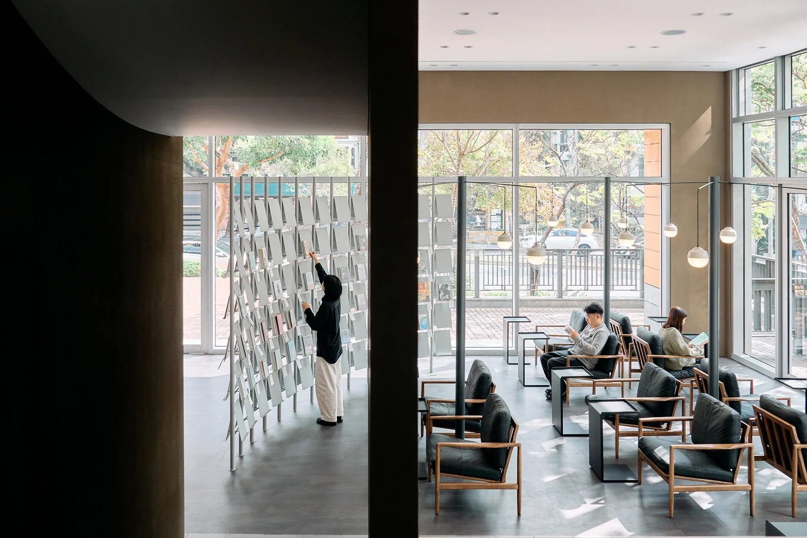
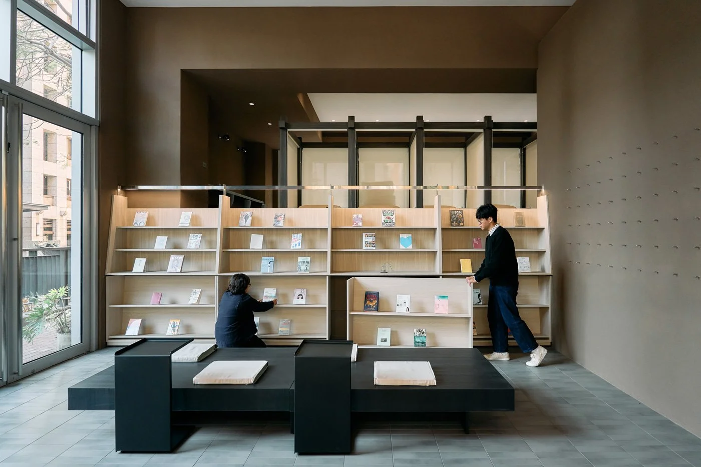
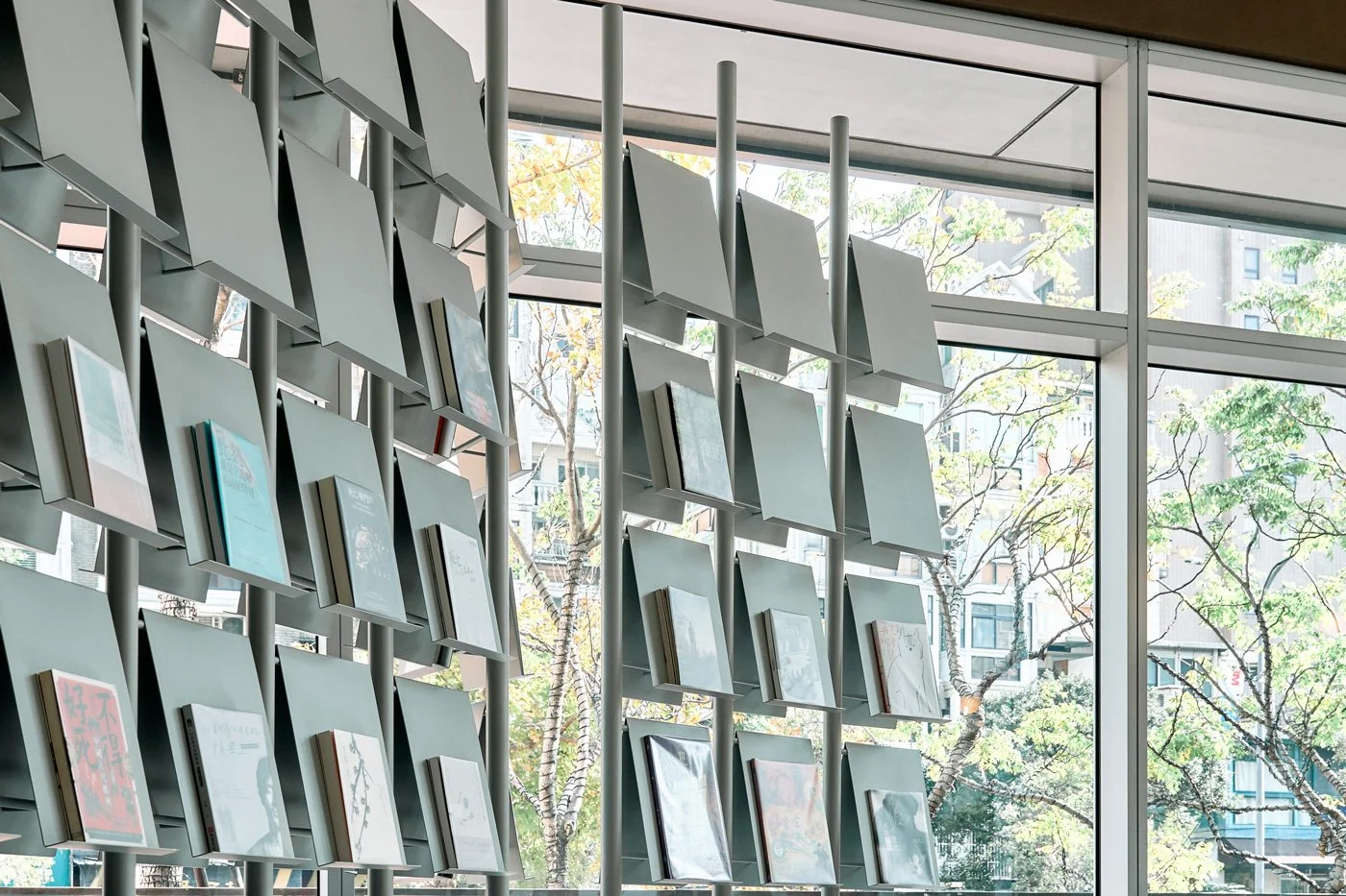
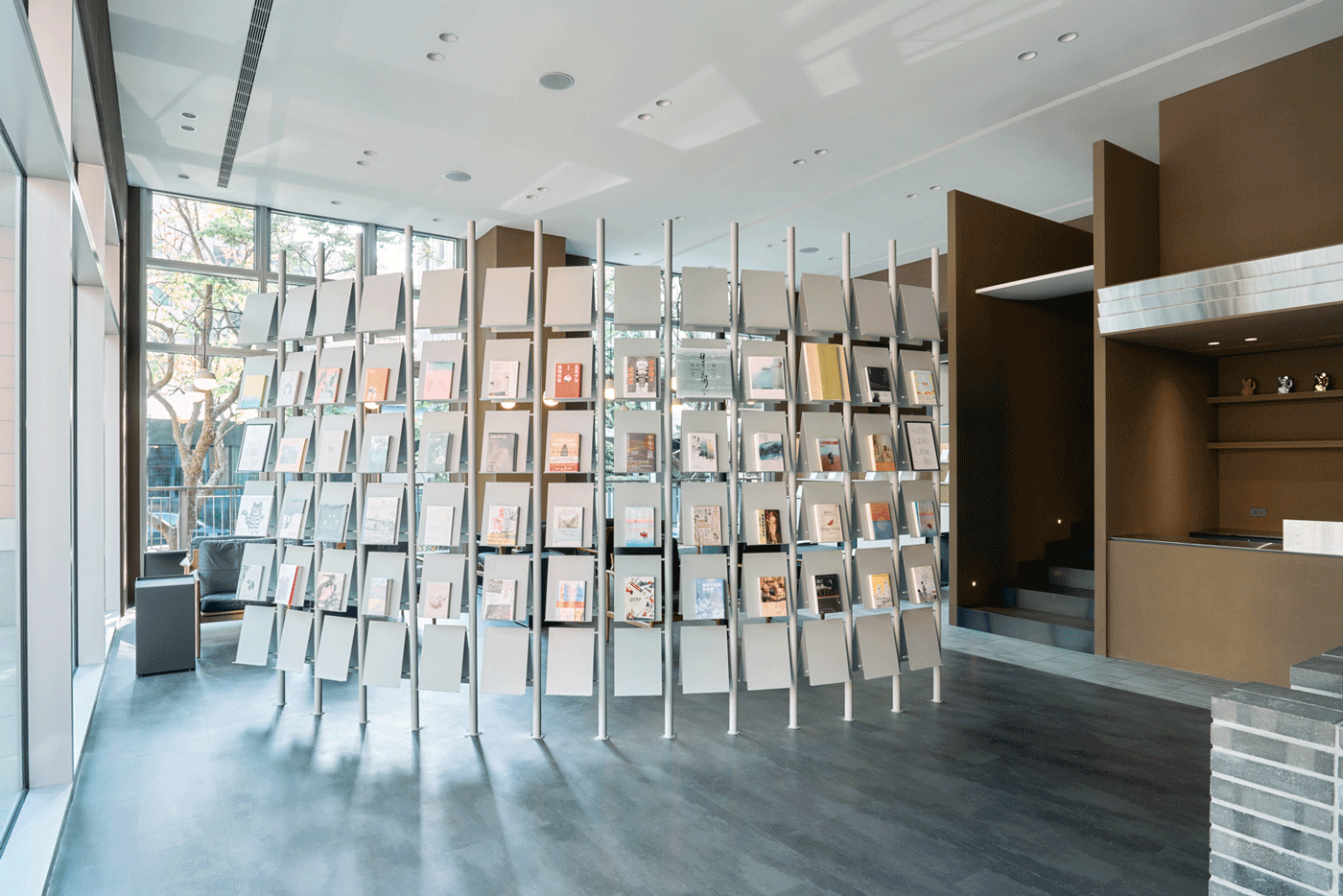
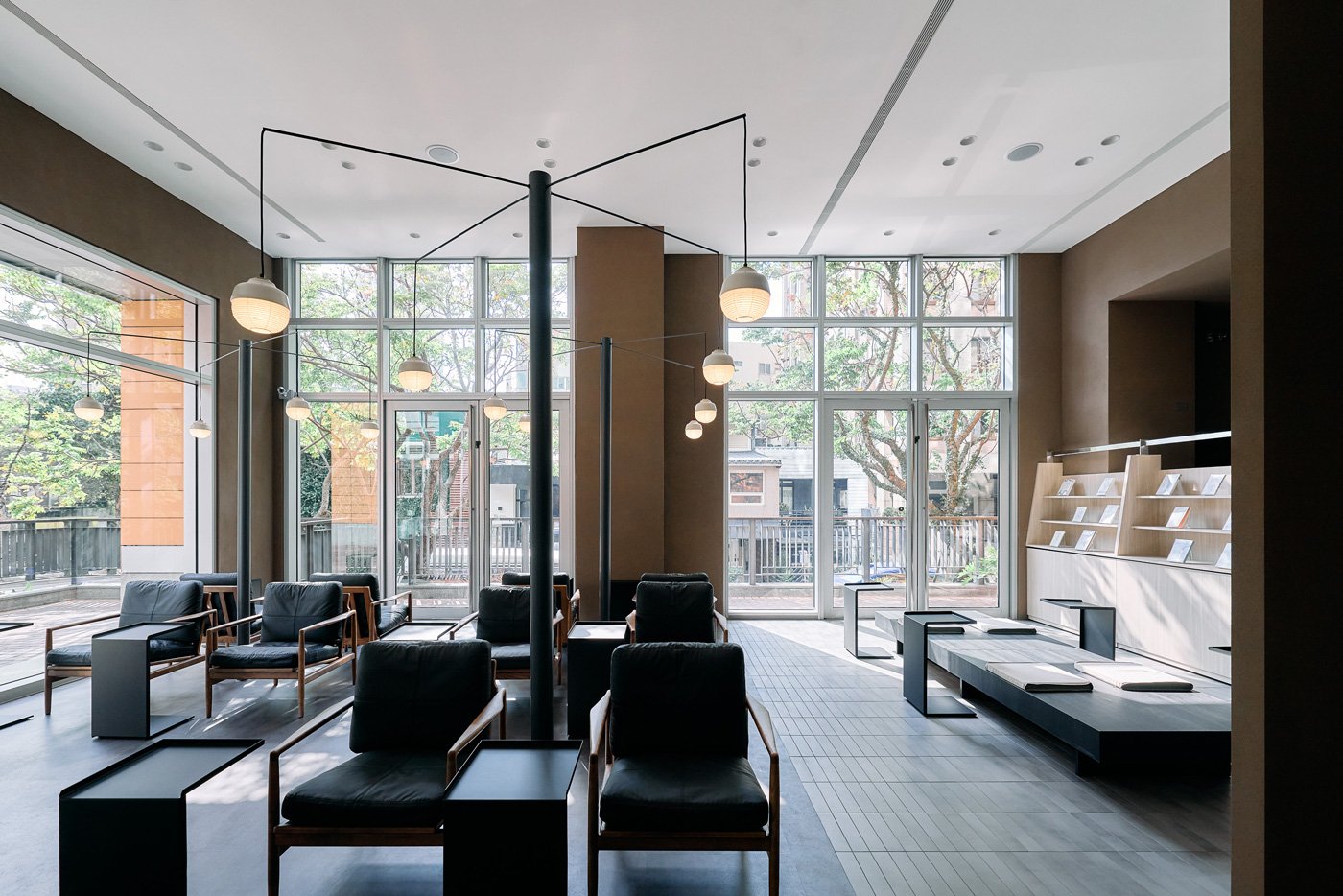
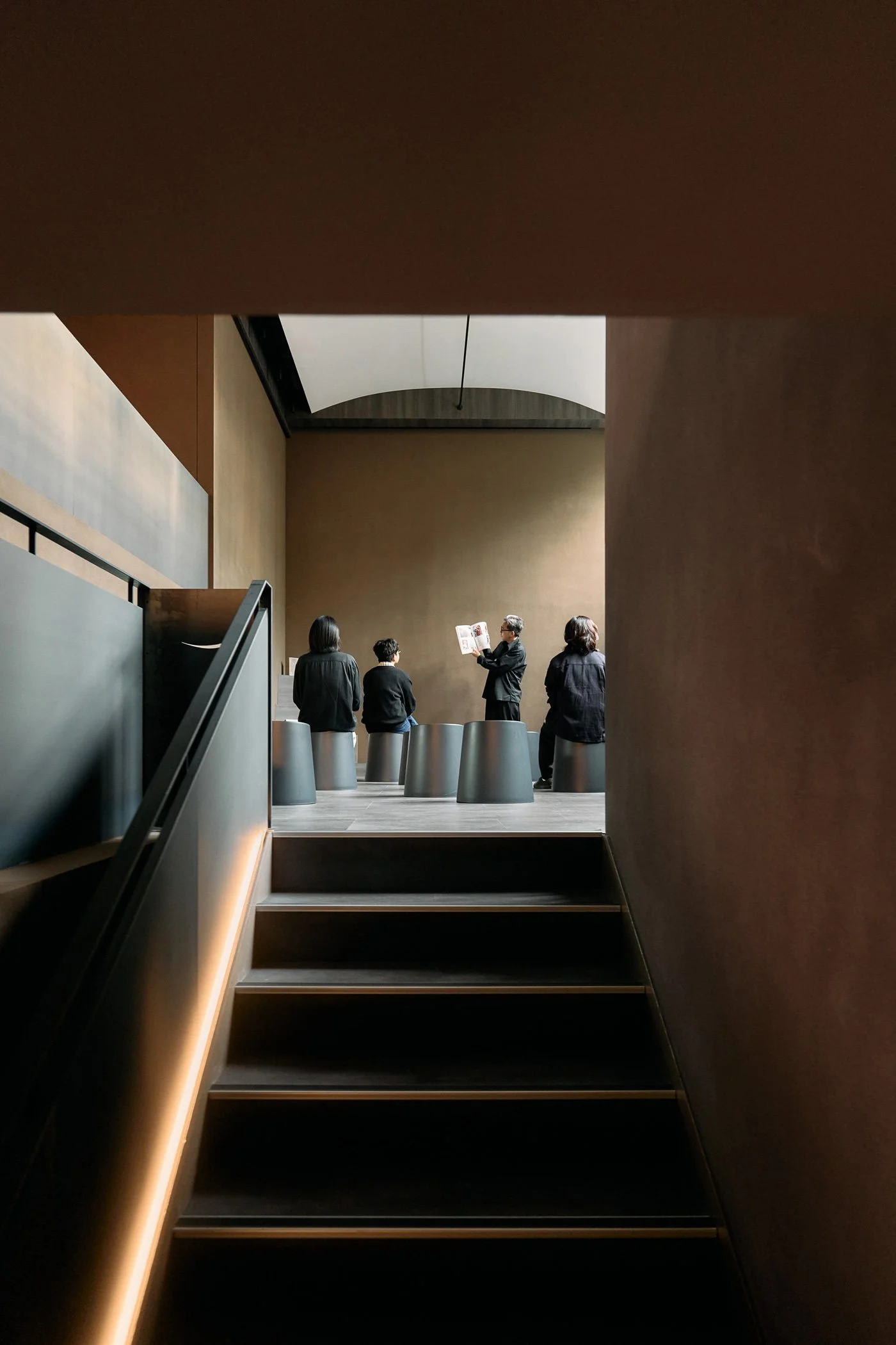
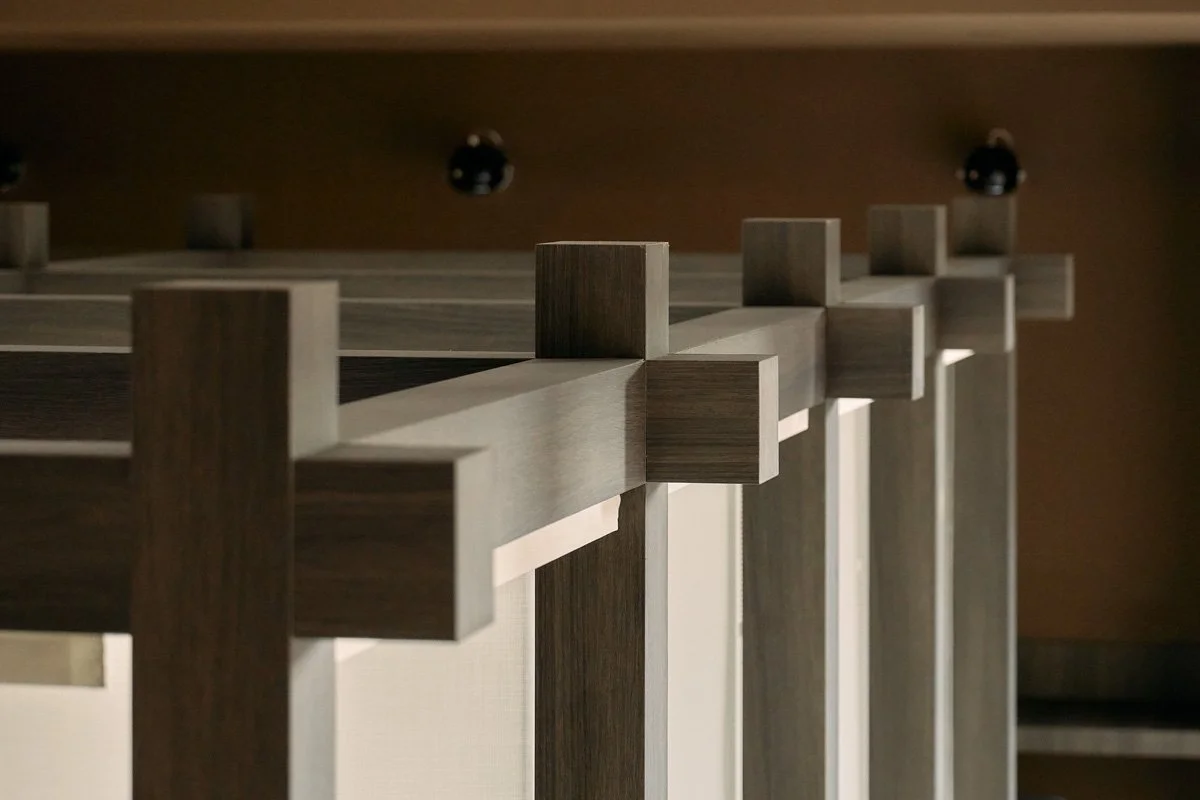
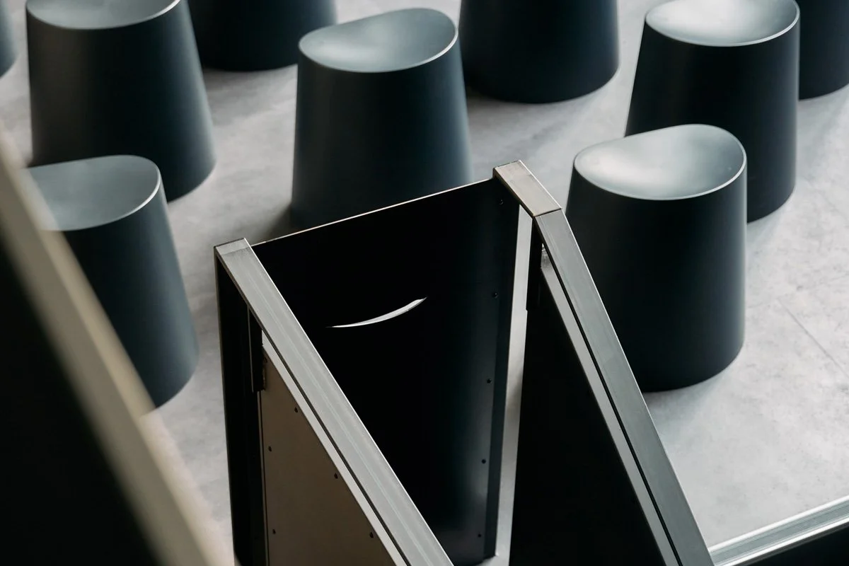
Stepping into the static reading area on the first floor, the eye is immediately drawn to the iconic curved, rotating book wall—an extension of the arc in the brand logo that represents a mother’s smile. Each structural bracket can be rotated to different angles according to the seasonal theme. The juxtaposition of front and back subtly serves as a metaphor for the opposition and dialogue of differing viewpoints. Under specific curatorial themes, by rotating the shelves to divide the room, the space can simultaneously present diverse stances, ensuring that readers encounter books anew with every single visit
-
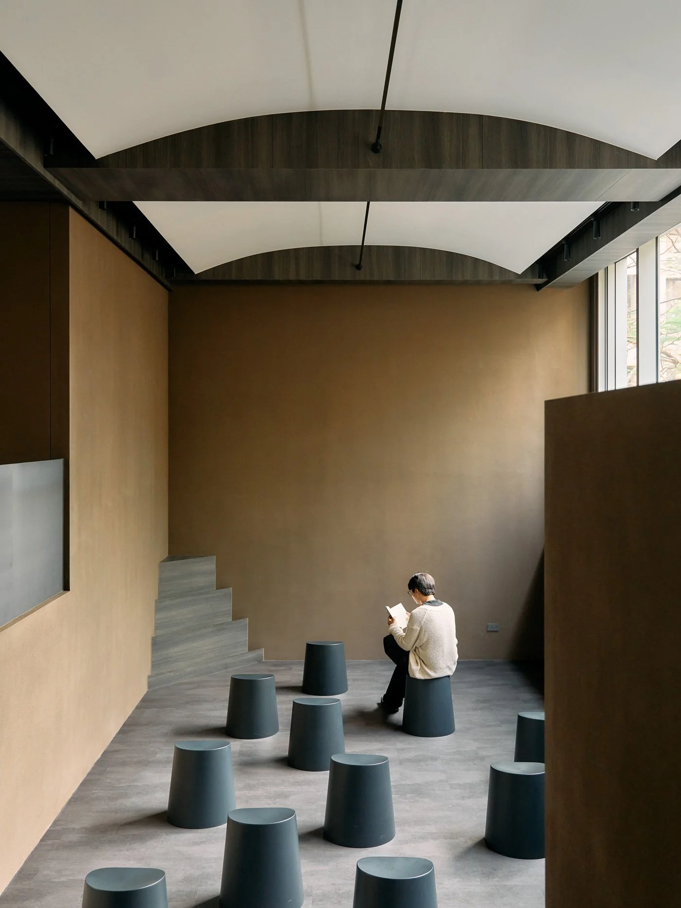
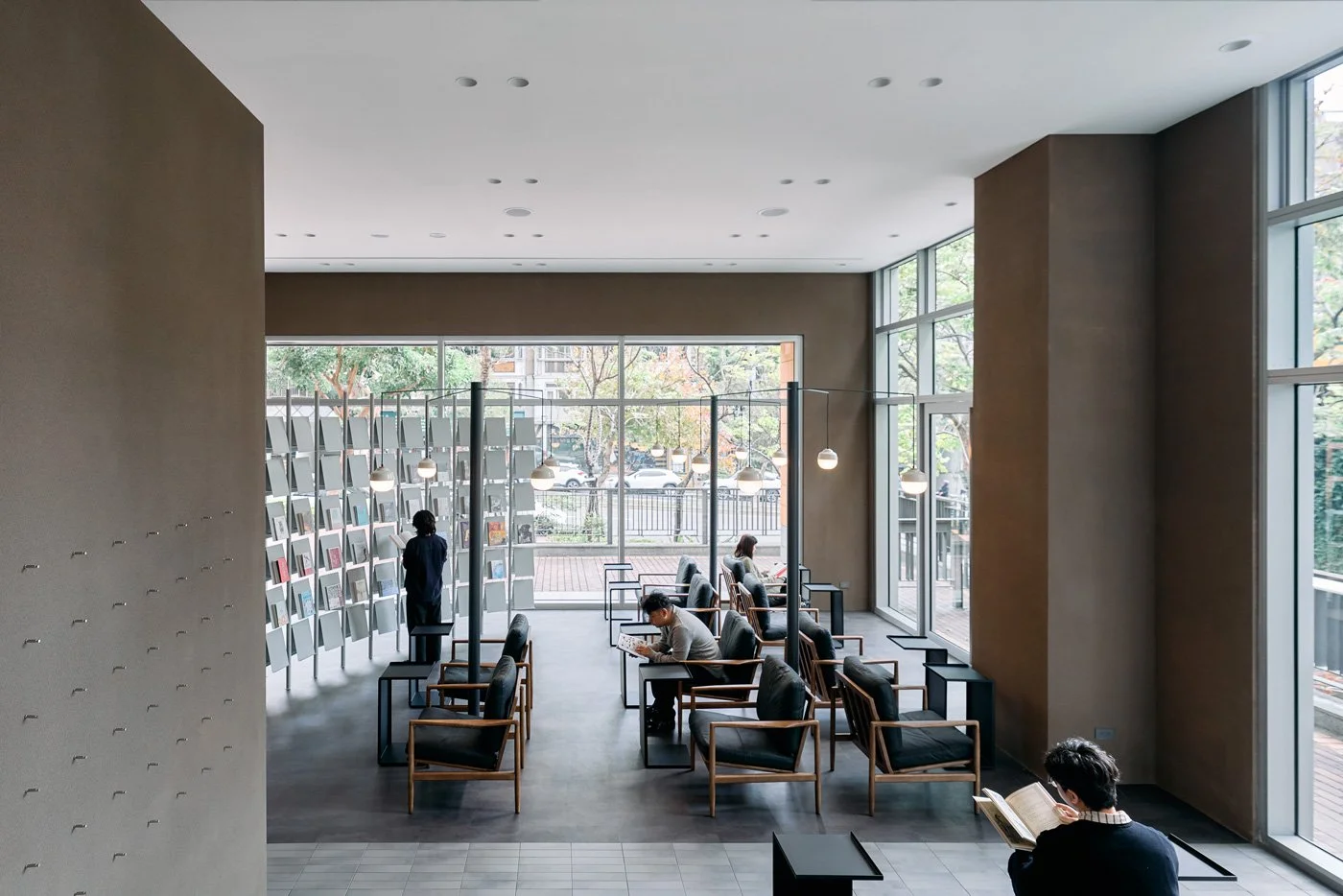
To safeguard this profound sense of focus, Yingtai Space Design crafted the lighting and shadows with exquisite care. The team anchored the interior in a deep, rich brown color palette, paired with the rough, tactile finish of stone-textured wall paint, naturally drawing the visual center of gravity downward onto the pages. Above the solitary reading seats hang spherical pendant lights—metaphorical "guiding lights"—symbolizing that in a vast sea of books, there is always a golden quote waiting to illuminate someone's path at the perfect moment, offering spiritual inspiration and solace. This warm interplay of light and shadow not only brightens individual reading nooks but also seamlessly echoes the concept of the message area. Here, readers are encouraged to write down sentences that touched them or recommend a book to the next stranger, allowing the lingering resonance of their reading experience to carry on.
-
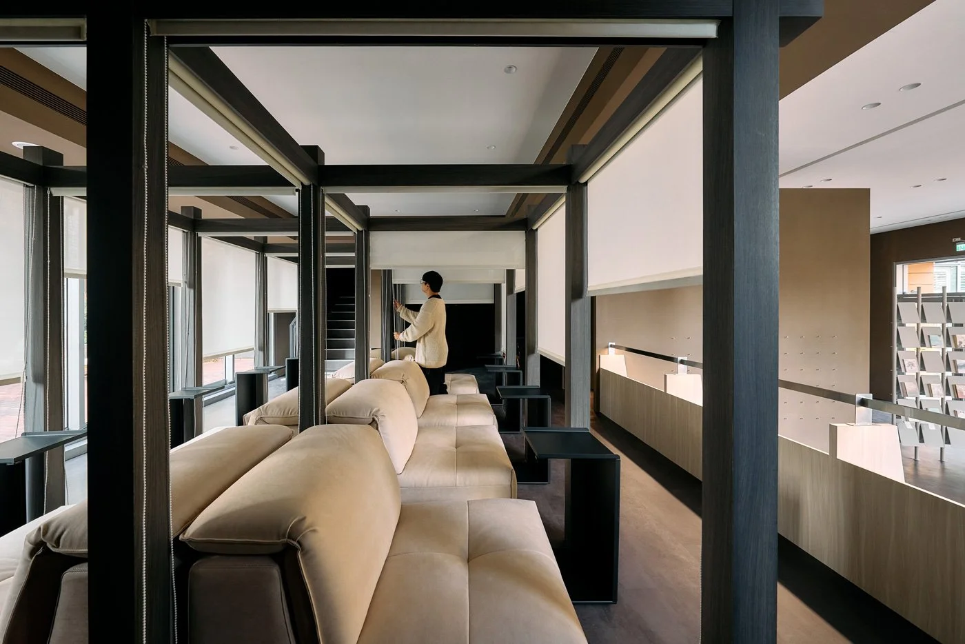
From Quietude to Dynamic Exchange: A Gentle Transition Between Introspection and Dialogue
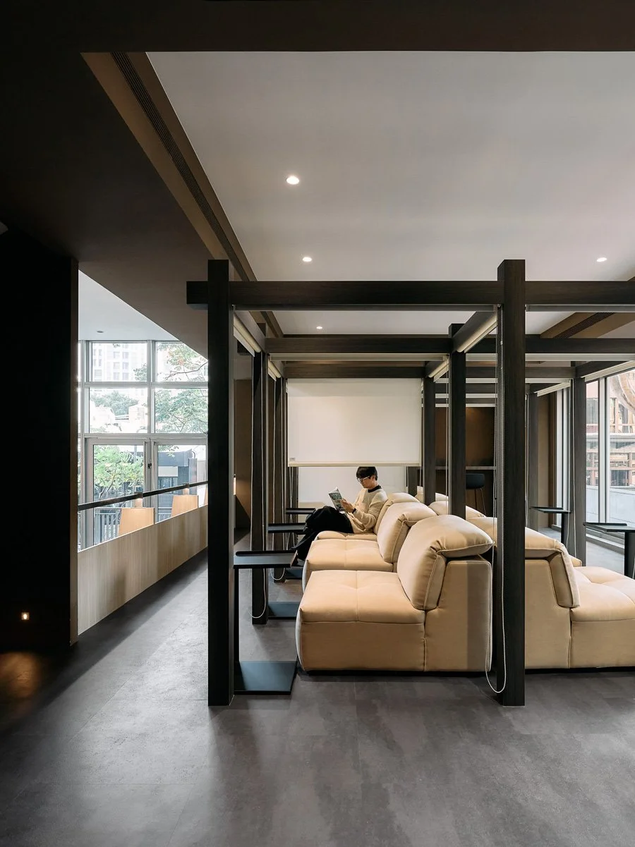
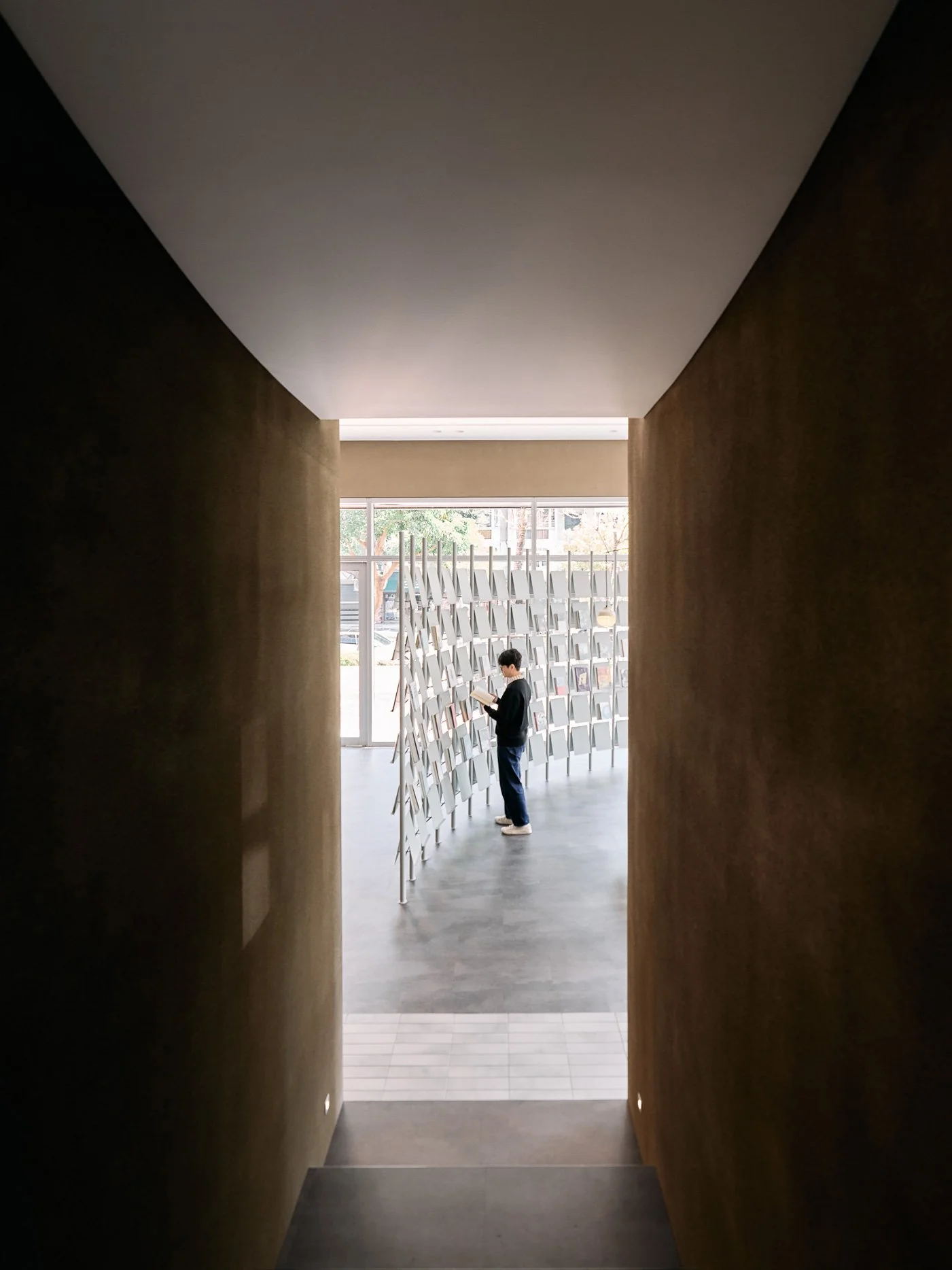
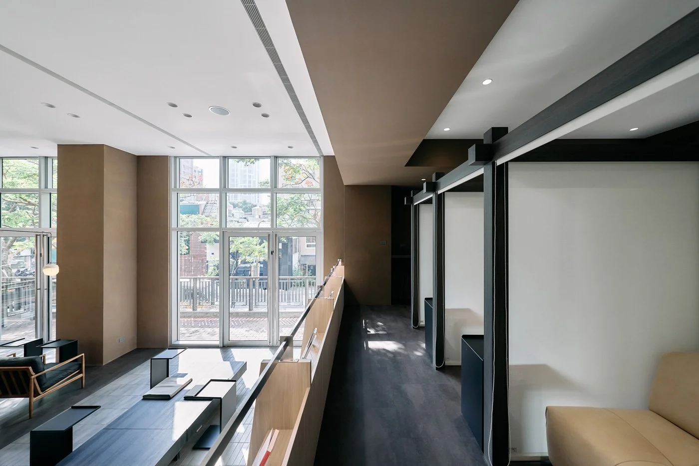
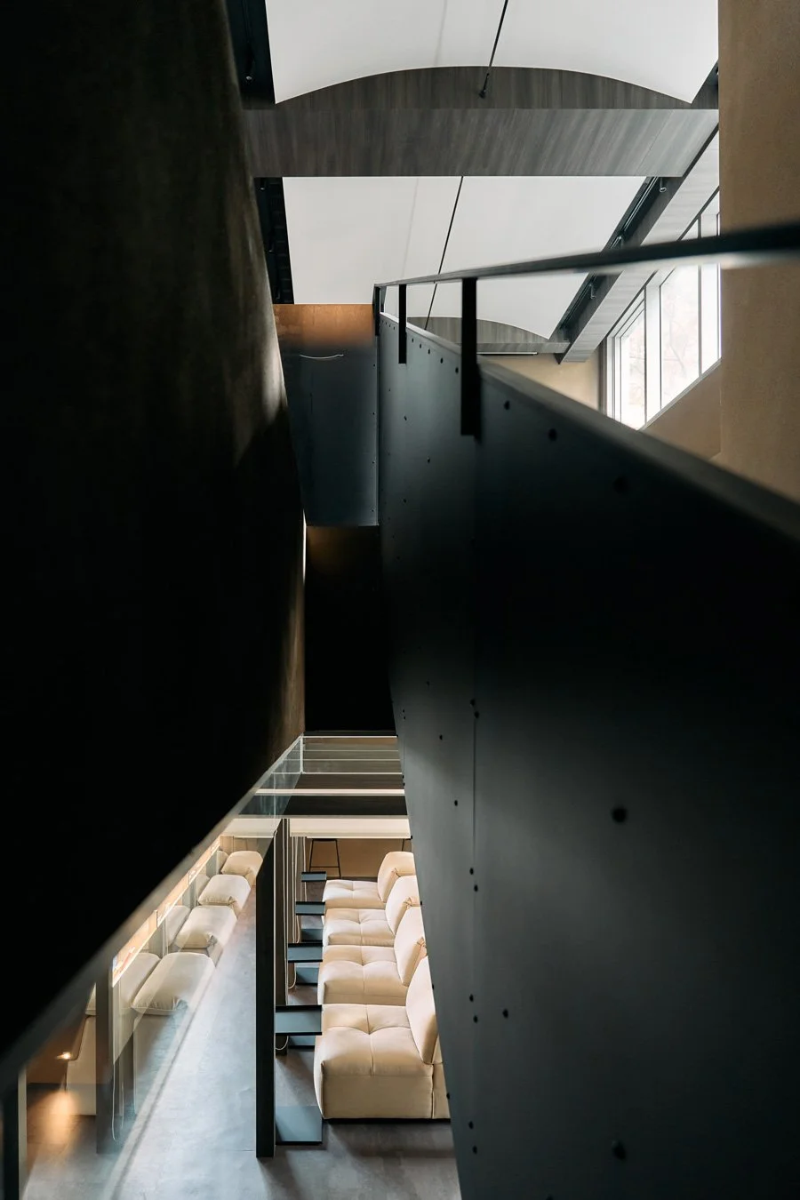
In terms of functional layout, the design team cleverly utilized the site's high ceilings to divide the space: static contemplation on the first floor and dynamic exchange on the second. The corridor connecting the two floors acts as a pre-reading ritual; through the intentional contraction and expansion of spatial volume, it gently guides the readers' moods as they adjust between solitude and participation.
Stepping onto the second floor, the space transforms into a highly flexible, dynamic exhibition area capable of hosting book clubs, book launches, and even floral arrangement classes or lectures tailored to the current curatorial theme. Here, the design team retained a sweeping sense of openness, allowing reading to expand from an individual spiritual practice into a collective collision of ideas.
-
Unlike most bookstores that cater to the fast-paced nature of coffee culture, Jin Feng Bookstore purposefully chose Taiwanese tea and wine as its companions for reading. Tea leaves slowly unfurling in hot water, with the brew gradually lightening over multiple infusions, perfectly match the rhythm of passing time. Wine, on the other hand, allows tense nerves to relax, facilitating a deconstruction and reconstruction of text in a state of mild, comfortable intoxication.
Yingtai Space Design deliberately allowed sensory distractions to fade into the background, ensuring nothing interferes with the absolute essence of reading. As the green canopy of Tianmu outside the window shifts with the setting sun, all that remains inside is the warm aroma of tea and the quiet rustling of pages. In this beautiful corner framed by time, person and book finally meet, completing the purest dialogue of the soul.