拾起童年故事,尋回記憶溫度:人工人設計制作拼出「來好 LAI HAO」辦公室的細膩滋味
-
Heritage unfolds not in grand ceremonies but in quiet moments, subtly passed down through tactile objects and spatial atmospheres. It is the residual warmth of time, blending past affections with future aspirations. Translating heritage into a commercial space involves more than brand continuation; it requires transforming original intentions into a framework that supports modern life.
Within the office of the cultural and creative brand LAI HAO, heritage becomes a warm temporal thread. It channels the rustic life philosophy of the founder's grandmother, Ms. Lai Hao. Through the vision of Daniel, Design Director at Zinkouzin Design, this deep affection from Chiayi is seamlessly woven into a brightly illuminated space on Xinsheng South Road in Taipei. This dialogue between an old soul and a new generation allows memories to settle and breathe within modern design.
-
Red Brick Memories Beneath Your Feet
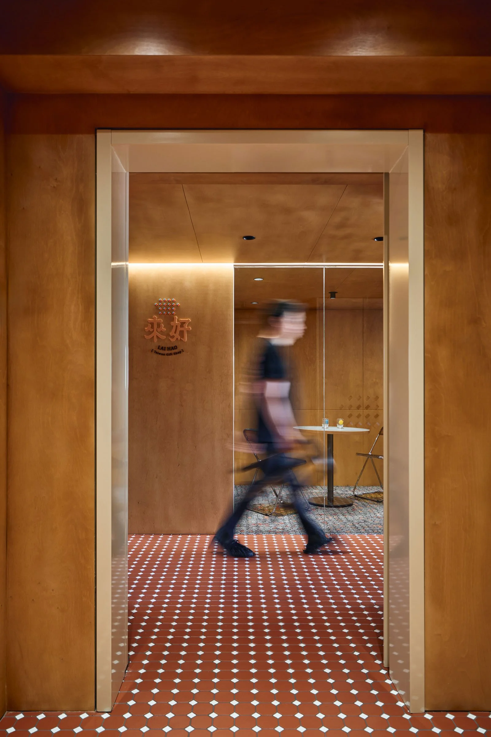
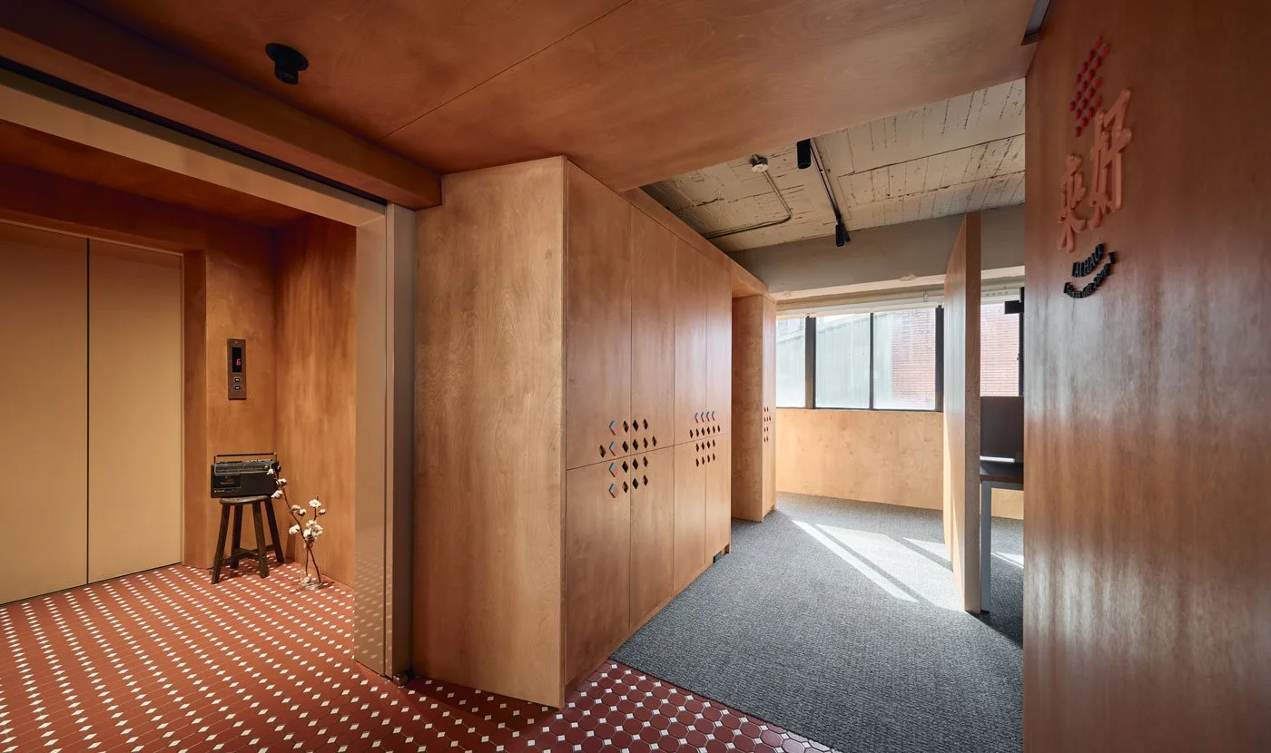
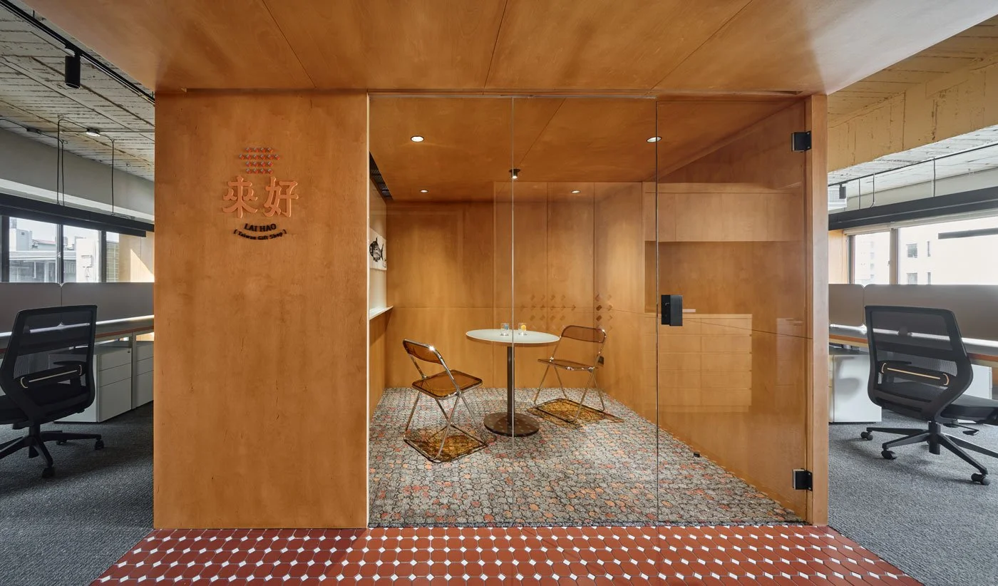
Daniel believes a space should transcend mere functionality to connect with human experiences and foster daily dialogue. As the elevator opens, visitors are greeted not by a sterile reception desk but by rustic kiln fired red octagonal tiles. In traditional Taiwanese houses, these tiles form the foundational canvas of a home, carrying the weight of daily life and a gently worn warmth. Stepping across this tiled pathway expands the visual field and reveals the first subtle design cue crafted for the brand.
-
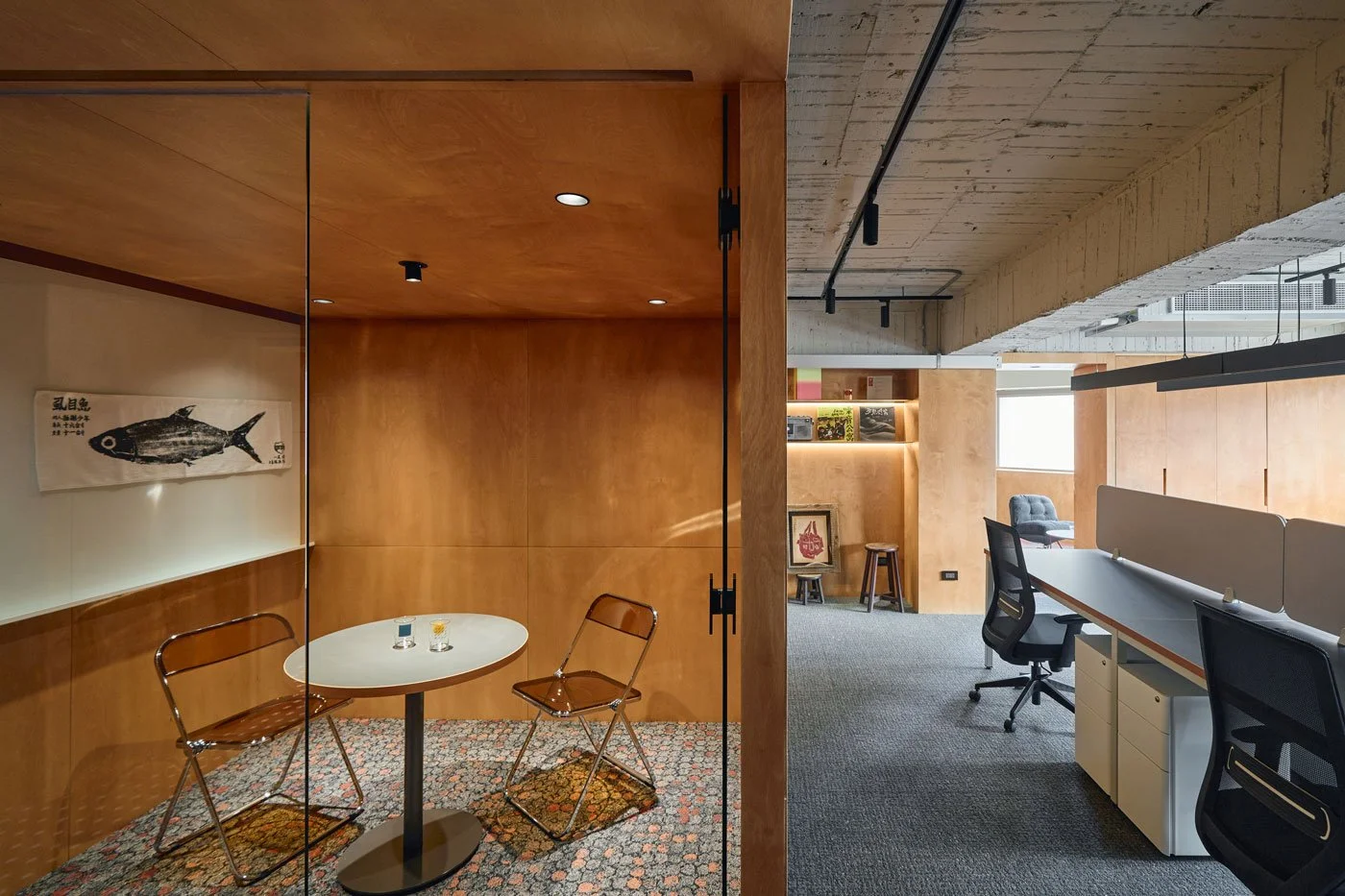
This subtly extending color palette begins at the entrance tiles, transitions to the meeting room carpet, and culminates in the rich brick red tones of the restroom. Consistent hues across varying materials establish emotional resonance throughout functionally distinct areas. This profoundly echoes the longing for the grandmother behind the LAI HAO name, allowing visitors to connect with fragments of the past through continuous visual warmth.
-
Breathing in an Illuminated Space
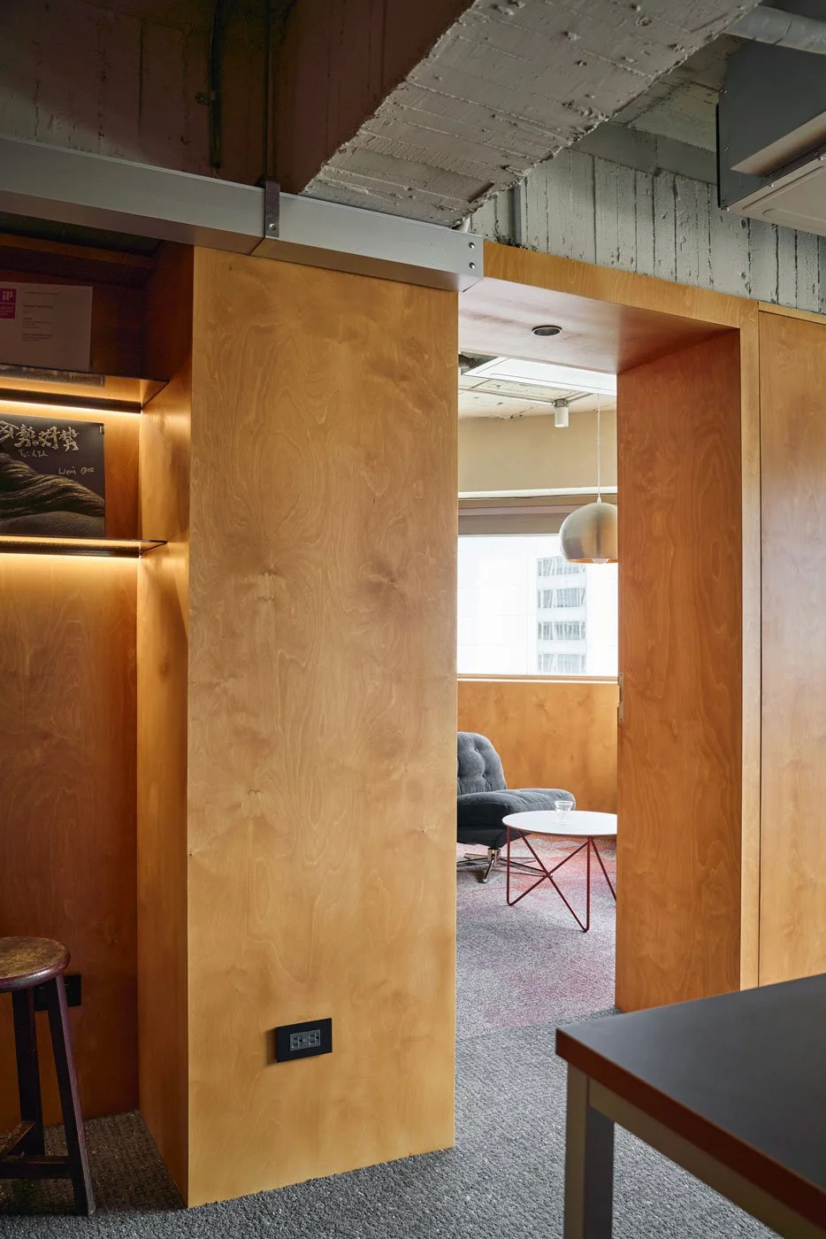
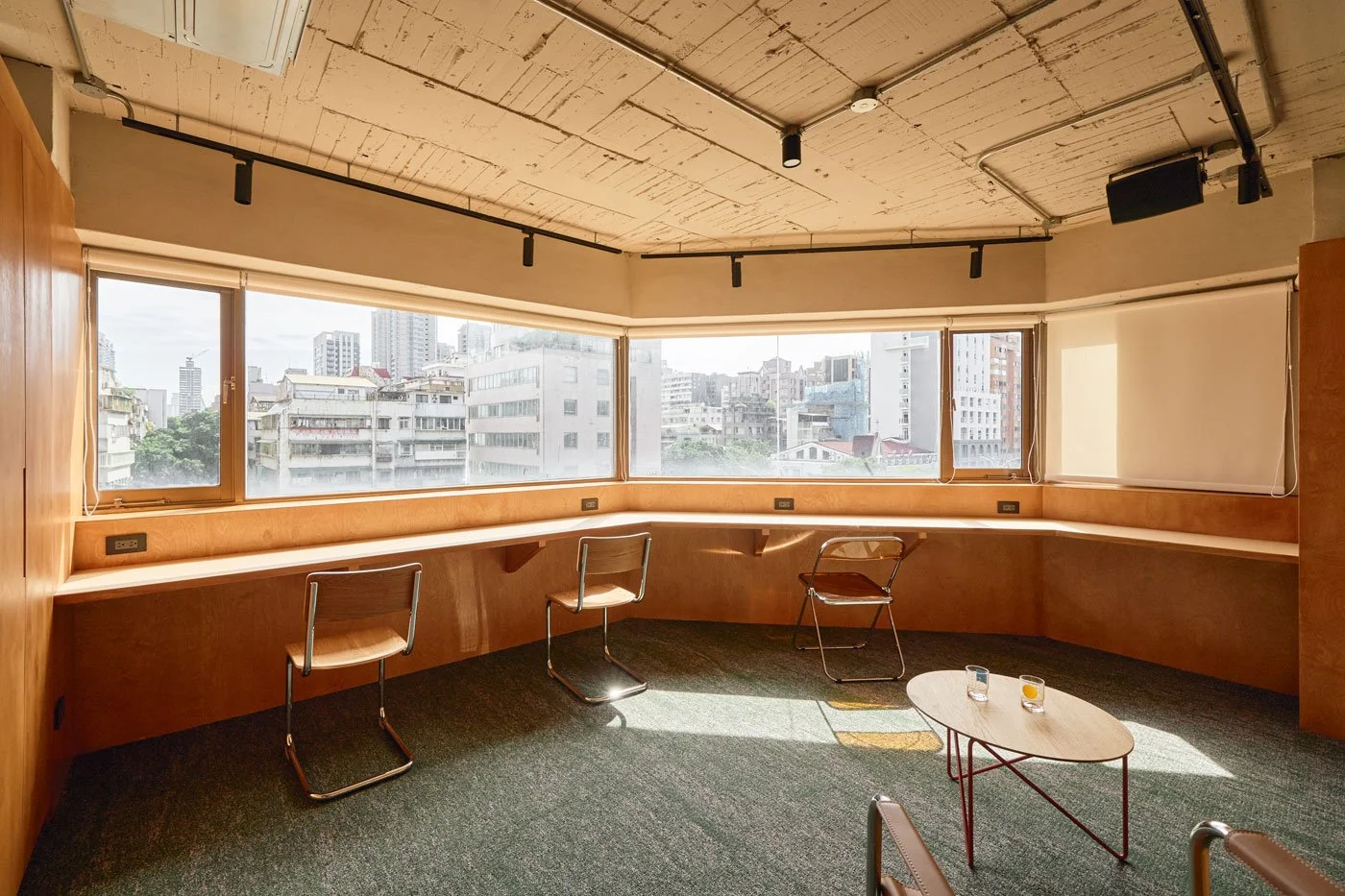
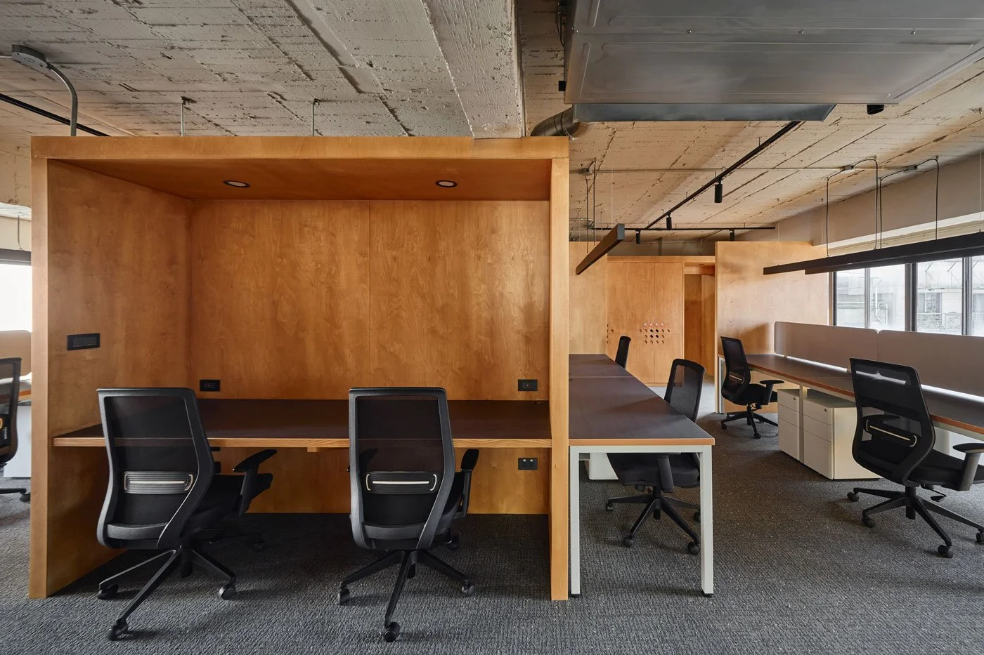
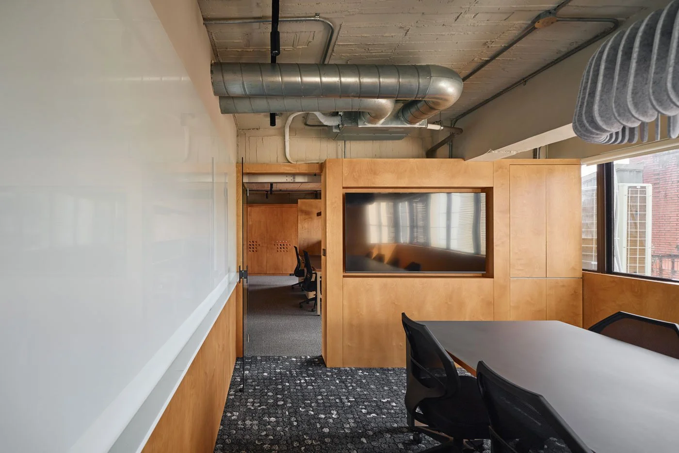
If materials represent the physical body of a space, light serves as its soul. Through a thoughtful layout logic, Daniel reserves bright natural light for everyone moving through the office. The meeting area is strategically placed at the center near the elevator to accommodate frequent discussions with partners and manufacturers. Consequently, external visitors remain separate from the main workspace, preserving employee focus while optimizing business circulation.
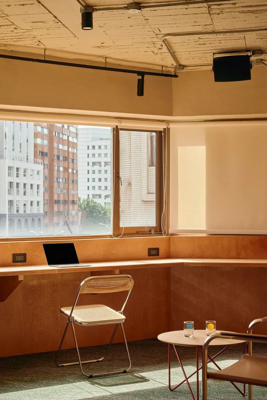
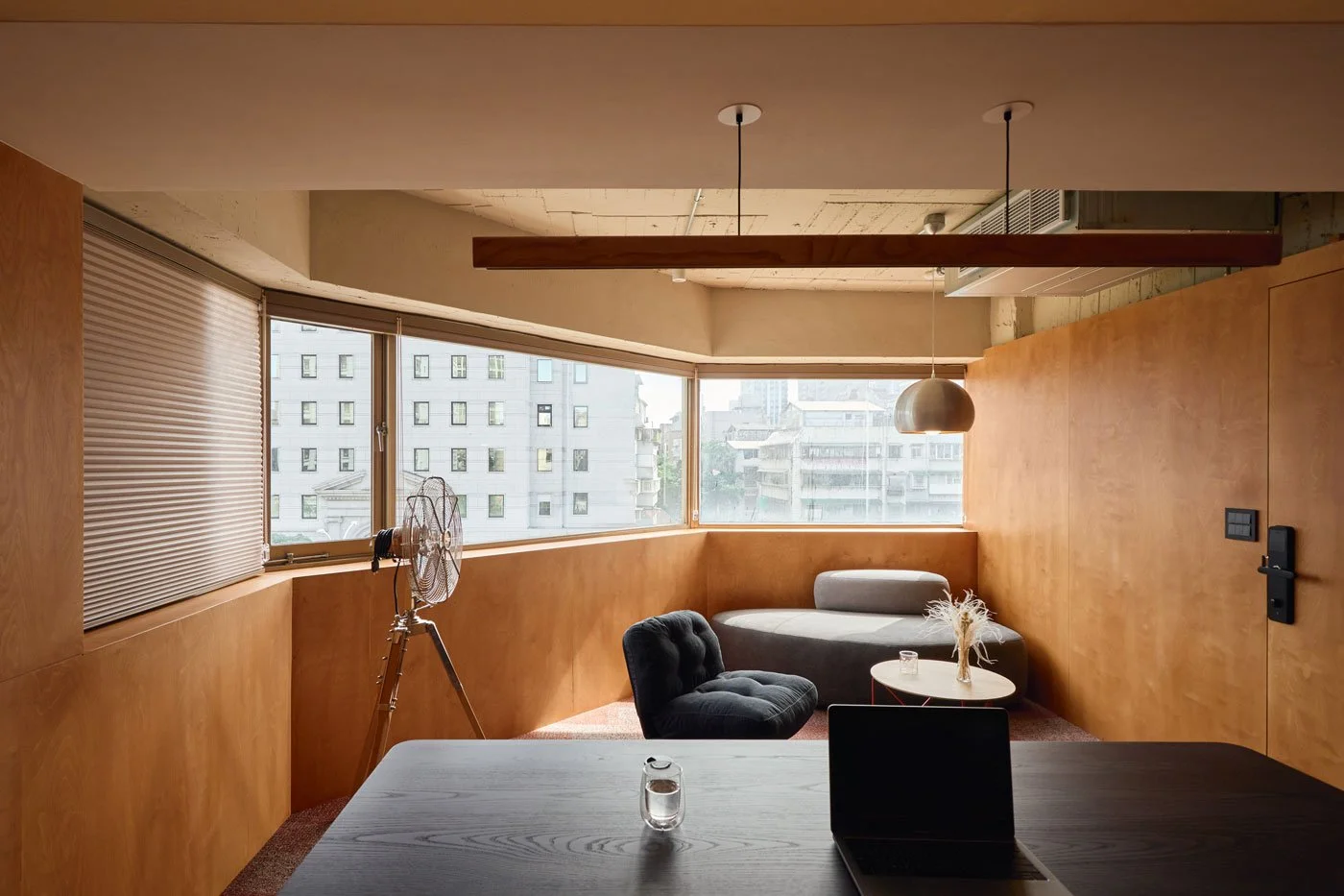
Shifting toward the bright southeast corner, a spacious lounge and photography area unfolds. For a vibrant young team, an office must transcend rigid workstations to become a living space for dining, conversing, and brainstorming. This area simultaneously functions as a studio, offering the marketing team a flexible environment for frequent shoots. Pure natural light and sweeping eastern views create an organic filter that allows products to display their truest warmth.
-
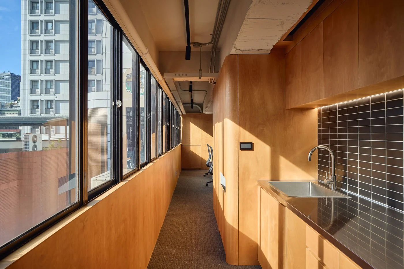
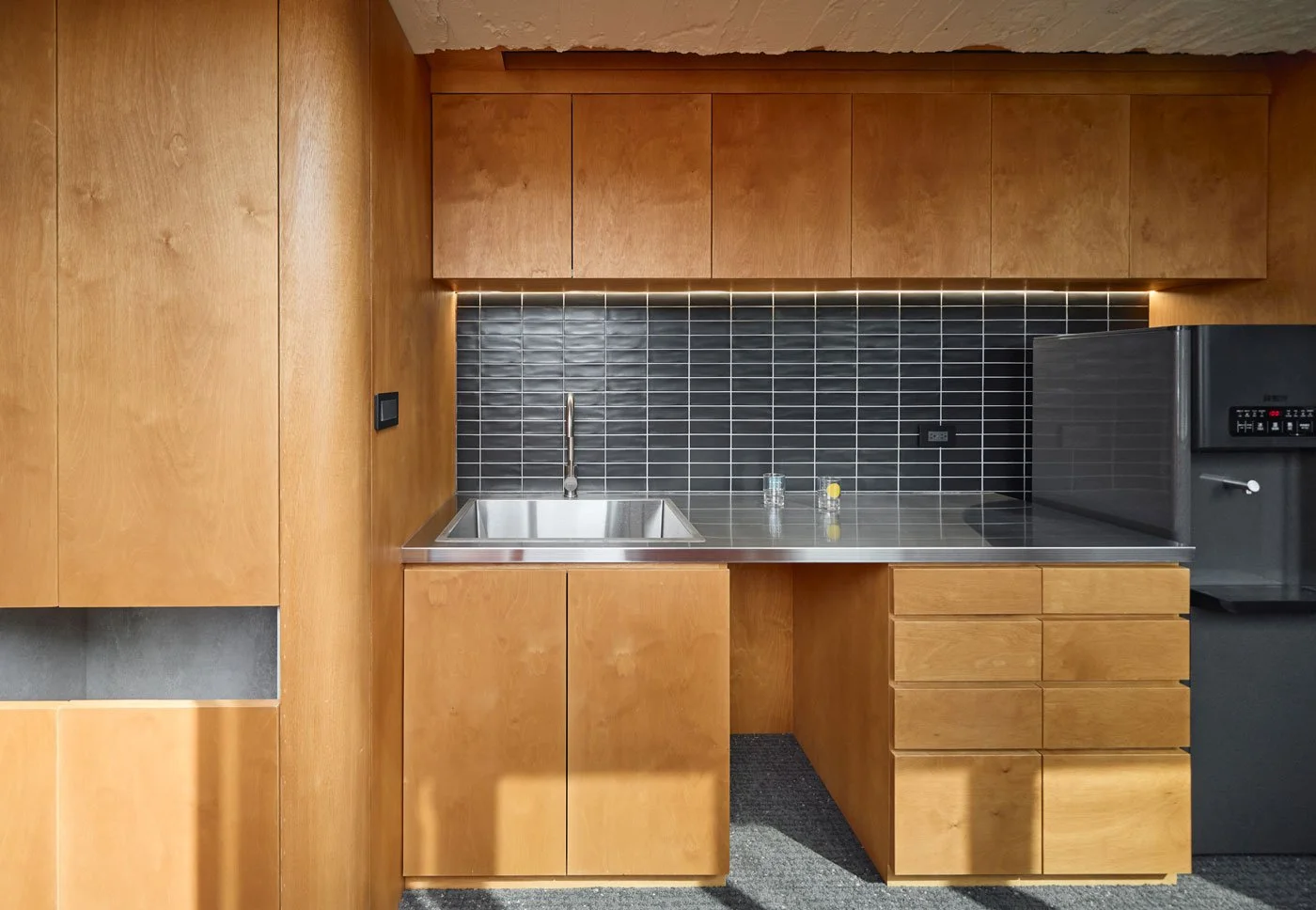
This dedication to detail extends to the pantry and restroom in the southwest corner. Divided by the original column structure, the area with optimal light penetration is designated as the pantry. Brewing morning coffee here while sunlight pours in ensures that users experience thoughtful spatial planning even in the most modest corners.
-
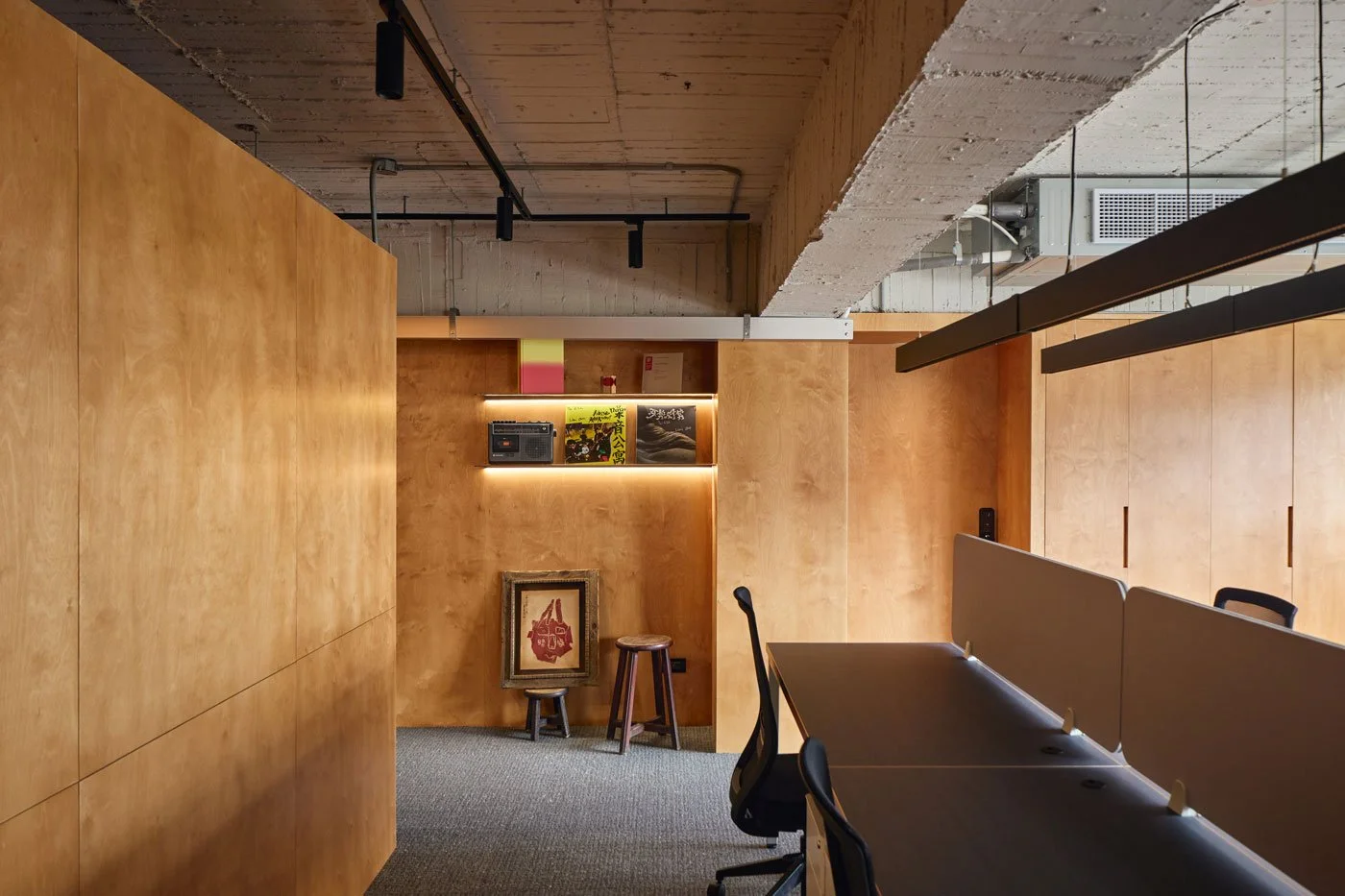
Decoding Memories in Birch Textures
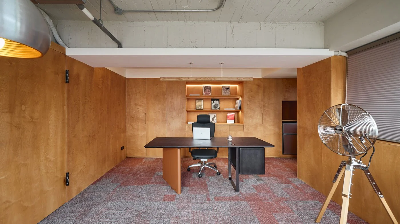
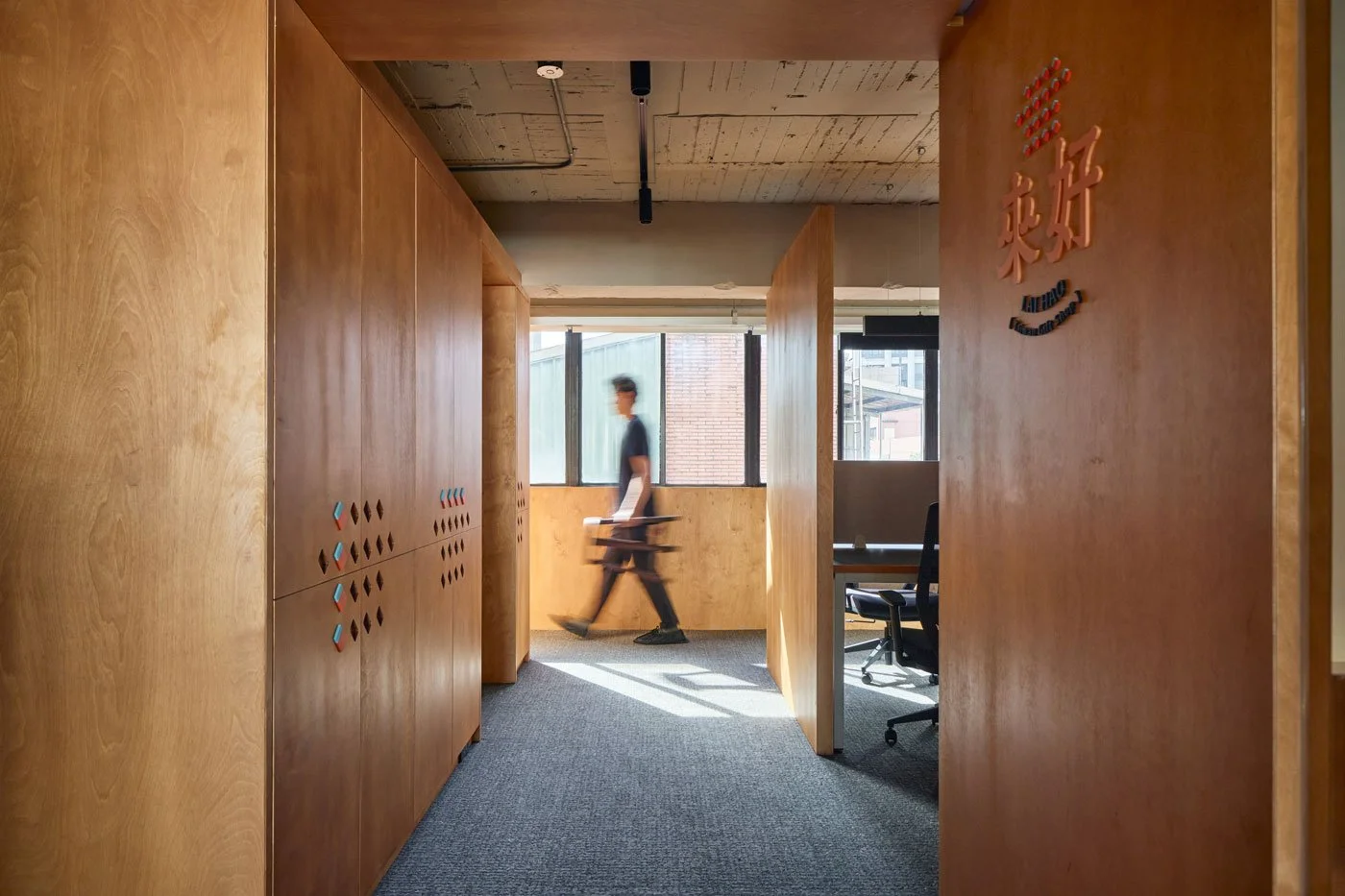
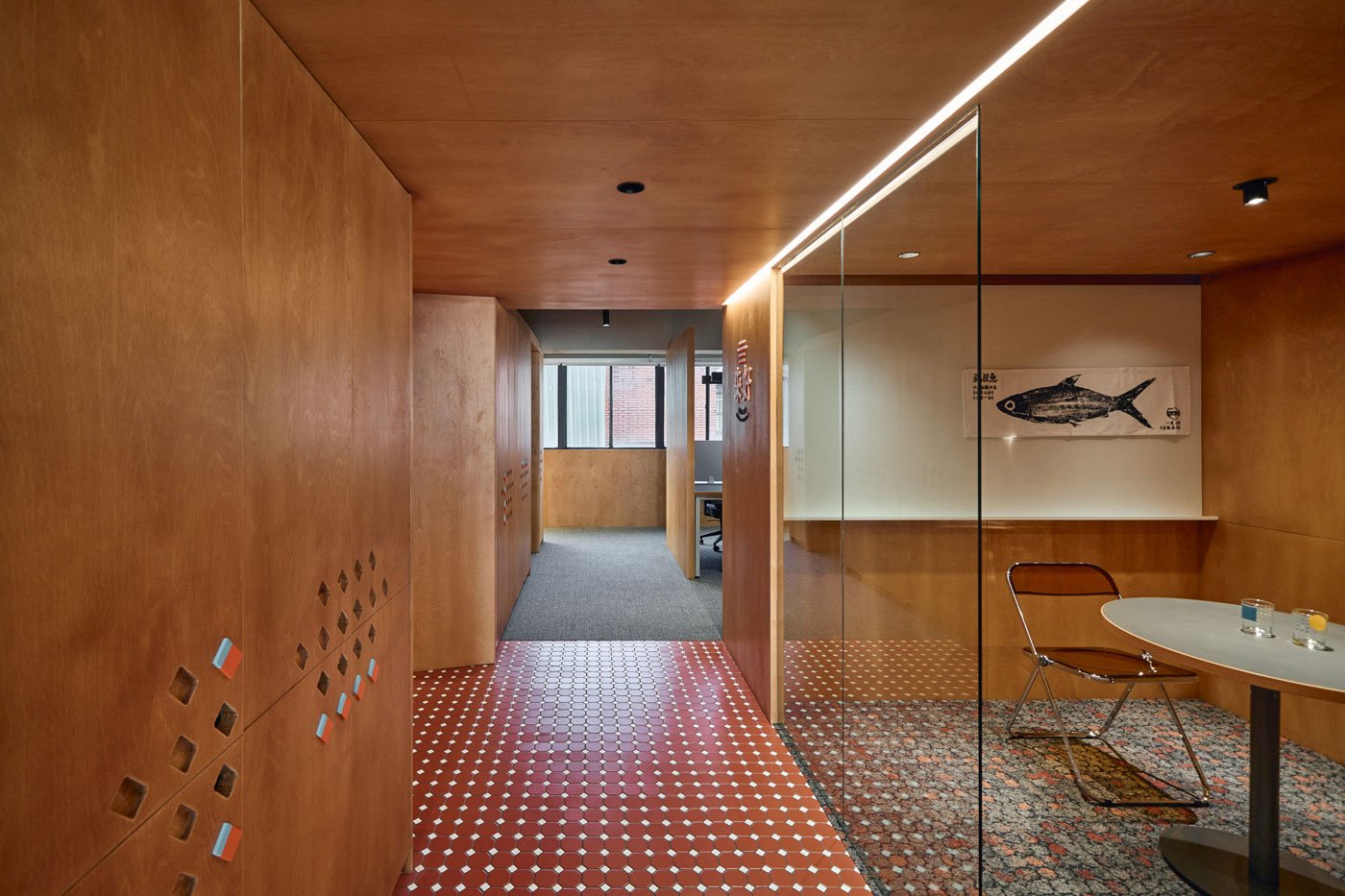
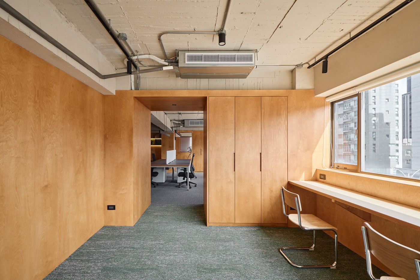
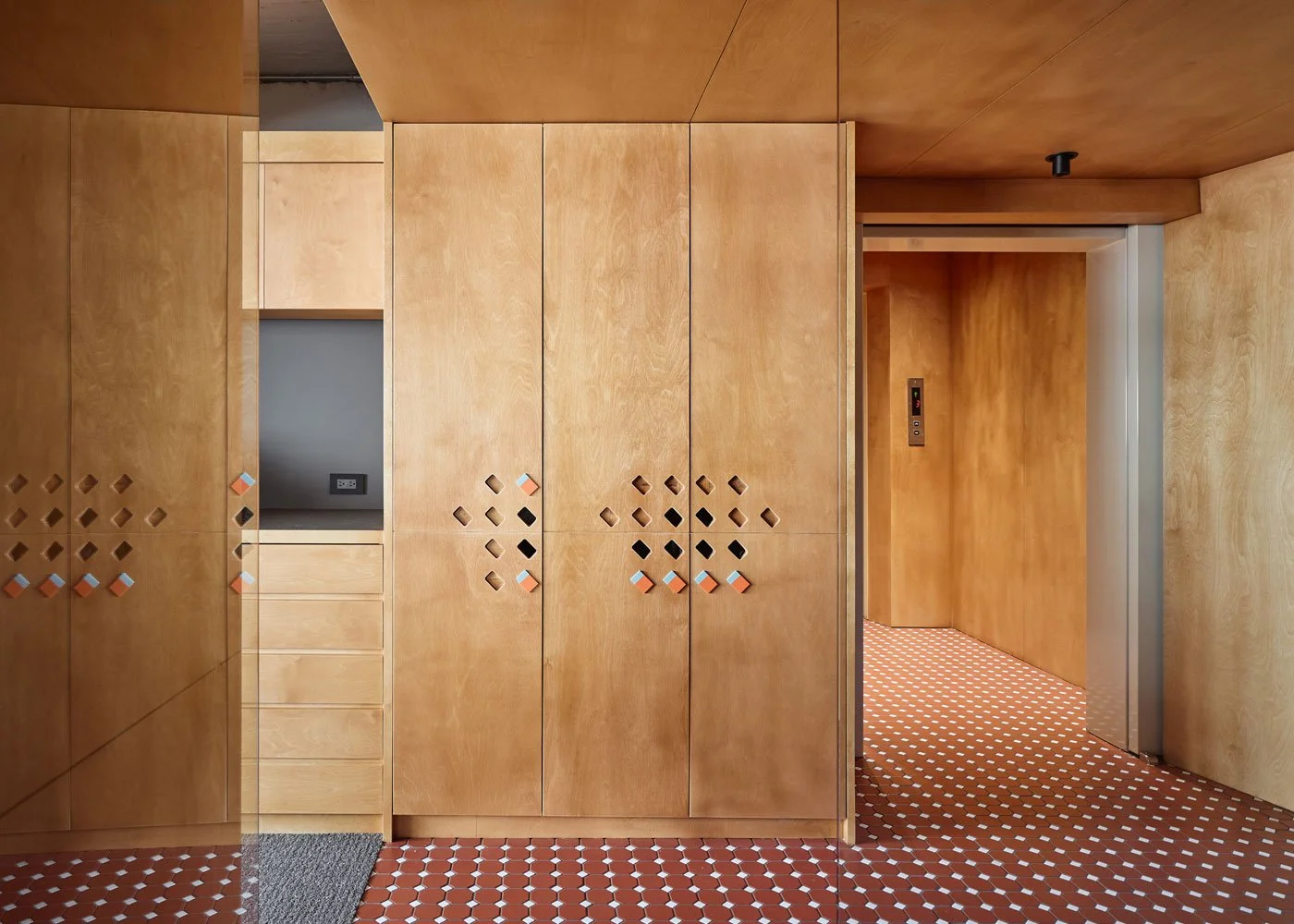
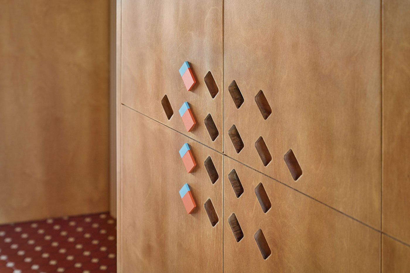
For the primary visual tone, fine birch wood panels were selected for the walls. Through meticulous dyeing processes, the wood presents warm and layered color gradients that evoke a grounded earthy aesthetic. Furthermore, the small house silhouette from the brand logo symbolizing the hometown of Chiayi is ingeniously transformed into perforated patterns on the cabinet doors. This introduces an engaging design layer while serving the practical function of opening the cabinets. Blue and orange corporate elements are interspersed throughout, injecting dynamic brand vitality into the elegant wood tones.
In office design, the true challenge often lies not in innovation but in addressing the residual language of older buildings. Retaining the exposed ceiling, Daniel applied a new layer of earthy textured paint to conceal old marks. This captures the building's original raw formwork textures, allowing the space to exude a natural and vibrant atmosphere.
-
Zinkouzin Design Director Daniel asserts that a space must embody consciousness, spirit, and personality. For LAI HAO, the moment the elevator opens, the octagonal tiles underfoot and the perforated symbols initiate an immediate dialogue with visitors. Even without knowing the familial story behind the brand, one can intuitively sense a profound and welcoming warmth.
Through this design, the warm brand spirit is translated into a concrete spatial vocabulary, allowing past memories and future routines to seamlessly overlap.